Dynamically Create Charts Using MooTools MilkChart and Google Analytics

The prospect of creating graphics charts with JavaScript is exciting. It's also the perfect use of JavaScript -- creating non-essential features with unobtrusive scripting. I've created a mix of PHP (the Analytics class), HTML, and MooTools JavaScript that will connect to Google Analytics, create an HTML table with the statistics for a given month, and use MooTools MilkChart to colorfully chart them out.
The PHP
/* defaults */
$month = date('n');
$year = date('Y');
$type = 'Column';

/* submission? */
if($_GET['month'] || $_GET['year']):
	/* cleanse lookups */
	$month = (int) $_GET['month']; if(!$month) { $month = 1; }
	$year = (int) $_GET['year']; if(!$year) { $year = date('Y'); }
	/* retrieve information from google analytics */
	require 'ga/analytics.class.php';
	$analytics = new analytics('youraccount@gmail.com', 'yourP@ss');
	$analytics->setProfileByName('yourdomain.com');
	$analytics->setMonth($month,$year);
	$visits = $analytics->getVisitors();
	$views = $analytics->getPageviews();
	/* build tables */
	if(count($visits)) {
		//visits - php
		$visits_table_data = '<table id="data-table-visits">';
		/* $visits_table_data.= '<thead><tr><th>Unique Visits</th><th>PageViews</th></tr></head><tbody>'; */
		$visits_table_data.= '<thead><tr><th>Unique Visits</th></tr></head><tbody>';
		foreach($visits as $day=>$visit) {
			/*
			$visits_table_data.= '<tr><td>'.$visit.'</td><td>'.$views[$day].'</td></tr>'."\n";
			$visits_table_foot.= '<td>'.$day.'</td><td>'.$day.'</td>'."\n";
			*/
			$visits_table_data.= '<tr><td>'.$visit.'</td></tr>'."\n";
			$visits_table_foot.= '<td>'.$day.'</td>'."\n";
		}
		$visits_table_data.= '</tbody>';
		$visits_table_data.= '<tfoot><tr>'.$visits_table_foot.'</tr></tfoot>';
		$visits_table_data.= '</table>';
	}
endif;
It all kicks off with grabbing the information from Google Analytics. Simply provide the time frame you would like statistics for. I usually choose to retrieve statistics by the month.
The Generated HTML & MooTools JavaScript
<h2>Select Your Month/Year</h2>
<form method="get">
	<select name="month" id="month">
		<option value="">-- Select Month --</option>
		<?php
			for($x = 1; $x <= 12; $x++):
				echo '<option value="',$x,'"',($month == $x ? ' selected="selected"' : ''),'>',date('F',mktime(0,0,0,$x,1,2009)),'</option>';
			endfor;
		?>
	</select>
	<select name="year" id="year">
		<option value="">-- Select Year --</option>
		<?php
			for($x = 2008; $x <= date('Y'); $x++):
				echo '<option value="',$x,'"',($year == $x ? ' selected="selected"' : ''),'>',$x,'</option>';
			endfor;
		?>
	</select>
	<select name="type" id="type">
		<option value="">-- Select Chart Type --</option>
		<?php
			$chart_types = array('Column','Bar','Line','Scatter','Pie');
			foreach($chart_types as $chart_type):
				echo '<option value="',$chart_type,'"',($type == $chart_type ? ' selected="selected"' : ''),'>',$chart_type,'</option>';
			endforeach;
		?>
	</select>
	<input type="submit" name="submit" id="submit" value="Get Statistics!" />
</form>

<?php
	//php time - echo tables
	if($visits_table_data) { echo '<h3>Visits</h3>', $visits_table_data,'<br />'; }
?>
<?php if(count($visits)): ?>
	<script type="text/javascript">
		var visits = new MilkChart.<?php echo $_GET['type']; ?>('data-table-visits',{
			width: 960,
			height: 550,
			font: 'tahoma',
			showValues: false,
			useFooter: true
		});
	</script>
<?php endif; ?>
Using the THEAD, TBODY, and TFOOT elements is extremely important in the ensuring the correct labels are placed within the generated chart. The data table itself is very simple. MilkChart will take the above table and create a CANVAS element which will contain the chart.
There are five different chart types you may choose from: Column, Bar, Pie, Line, Scatter. MilkChart takes full advantage of MooTools' inheritance model as each type of chart's class extends the base MilkChart class.
I love the way the MilkChart developer(s) utilized MooTools' OOP/inheritance model to perfection. I also love that MilkChart requires the bare minimum of data for the HTML table. MilkChart isn't without its flaws though. A few of the table types had a fit about including multiple dimensions (using both page views and visits within the same chart, for example) and value label placement has yet to be perfected.


Wow, great idea! This inspired me to make an alternative that works with a self hosted solution (so users can see related statistics in their profiles). Thanks^^
MilkChart is pretty sick. BTW, if you’re comparing this to jQuery Flot you should know that Flot does not have pie charts IIRC.
David, it doesn’t seem to be working. Neither in Opera or IE8.
IE says “Object doesn’t support this property or method”. Any idea?
@Matthew: IE does not support the CANVAS element which this plugin is based off of. I’ll look further into the Opera issues.
Very nice, sadly the IE incompatibility limit the possibilites of usage a lot :(
What about showing data in a table for unsupported browsers?
Another thing: It does not seem to be working on Linux (i’m using FireFox [3.0.8] – shared computer at the faculty)..
You should check http://g.raphaeljs.com/ for charts. Works cross browser.
The tool milkchart and the post is very good. I was using jpgraph but I guess with this I can create the graphs which we need mostly for various MIS fastly.
Thanks
Hrushikesh Wakadkar
The labels for the wedges in the pie chart align differently than they should. They are very close to the pie chart on one side, and further from the chart ( to the point of being outside the containing element ) on the other side.
This makes the pie chart style basically worthless since I can’t see what some of the values line up to, and other values I plain can’t see since they get cut off.
FF 3.5.4 OS X 10.5.8 <- broken as above, also the key is spaced to where I only can see the 11th through the 20th using your default september 2009 data.
Safari 4.0.3 OS X 10.5.8 <- broken as above, but not 'quite' as badly.
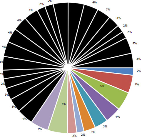
Thanks for the plug here David :) and all the feedback. I got some time so I will be fixing some bugs and implementing some more features. The biggest bug right now is IE and it should be fixed soon. I also added a color generator in trunk, thats why the pie graph above is half black :)
Thanks again and glad to see it’s being used!
David, the dropdowns are empty for me. Chrome 4.0.237.0 on Karmic64 bit.
@Derek:
Doh! it’s the latest chrome, doing it on several sites.
some bugs and implementing some more features. The biggest bug
For those of you not as tech savvy yet still want to display your Google Analytics in Graphical/Chart form, check out EmbeddedAnalytics ( http://www.embeddedanalytics.com ). This is a site I have developed. You simply define your report (profile, metrics, dimensions, and time-frame). You can then embed the report directly into a webpage simply by embedding a snippet of iframe code.
thanks for you. cool analytics
Is there any way to pull just the stats for one url? like only get the stats for http://davidwalsh.name/milkchart ?
i see not ga/analytics.class.php
please help!
sorry for english bad.
Its awesome that charts can be visible from the Google Analytics which really helps a lot in evaluating traffic.
Website ( http://www.techliance.com )also has some useful tools which may help in measuring traffic.
Only question in my mind is will it be compatible with different internet explorers? Need guidance.
If i want to make the chart real time Updated in every 10 seconds,How to do it??please help me
If i want to make the chart real time Updated in every 10 seconds,How to do it??please help me