JS Charting: Google Sheets
In this article, we will chart data from a publicly accessible google spreadsheet feed (via JSON) and create a dashboard using the JS Charting library. By consuming the spreadsheet in this way, updated results will show live as soon as any shared edits are made by those with permissions to edit the data.
We will use this spreadsheet (Figure 1):

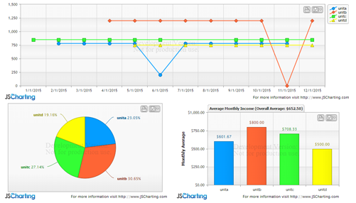
To create the following dashboard (Figure 2):
Setting up the spreadsheet
When parsing the spreadsheet data feed, it will be more practical to access the columns by header names. In order to setup a header row, you must freeze a row in the spreadsheet page. Click View > Freeze > 1 row to create a header row. This can also be done with columns but for our case we only freeze a single row which is styled in bold in figure 1.
The next step is to publish the spreadsheet to the web so it can be accessible in the browser. From the menu in google docs with the spreadsheet open, select: File > Publish to the web.
There will be a link generated, which in our case is
https://docs.google.com/spreadsheets/d/1D1vL8EI0uRzeiGM-A8hZLgUCexXrocw5B_qTGnCekNE/pubhtml
Copy this link for reference as we will use it to fetch the data feed. Then click the Publish button.
Fetching the data feed
Now that the spreadsheet is available online, we will use the jQuery getJSON function to fetch it as JSON. The following specific URL formatting is required to obtain the JSON:
https://spreadsheets.google.com/feeds/list/1D1vL8EI0uRzeiGM-A8hZLgUCexXrocw5B_qTGnCekNE/od6/public/basic?alt=json
Notice the highlighted portion of the URL which is taken from the, “Publish to the web” URL popup in the previous step.
The code to get this data feed with jQuery is:
$.getJSON(
    "https://spreadsheets.google.com/feeds/list/1D1vL8EI0uRzeiGM-A8hZLgUCexXrocw5B_qTGnCekNE/od6/public/basic?alt=json",
    function(data){
    console.log(data);
}
This line would just access the JSON and write it in the browser's console, but we need to parse and consume the data.
Parsing the data
The raw JSON data structure looks like:
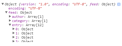
Each entry represents a row in the spreadsheet. This is an example row from the data
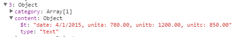
Please note that only the cells with content are included in the $t property.
The following code parses spreadsheet data into a series of points and takes two parameters. The data, and the name of the column that represents the x values that are shared by all data points.
See the Pen by Arthur Puszynski (@jsblog) on CodePen.
It works by passing each entry with a series name, x, and y value to the addPointToSeries() function. If a series with that name doesn’t exist, a new series is created, otherwise, a point is added to the series. After all entries are processed, an array of series is returned.
NOTE: When parsing the $t content property, make sure to split the values to using a comma with a space after it ', ' The same goes for the column name and value ': ' This is required as numeric values can be formatted including a comma such as $1,120.00 and Datetime values can contain a colon within the time part, both of which can cause issues when parsing.
Making your chart dashboard
Now we get to the fun part—visualizing this data. jQuery is already included, so we only need to add the chart script to get started.
<script src="JSC/JSCharting.js"></script>
Next, a div element is added for the chart itself:
<div id="mainChart"></div>
And the code to create a chart from the data we have so far:
$('#mainChart').JSC({
	xAxisScaleType: 'time',
	yAxisScaleRangeMin: 0,
	series: seriesData
});
See the Pen by Arthur Puszynski (@jsblog) on CodePen.
Now that the basic chart is setup, we will add some settings to tune the chart and take advantage of the customization offered by JSCharting.
First, some y axis settings to describe the values presented in this chart.
yAxis:{
    formatString:'c',
    labelText:'Received',
    scaleRangeMin: 0
},
Note: notice how this block of options is an object under the yAxis property whereas in the previous example a single property at the options root was used to set similar options. This is possible because the JSCharting options API allows joining the property hierarchical names into a single property setting for convenience.
Here we format the y data values as currency and set the y axis label. Describing the data in this way will propagate to all other parts of the chart that utilize y values. For example, whenever a y value is mentioned in a tooltip, or elsewhere, it will be automatically formatted as currency. By giving the axis a label, it will also help the automatic tooltips describe the data points.
Next we specify a title for this chart using the following code:
titleLabelText: '2015 Accounts Receivable Total: %sum'
Notice the %sum token included in the title text. There are many tokens that can be used in the chart title. These tokens are all listed under the series collection section of this token reference.
Also, note how the sum takes on the currency format since it related to values on the y axis.
Next, let's modify the legend labels to include sums for each series:
legendDefaultEntryText:'%name %sum',
See the Pen by Arthur Puszynski (@jsblog) on CodePen.
The next chart we create will be based on calculations retrieved from this first chart and it will have average monthly income for each unit shown as a bar chart. Another div is added to the html for the second chart of our dashboard:
<div id="avgChart"></div>
Then, in order to interact with the first chart’s data and use those calculations, the code for the average chart will be placed inside a callback of the first charts initialization method.
$('#mainChart').JSC({/*options*/, function(chart){ /*callback code*/});
This chart will contain only one series with a bar representing the average monthly income of each series. To do this, the main chart’s series are iterated and a new point is created for each where the y value is the series sum divided by 12 months.
By specifying a palette for this series, each bar will take on a different color and match the color coding of the main chart.
See the Pen by Arthur Puszynski (@jsblog) on CodePen.
The final chart will be a pie chart using this original data to show the percentage of income each unit contributed to the total. Our current chart can be converted to a pie chart by simply adding a type:'pie' property. You can view a list of JS charting chart types along with samples for each to experiment with other types. This setting causes the chart to show a pie where each series become a slice. If the goal was to have a pie represent each series, the setting would be defaultSeriesType:'pie' which would have each series be a pie type instead.
See the Pen by Arthur Puszynski (@jsblog) on CodePen.
$('#pieChart').JSC({
	type:'pie',
 	yAxisFormatString: 'c',
     defaultPointLabelText:'<b>%name</b> %percentOfTotal%',
	series: seriesData
  });
Notice how the y axis format string is specified despite the fact that pies do not have axes. This is because the y axis setting describes the y values rather than an actual axis.
The default point label text is also specified for this pie chart using the following code:
defaultPointLabelText:'<b>%name</b> %percentOfTotal%',
Again, we leverage tokens, but this time they are from the point token set.
JS Charting Spreadsheet helper
It is worth mentioning an interesting feature of JS Charting that can be helpful in some spreadsheet cases. In the above chart, we use a time scale for the x axis, so the order and position of each data point is defined by the value itself. In some cases, such as three letter month abbreviations, x values are names or any arbitrary strings. Since some of these strings cannot be parsed into dates or any quantitative values that indicate a position along the x axis, the sort order of points may not be correct. That is, of course, if there are empty cells in a spreadsheet and the first few values of the first series are missing. Generally you would expect the first processed series to define the initial x axis values. Then any new x axis values encountered in subsequent series would be placed at the end of the x axis. JSCharting will automatically analyze the order of all the series points to determine what the intended order is even when some series have missing points. You can see an example of this here.
See the Pen by Arthur Puszynski (@jsblog) on CodePen.
Here, we assign the date values as point names and remove the x axis time scale setting. The result is that the chart looks the same as when using time scales and values.
Conclusion
Google spreadsheets offer some unique capabilities for storing data in the cloud and allows fetching it for use in any web apps. It is also possible to dynamically update these spreadsheets providing a cloud based database backend. JSCharting makes visualizing this data effortless and with its label tokens support, rich and descriptive charts can be created with very little code. There are many chart types available including mapping which is bundled with the product at no additional cost. The full suite of chart types and features is free to download and experiment with for development purposes. The JSCharting documentation describes the declarative API and is quite exhaustive.


About Arthur Puszynski
Initially inspired by C++ graphics demoscenes in the 90s, Arthur’s passion for graphics programming has continued to grow since that time. With 15+ years focused on chart and mapping visualizations, the death of plugins have brought a renewed passion for platform independent graphics using JavaScript and SVG.