CSS 3D Folding Animation
Google Plus provides loads of inspiration for front-end developers, especially when it comes to the CSS and JavaScript wonders they create. Last year I duplicated their incredible PhotoStack effect with both MooTools and pure CSS; this time I'm going to duplicate their map fold-in effect. This effect uses 3D CSS animations which makes the animation even more sexy, and to make it red host, the animation requires no JavaScript!
The HTML
There's a series of HTML elements that need to be in place to accomplish the effect and keep the content in place:
<div id="container">
	<div class="parent1">
		<div class="parent2">
			<div class="parent3">
				<!-- Content goes here -->
			</div>
		</div>
	</div>
</div>
The first parent element will define 3D state, the second parent element will contain the fully viewable code during the animation, and the third parent is the most visibly different during the animation progress.
The CSS
The CSS to complete this animation is quite interesting, and there's probably less of it than you'd think:
/* Static state */
#container 	{
	width: 400px;
	height: 400px;
	position: relative;
	border: 1px solid #ccc;
}
.parent1 	{
	/* overall animation container */
	height: 0;
	overflow: hidden;

	transition-property: height;
	transition-duration: 1s;
	perspective: 1000px;
	transform-style: preserve-3d;
}
.parent2	{
	/* full content during animation *can* go here */
}
.parent3	{
	/* animated, "folded" block */
	height: 56px;
	transition-property: all;
	transition-duration: 1s;
	transform: rotateX(-90deg);
	transform-origin: top;
}

/* Hover states to trigger animations */
#container:hover .parent1	{
	height: 111px;
}
#container:hover .parent3	{
	transform: rotateX(0deg);
	height: 111px;
}
The static state of parent1 sets the 3D transform and perspective states, starting at 0px height. The static state of parent3 sets the transition and transformation of the rotation. Upon hover the parent1 and parent3 heights are animated to full height, 111px in this case, and rotated to 0deg, i.e. a front-facing state.
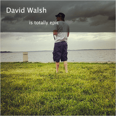
I get the feeling we'll be seeing a lot more of this animation in the future; a folding billboard is a nice effect and takes very little space. As evidenced above, there's also very little CSS required so there's a large payoff for so little code. I do think this effect looks better when an image is animated in -- it's easier to visually see the transform.


Awesome effect David !! And the blocks example doesnt aeem to have an picture in it.
Thanks for sharing it
A seriously nice and easy script. Cheers!
Thats freaking awesome bro!
WOW, that was so simple. I expected there to be a more code than that. Thanks David :)
Several days ago I found a tutorial about how to recreate the stream as viewed on tablets – it was a basic demo, not the full experience, only two columns with content, flying in the page on scrolling down, but it might be combined with that one.
Unfortunately I lost the link to the other tutorial :( If someone knows what I am talking about, know how to find it or have it, please, share it :-)
It’s really nice, but I would not rely much on mouse hover anymore, until “pointer” type media-query becomes widely supported.
That is freaking awesome! Do you know any script gallery with more stuff like this to test out?
I would also like to know!
great job~~~~~~
Hi David. Trying to achieve the Metro UI Flip effect. Any suggestions!!. It seems I could take something from this Demo
you’re the man david!
This is awesome.. Thanks David !
Dude — check out oridomi.com
David, in Firefox you need to preserve-3d also on “.parent2”, “.text-parent2” and “.slow-parent2”:
.parent2, .text-parent2, .slow-parent2 {
    -moz-transform-style: preserve-3d;
}
p.s. it seems that Firefox don’t need its vendor prefix anymore on “transform-style” and “perspective” :D
doesn’t work as intended for me
where do you insert image i mean in your example your image
i tried but it only shows david walsh is epic
Thanks for this cool tutorial – I had a question – is it possible to have the folding box fold up from the BOTTOM of the image? It seems height changes of divs in CSS always take place at the TOP of the parent container. Is there a clever way to have this effect but from the bottom of the parent container?
Thanks,
Nick
Nice.
Good Job.
David, Nice CSS effect.
I tried to copy your CSS. I put my content in within #container div and outside of #parent1 div. Now it folds after the content, not from the top of it.
Where do you put your content ?
can i get the same animation of img when page load not with the mouseover