Create a Photo Stack Effect with Pure CSS Animations or MooTools

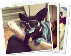
My favorite technological piece of Google Plus is its image upload and display handling. You can drag the images from your OS right into a browser's DIV element, the images upload right before your eyes, and the albums page displays a sexy photo deck animation when you hover over them. Outstanding! I've researched the effect a bit and was able to pull it off with both pure CSS and some MooTools JavaScript.
Initial Setup
The HTML setup is quite simple:
<a href="" class="album">
	<img src="https://davidwalsh.name/demo/gplus/photo4.png" class="photo1" />
	<img src="https://davidwalsh.name/demo/gplus/photo1.png" class="photo2" />
	<img src="https://davidwalsh.name/demo/gplus/photo2.png" class="photo3" />
</a>
I've used an A elements so that we can also play the animation with focus via tab. With the images in place, we need to style the A and images themselves:
/* the A tag */
.album {
	position: relative;
	z-index: 5;
	width: 250px;
	vertical-align: top;
	display:block;
}

/* the images */
.album img {
	position: absolute;
	top: 0;
	left: 0;
	border: 5px solid #f3f3f3;
	box-shadow: 1px 1px 2px #666;
	width:250px;
	height:250px;
	display:block;
}
These styles act as a base to the CSS and MooTools methods of animation.
The CSS Version
Both the CSS-only and MooTools versions will rely on browser-provided CSS3 animations via transforms. The transforms we'll be using are rotate, translate, and scale. The scale will be kept relatively small so that the magnification isn't abrupt.
The first step is getting our @-keyframes properties set up so that we can use the animations later. The following CSS assumes there will be 3 photos and user Google's animation values:
/* first image */
@keyframes image1 {
	0%   { transform: rotate(0deg) translate(0, 0) scale(1.0); }
	100% { transform: rotate(-6deg) translate(-100px, -3px) scale(1.1); }
}

/* second image:  webkit */
@keyframes image2 {
	0%   { transform: rotate(0deg) translate(0, 0) scale(1.0); }
	100% { transform: rotate(0deg) translate(0, -3px) scale(1.1); }
}

/* third image:  webkit */
@keyframes image3 {
	0%   { transform: rotate(0deg) translate(0, 0) scale(1.0); }
	100% { transform: rotate(6deg) translate(100px, -3px) scale(1.1); }
}
With the keyframes ready, it's time to implement the CSS settings within the selectors themselves:
/* first image animation properties */
.album:hover .photo1, .album:focus .photo1 {
	/* animation properties */
	animation-name: image1;
	animation-duration: .2s;
	transform: rotate(-6deg) translate(-100px, -3px) scale(1.1);

	/* microsoft animation properties */
	-ms-transform: rotate(-6deg) translate(-100px, -3px) scale(1.1);
}

/* second image animation properties */
.album:hover .photo2, .album:focus .photo2 {

	/* animation properties */
	animation-name: image2;
	animation-duration: .2s;
	transform: rotate(0deg) translate(0, -3px) scale(1.1);

	/* microsoft animation properties */
	-ms-transform: rotate(0deg) translate(0, -3px) scale(1.1);
}

/* third image animation properties */
.album:hover .photo3, .album:focus .photo3 {

	/* animation properties */
	animation-name: image3;
	animation-duration: .2s;
	transform: rotate(-6deg) translate(-100px, -3px) scale(1.1);

	/* microsoft animation properties */
	-ms-transform: rotate(6deg) translate(100px, -3px) scale(1.1);
}
The :hover state signals showtime, and the animation is wonderful. You'll see that I've duplicated the 100% setting within the :hover state as well, and that ensures the elements stay at their destination transformation after the animation is playing (otherwise the elements would abruptly revert to original state one the animation was done playing).
While this animation looks great, and requires no JavaScript, the abruptness in return to original state is slightly off-putting. Time for some MooTools magic.
UPDATE: CSS Transitions FTW
Using CSS transitions instead of animations, we can create a complete CSS-only solution!
/* the A tag */
.album {
  position: relative;
  z-index: 5;
  width: 250px;
  vertical-align: top;
  display:block;
}

/* the images */
.album img {
  position: absolute;
  top: 0;
  left: 0;
  border: 5px solid #f3f3f3;
  box-shadow: 1px 1px 2px #666;
  width:250px;
  height:250px;
  display:block;
  transition: all .3s ease-in-out;

}
/* first image animation properties */
.album:hover .photo1, .album:focus .photo1 {
    transform: rotate(-6deg) translate(-100px, -3px) scale(1.1);
}

/* second image animation properties */
.album:hover .photo2, .album:focus .photo2 {
    ms-transform: rotate(0deg) translate(0, -3px) scale(1.1);
}

/* third image animation properties */
.album:hover .photo3, .album:focus .photo3 {
    transform: rotate(6deg) translate(100px, -3px) scale(1.1);
}
Thanks to @ActualGabe for pointing this out!
The MooTools Version
Since there was no method for animating each image to its original position with just CSS, and considering MooTools has the smoothest animations on the web, it was only natural that I use MooTools to complete the effect. JavaScript is also nice in that we can do variable animations based on developer configuration and variable numbers of images.
After creating an initial inline-script, I refactored what I had to provide the following MooTools JavaScript class:
var PhotoStack = new Class({

	Implements: [Options],

	options: {
		images: "img", // Which images inside the wrapper should we grab?
		rotationMax: 6, // Rotation max (both positive and negative)
		translationChange: 100, // Positive and negative,
		translationPxChange: 3, // Only positive
		scaleMax: 1.1, // Only positive, obviously,
		duration: 100 // Animation duration
	},

	initialize: function(wrapper, options) {
		this.setOptions(options);

		// Sort out elements
		this.wrapper = wrapper;
		this.images = [];

		// Add images
		wrapper.getElements(this.options.images).each(this.addImage, this);
		this.initialAdded = true;
		this.calculateSteps();

		// Add events
		this.addEvents();

		// This string will hold the proper calculation
		this.calculatedStyle = "";
	},

	calculateSteps: function() {
		// Get the images and calculation transformation values based on those images
		var images = this.images,
			numImages = images.length,
			halfImages = (numImages / 2),
			options = this.options;

		// Calculate the fx properties
		this.rotationIncrement = (options.rotationMax * 2 / (numImages - 1));
		this.rotationStart = options.rotationMax * -1;
		this.translationIncrement = options.translationChange / (numImages - 1);
		this.translationStart = options.translationChange * -1;
		this.translationPx = options.translationPxChange * -1;
	},

	addImage: function(image) {
		this.images.push(image);
		if(this.initialAdded) this.calculateSteps();
	},

	createFx: function(image) {
		if(image.retrieve("photostack")) return;

		// Create an instance of select
		var fx = new Fx({ duration: this.options.duration });
		fx.set = function(value) {

			// Calculate image settings specific to this instance
			var index = image.retrieve("photostack-index"),
				targetRotation = (this.rotationStart + (index * this.rotationIncrement)), // deg
				targetTranslation = (this.translationStart + (index * this.translationIncrement)), // px
				targetTranslationPx = this.translationPx; //px

			// Create the style string for this spot in the animation
			var style = "rotate(" + (targetRotation * value) + "deg) translate(" + (targetTranslation * value) + "px, " + (targetTranslationPx * value) + "px) scale(" + (1 + (value * (this.options.scaleMax - 1))) + ")";

			// Update those styles accordingly
			image.setStyles({
				"-webkit-transform": style,
				"-moz-transform": style,
				"-o-transform": style,
				"-ms-transform": style,
				transform: style
			});
		}.bind(this);

		// Store the fx object
		image.store("photostack", fx);
	},

	addEvents: function() {
		var images = this.images, wrapper = this.wrapper;

		// Create an event to lazyload photodeck fx creation
		var lazyFxEvent = function() {
			images.each(this.createFx, this);
			wrapper.removeEvent("mouseenter", lazyFxEvent);
			wrapper.removeEvent("focus", lazyFxEvent);
		}.bind(this);

		// Add the proper events
		wrapper.addEvent("mouseenter", lazyFxEvent);
		wrapper.addEvent("focus", lazyFxEvent);

		// Create basic mouseenter/leave events
		var todo = function(images, to, from) {
			return function() {
				images.each(function(image, index) {
					image.store("photostack-index", index);
					image.retrieve("photostack").start(to, from);
				});
			};
		};

		// Add the mouseenter and leave events to the album wrapper
		wrapper.addEvents({
			mouseenter: todo(images, 0, 1),
			focus: todo(images, 0, 1),
			mouseleave: todo(images, 1, 0),
			blur: todo(images, 1, 0)
		});
	}
});
There can be a lot of math involved with allowing for a variable number of images, so to ease the burden of those calculations, I've placed "max" options within the class to manage those calculations for the developer. Using the class is as simple as:
window.addEvent("domready", function() {
	$$(".album2").each(function(album) {
		new PhotoStack(album);
	});
});
The animation back to original state is a nice change from the abrupt state restoration from the CSS-only solution. Feel free to take and update the class however you'd like!
Duplicating Google's photo stack effect was much easier than I had expected it to be thanks to MooTools' flexible, easy to use Fx class. If you aren't worried about animating back to original position, you can stick to the simple CSS solution. You can't lose with either effect; they're both very smooth and add a subtle touch of class to an otherwise dull photo display.
If you're looking for a jQuery alternative, this method appears to be close to mine.


Really nice work David. Thanks
Very cool effect… unfortunately the diagonal lines are really choppy in Chrome (looks good in FF though)
Add
-webkit-backface-visibility: hidden;to the images and it will be fine :)Super cool! Me likey! None of them work in IE7 though. Looks great in FF and Chrome.
IE7 doesn’t support transforms.
Nice, Hyder has posted a jQuery solution, but I find yours much better.
Yeah i agree with you. i like the css3 version that david did.i never thought it was possible with pure css3 [ though i must admit my css3 knowledge is limited :) ].But i think if you want to display album photo stack dynamically,i guess the best way to go would be the mootools/jQuery version .The css3 version would be good for a less dynamic site such as a portfolio website ?what do you think guys ?
One suggestion. To see better quality at transformation using CSS you could use transform3d (example: http://www.darkyndy.com/projects/photo-stack/ ). Last time when I checked transform3d was supported only by WebKit browser.
great David!
It will be nice if you can bring up the picture behind with a click on it.
Can you reach this by only changeing the z-index?
Hello again,
i added:
images.each(function(el,i) {
     el.addEvents({
        'click':function(e) {
            images.each(function(el,i) {el.setStyle("z-index",1+i);})
            el.setStyle("z-index",100);
                }
     })
});
after
to get a picture up on click.
also I changed the to othervise you need a e.stop() to not propagate the href: on click
Nice bit of code; the only issue I see is that nothing happens when you click the link. Don’t you want clicking on the elements to go somewhere? Simply showing the image clicked isn’t too helpful.
Correct.. this (the stack effect) is just an fx, eye candy to make it look neat. Though if it doesn’t work (eg. when the browser doesn’t support the css) it still functions and you understand what it is; a link.
So while the click-show-image-X-from-stack is nice, the (original) purpose is just an fx.
I love the idea of clicking the image to bring it to the front as a sort of micro gallery but have a problem when i added Joe’s snippet to the code – the image pops to the front then the stack closes to the original first image.
would it be possible to have the stack bring the image to the front then stay open, allowing me to click any or all images to view them without the stack folding again?
Nice David, a nice little dynamic effect.
amazing! nice job man :)
This is cool, but when you mouseout, the animation needs to be smooth as well
Yes, but that’s discussed in the post…
“While this animation looks great, and requires no JavaScript, the abruptness in return to original state is slightly off-putting. Time for some MooTools magic.”
Thus, JS required for the fx on mouseout.
Cool and wonderful effect. i thik will use for my gallery.
dont work in IE 7, someone have working in ie browsers
amazing tutorial both, css-only tranformation method and the mootools method are equaly pretty sweet, but the css-only transformation method goes for the win since is a lot less code but in the other hand not all modern browsers support transformation that why this is maeby a tie bitween the two.
Hi !
I do not use Google+ much, so I hadn’t seen this effect before, and I have to admit it is pretty neat indeed !
One question though, why not using CSS transitions instead of CSS animations since they have a much better browser supports ?
I made a little demo on CodePen just to show the simplicity of the code for (as far as I can say) the same effect : http://codepen.io/HugoGiraudel/pen/eAnDw
Thanks for the MootTools version anyway. :)
See you !
My update uses transitions above.
And that’s what happen when I read the post too fast… Sorry. :)
Nice stuff.
Love the CSS transitions version.
In Chrome I get a little space between the border and the image. This can be solved by using padding:5px and a background color instead of border.
2nd one is more better transitions. I think this CSS3 Effects are old.