Create Twitter-Style Buttons with the Dojo Toolkit
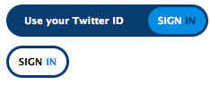
I love that JavaScript toolkits make enhancing web pages incredibly easy. Today I'll cover an effect that I've already coded with MooTools: creating a Twitter-style animated "Sign In" button. Check out this five minute tutorial so you can take your static buttons to the next level!
The HTML
<!-- left version -->
<div class="button_wrap">
    <a class="button_aLeft" id="button_aLeft"><span>Use your Twitter ID</span></a>
    <a class="button_bLeft slidebttn" id="button_bLeft">Sign <span>in</span></a>
</div>
<!-- right version -->
<div class="button_wrap">

    <a class="button_aRight" id="button_aRight"><span>Use your Twitter ID</span></a>
    <a class="button_bRight slidebttn" id="button_bRight">Sign <span>in</span></a>
</div>
The "button" consists of one DIV with two sets SPANs wrapped by A elements.
The CSS
.button_wrap{ position:relative; width:225px; height:36px; overflow:hidden; font-weight:bold; font-size:11px; margin:10px; }
.button_aLeft{ width:70px; height:36px; -moz-border-radius:20px; -webkit-border-radius:20px; background-color:#093d6f; color:#fff; top:0px; right:0px; position:absolute; line-height:36px; text-align:left; }
.button_aLeft span{ z-index:200; padding-left:20px; color:#fff; }
.button_aRight{ width:70px; height:36px; -moz-border-radius:20px; -webkit-border-radius:20px; background-color:#093d6f; color:#fff; top:0px; left:0px; position:absolute; line-height:36px; text-align:right; }
.button_aRight span{ z-index:200; padding-right:20px; color:#fff; }

.button_bLeft{ width:64px; height:30px; background-color:#fff; -moz-border-radius:20px; -webkit-border-radius:20px; color:#000; position:absolute; top:3px; right:3px; text-transform:uppercase; line-height:30px; text-align:center; cursor:pointer; }
.button_bLeft span{ color:#008ddd; }
.button_bRight{ width:64px; height:30px; background-color:#fff; -moz-border-radius:20px; -webkit-border-radius:20px; color:#000; position:absolute; top:3px; left:3px; text-transform:uppercase; line-height:30px; text-align:center; cursor:pointer; }
.button_bRight span{ color:#008ddd; }

.button_c{ background-color:#008ddd; color:#fff; text-transform:uppercase; }
.button_c span{ color:#093d6f; }
The CSS code is a mess -- lot of CSS goes into styling the button. As always, style however you'd like. Be careful with this set though -- I recommend sticking to just changing colors.
The Dojo JavaScript
dojo.addOnLoad(function() {
	dojo.forEach(dojo.query('.button_wrap'),function(wrap) {
		var a = dojo.query('a',wrap)[0];
		var span = dojo.query('span',a)[0];
		var button = dojo.query('a',wrap)[1];

		dojo.anim(span,{ opacity:0 },1);

		dojo.connect(button,'onmouseenter',function() {
			dojo.addClass(button,'button_c');
			dojo.anim(a,{ width:200 });
			dojo.anim(span,{ opacity: 1 });
		});
		dojo.connect(button,'onmouseleave',function() {
			dojo.removeClass(button,'button_c');
			dojo.anim(a,{ width:70 });
			dojo.anim(span,{ opacity: 0 });
		});
	});
});
The first step is to collect each "button" DIV and sift through the its child elements to get links and SPAN elements. When the user's mouse enters the "Sign In" link, the first link within the wrapping DIV grows in width and shows the supporting text.
It's little enhancements like these that take a website from a 6 to an 8, transforming the website from static to dynamic. Can you think of any other small enhancements like this? Share!


Great Job! Didnt I see these on the Adobe website though?
Good! Maybe you could make a Dojo tutorial (and a Moo one as well)!
@ctult: There are MooTools and jQuery tutorials that mirror this functionality. Check the “Related Posts” section above.
@David Walsh: Oh. Yeah. Erm…I..uh knew that.
Cool effect. I was looking for a different type of a twitter login. This definitely goes into the list.