Create Your Own Dijit CSS Theme with LESS CSS
The Dojo Toolkit seems to just get better and better. One of the new additions in Dojo 1.6 was the use of LESS CSS to create Dijit themes. The move to using LESS is a brilliant one because it makes creating your own Dijit theme much easier. Let's take a look at how Dojo leverages LESS to create Dijit themes and create our own theme.
LESS CSS
The idea behind LESS CSS is quite simple: extend CSS with dynamic behavior such as variables, mixins, operations and functions. Simply put: fix CSS' inherit limitations. LESS can be used on the command line / server-side with Node.js or with a JavaScript file on the client side. For the purposes of building Dojo themes, we'll be using the Node.js solution. To install LESS, and assuming you have npm, run the following command:
npm install less
The LESS package should now be installed on your machine, ready to use with Node.js, which must also be installed on your machine.
Dijit's Use of LESS
Navigate to the following directory within your Dojo 1.6+ checkout:
cd dijit/themes/claro/
You'll see built {WidgetName}.css files but also a number of {WidgetName}.less files -- the .css files were built using LESS! Before popping into individual .less files, open variables.less. The variables.less file contains the declared variables which are used throughout other CSS files; consider variables.css a "defaults" file. Take a look at a few snippets from variables.less:
/* General */
@text-color: #000000;				/* Text color for enabled widgets */

@border-color: #b5bcc7;				/* Border color for (enabled, unhovered) TextBox, Slider, Accordion, BorderContainer, TabContainer */
@popup-border-color: #769dc0;		/* Border for Dialog, Menu, Tooltip.   Must also update tooltip.png (the arrow image file) to match */
@minor-border-color: #d3d3d3;		/* Color of borders inside widgets: horizontal line in Calendar between weeks, around color swatches in ColorPalette, above Dialog action bar */

@disabled-border-color: #d3d3d3;	/* Border color for disabled/readonly Button, TextBox etc. widgets */
@disabled-background-color: #efefef;/* Disabled button, textbox, etc. */
@disabled-text-color: #818181;		/* Text color for disabled/readonly widgets */

/* ... */

/* Input widgets
@focused-border-color: #769dc0;				/* Focused textbox, editor, select, etc. */
@error-border-color: #d46464;				/* Border for textbox in error state */
@error-focused-border-color: #ce4f4f;		/* Border of textbox in error state, and focused */
@erroricon-background-color: #d46464;		/* Background color for exclamation point validation icon (for TextBox in error state) */
@textbox-background-color: #fff;			/* Default background color of TextBox based widgets */
@textbox-hovered-background-color: #e9f4fe;	/* Background color when hovering a unfocused TextBox, Select, Editor, or other input widget */
@textbox-focused-background-color: @textbox-background-color;
@textbox-error-background-color: @textbox-background-color;
@textbox-disabled-background-color: @disabled-background-color;

/* mixins */
.border-radius (@radius) {
	-moz-border-radius: @radius;
	border-radius: @radius;
}

.box-shadow (@value) {
	-webkit-box-shadow: @value;
	-moz-box-shadow: @value;
	box-shadow: @value;
}
You'll notice how LESS CSS works:
- To define a variable, start with "@" symbol along with the variable name.
- To use a variable, define the property and provide the @-prefixed variable name as the value.
- To define a mixin, provide a selector name with arguments and define sub-properties of that property.
You can bring link definitions into other .less files by using the following directive which you'll find in all of the theme .less files:
@import "variables";
Now open Calendar.less and look for instances of "@border-color". You'll note that those instances reference the "@border-color" variable provided in variables.css file. All other variables beginning with "@" will be replaced within the build process as well!
Creating Your Own Dijit Theme
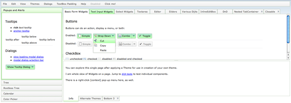
The easiest way to get started with your own theme is to copy the most recently-created, officially supported them. In this case, that theme would be claro. The claro theme is a professional-looking blue theme which makes use of CSS gradients, transitions, and rounded corners when supported by the browser.
Run a quick cp to copy the claro folder to a folder which you'd like to call your theme:
cpmac claro davidwalsh
Before embarking on editing the existing code, it's important to change the ".claro" declarations in every CSS file to ".{yournamespacename}". My theme will be called "davidwalsh" so I'll use my text editor to find every instance of ".claro" and replace it with @theme, which we can map to "davidwalsh". With the copy of claro ready, jump into the variables.less file and make any color changes you see fit. I'm more of a "green guy" myself so I'll adjust the colors within variables.less to greenish counterparts:
/* General */
@text-color: #000000;				/* Text color for enabled widgets */

@border-color: #b7c7b5;				/* Border color for (enabled, unhovered) TextBox, Slider, Accordion, BorderContainer, TabContainer */
@popup-border-color: #b7c7b5;		/* Border for Dialog, Menu, Tooltip.   Must also update tooltip.png (the arrow image file) to match */
@minor-border-color: #b7c7b5;		/* Color of borders inside widgets: horizontal line in Calendar between weeks, around color swatches in ColorPalette, above Dialog action bar */

@disabled-border-color: #d3d3d3;	/* Border color for disabled/readonly Button, TextBox etc. widgets */
@disabled-background-color: #efefef;/* Disabled button, textbox, etc. */
@disabled-text-color: #818181;		/* Text color for disabled/readonly widgets */

/* ... */

/* Input widgets
@focused-border-color: #7bc076;				/* Focused textbox, editor, select, etc. */
@error-border-color: #d46464;				/* Border for textbox in error state */
@error-focused-border-color: #ce4f4f;		/* Border of textbox in error state, and focused */
@erroricon-background-color: #d46464;		/* Background color for exclamation point validation icon (for TextBox in error state) */
@textbox-background-color: #fff;			/* Default background color of TextBox based widgets */
@textbox-hovered-background-color: #e9fee9;	/* Background color when hovering a unfocused TextBox, Select, Editor, or other input widget */
@textbox-focused-background-color: @textbox-background-color;
@textbox-error-background-color: @textbox-background-color;
@textbox-disabled-background-color: @disabled-background-color;
After editing my variables.less file to match my desired design, it's time to look at each {WidgetName}.less file to make appropriate changes if I'd prefer the widget to look different than its claro look. Once all of the {WidgetName}.less files are edited to your liking, it's time to compile the .less files into working CSS files!
Compiling Your Less CSS Theme
Before compiling the theme, let's take a look at another file within the theme directory: compile.js. compile.js was written to scan the current directory as well as the form and layout directories looking for .less files. All less files are parsed and, using the variables.less directives, variable values are inject into their corresponding places and CSS file are created.
To use compile.js, navigate to your theme's folder via the command line and run the following command:
node compile.js
Upon running this command, .css files will be generated with the same name as their .less counterparts. A quick scan of these files will confirm that all variables have been placed in their proper spots! Now your theme files are ready to go!
Implementing Your Custom Dijit Theme
Find the themeTester.html file (/dijit/themes/themeTester.html) and modify it to include your theme:
// Fill in menu/links to get to other themes.
// availableThemes[] is just a list of 'official' dijit themes, you can use ?theme=String
// for 'un-supported' themes, too. (eg: yours)
var availableThemes = [
	{ theme:"davidwalsh", author:"David Walsh", baseUri:"../themes/" },
	{ theme:"claro", author:"Dojo", baseUri:"../themes/" },
	{ theme:"tundra", author:"Dojo", baseUri:"../themes/" },
	{ theme:"soria", author:"nikolai", baseUri:"../themes/" },
	{ theme:"nihilo", author:"nikolai", baseUri:"../themes/" }
];
I recommend this approach because you can compare your theme against every widget in the book. You'll also want to tweak your theme as your continually develop your web application.
Switching from hardcoded, static CSS files to LESS-powered stylesheets should make developing themes many times easier. LESS saves developers from running numerous search/replace commands and allows for stylesheet creation to be more dynamic and organized. Now that Dijit theme creation has been made exponentially easier, I look forward to seeing many more themes pop up!


I’ll be using MooTools Interface when I will need such styling options…
https://github.com/sixtyseconds/mootools-interface
With LESS can variables be used in the selectors, for example .claro .dijitHover {…. would be @theme .dijitHover { …. Then in variable.less @theme: .claro This would make changing theme names much easier.
This is good. However, I don’t see how you create the file “davidwalsh.css”. There does not seem to be any .css file that corresponds to this file.
Err, I mean any .less file that corresponds
Great Post., Very Helpful! Thanks a lot.
“My theme will be called “davidwalsh” so I’ll use my text editor to find every instance of “.claro” and replace it with @theme, which we can map to “davidwalsh”.”
Anyone know how we do the mapping as described in the above statement? Do we put @theme:themename in variables.less? I tried that and my compile failed.
Why can’t we just override claro like this…
instead of copying the replacing claro with myCustomTheme. I think renaming is unnecessary, let me know, thanks!
I meant…
body class=”claro myCustomTheme”
Is there a way to use claro without cloning it? I would like to take advantages of updates to claro, but override with LESS customization.
Excellent explanation! Any way to download your nice theme without having to copy/compile it? Is there a zip package available? Thanks
As you said, every .less file is converted to corresponding .css one. But the main theme’s file claro.css doesn’t get generated during compilation. How can I regenerate it? Thanks.
Hi, im trying to follow your guide, but at the node compile.js
what is happening?
module.js:340 throw err; ^ Error: Cannot find module '../../../util/less' at Function.Module._resolveFilename (module.js:338:15) at Function.Module._load (module.js:280:25) at Module.require (module.js:362:17) at require (module.js:378:17) at Object. (/Users/marcopaulo/Sites/shiprelease1/dojo-release-1/dijit/themes/trimble/compile.js:8:9) at Module._compile (module.js:449:26) at Object.Module._extensions..js (module.js:467:10) at Module.load (module.js:356:32) at Function.Module._load (module.js:312:12) at Module.runMain (module.js:492:10)Edit the compile.js file to change the path ‘../../../util/less’ to point to your lib less (in my case : ‘/usr/local/lib/node_modules/less’). This worked for me.
I am a bit stuck at one point. I managed to get the dojo toolkit source, pack it into a web server and I want to test my newly created theme. My issue is that it looks EXACTLY like the claro theme although I changed the color variables as described in this article. I renamed the claro.css file, I changed the .claro to .mytheme (for some reason I always got parse errors when I used @theme). Am I missing something and that is why my theme looks exactly like claro after I compiled it?
To namespace your theme you need to create the variable in “variables.less” and replace “.claro” e.g. variables.less @theme: hsbcnet_payments; Calendar.less .@{theme} .dijitCalendar {
border: solid 1px @border-color;
Hello,
Is it possible to download the less files of the samples ? Thx