Placeholders and Overflow
Oftentimes our search boxes and other form fields get drastically shortened on mobile devices. Unfortunately in some circumstances the INPUT element's placeholder text doesn't fit within the length of the element, thus displaying an ugly "cut off." To prevent this ugly display, you can use CSS placeholder styling and text-overflow: ellipsis!
input[placeholder] { text-overflow: ellipsis; }
::-moz-placeholder { text-overflow: ellipsis; } /* firefox 19+ */
input:-moz-placeholder { text-overflow: ellipsis; }
Most developers are unaware of each of the properties and even fewer are aware that they are so perfectly complimentary!
![Responsive and Infinitely Scalable JS Animations]()
Back in late 2012 it was not easy to find open source projects using requestAnimationFrame() - this is the hook that allows Javascript code to synchronize with a web browser's native paint loop. Animations using this method can run at 60 fps and deliver fantastic...
![Animated 3D Flipping Menu with CSS]()
CSS animations aren't just for basic fades or sliding elements anymore -- CSS animations are capable of much more. I've showed you how you can create an exploding logo (applied with JavaScript, but all animation is CSS), an animated Photo Stack, a sweet...
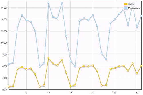
![Dynamically Create Charts Using jQuery Flot and Google Analytics]()
![Sexy Opacity Animation with MooTools or jQuery]()
A big part of the sexiness that is Apple software is Apple's use of opacity. Like seemingly every other Apple user interface technique, it needs to be ported to the web (</fanboy>). I've put together an example of a sexy opacity animation technique...


Cool! I never thought about it, i just robotically styled the placeholder’s text color and similar, but that’s really a “responsive” glance
Hello Sir
Is there a way to handle overflow of an input text element? Currently, browsers hide the extra text. You have to scroll to read it completely. What if I wanted to handle it a little differently? For example, show an ellipses? Would you know a possible solution for this?