CSS Tooltips
We all know that you can make shapes with CSS and a single HTML element, as I've covered in my CSS Triangles and CSS Circles posts. Triangles and circles are fairly simply though, so as CSS advances, we need to stretch the boundaries of single-element widgetry. One of those "widgets" we can now create with pure CSS is the tooltip; let's take a look at how to create a tooltip with just one element and CSS :before and :after magic.
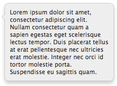
Like CSS triangles and CSS circles, we can accomplish this task using a single HTML element:
<div class="tip">
	Lorem ipsum dolor sit amet...
</div>
You need only populate the DIV with the content of your choosing. If you were looking to create a legacy solution, another element would need to be a added to this DIV, and the CSS triangles solution would need to be used.
The CSSBasic styling of the tooltip can be however you'd like, but the arrow (triangle) portion of the tooltip will be drawn using the :before and :after selectors. One of them will be an arrow with same color as the tooltip background, the other will give the appearance of a matching border.
/* base CSS element */
.tip {
	background: #eee;
	border: 1px solid #ccc;
	padding: 10px;
	border-radius: 8px;
	box-shadow: 0 5px 10px rgba(0, 0, 0, 0.2);
	position: relative;
	width: 200px;
}

/* arrows - :before and :after */
.tip:before {
	position: absolute;
	display: inline-block;
	border-top: 7px solid transparent;
	border-right: 7px solid #eee;
	border-bottom: 7px solid transparent;
	border-right-color: rgba(0, 0, 0, 0.2);
	left: -14px;
	top: 20px;
	content: '';
}

.tip:after {
	position: absolute;
	display: inline-block;
	border-top: 6px solid transparent;
	border-right: 6px solid #eee;
	border-bottom: 6px solid transparent;
	left: -12px;
	top: 21px;
	content: '';
}
You'll notice that the :before and :after generations are using the CSS triangle technique. Also note the main element requires relative positioning so that the :before and :after virtual elements can be absolutely position correctly. Also realize that you can place the tooltip arrow on the top, bottom, left, or right of the main element, making the solution presented here incredibly flexible!
The obvious drawback is lack of legacy IE support. This effect should work with IE9 and above, while IE8 will be quite touchy. Also note that the solution above covers only the visual aspect of the tooltip -- it does not do positioning. Positioning and window-measurements will need to be implemented with JavaScript, so your best bet is using an existing positioning library for doing such. The ability to create the complete tooltip interface with one HTML element and a bit of CSS is excellent!


In the example I see 2 tool tips. The top one has the upward pointing triangle in the center of the element in chrome/firefox. Other than that pretty awesome tip.
Right — I was illustrating multiple tooltips, proving that you can add the arrow wherever and in whichever direction you’d like! :)
i can only say WOW …..
this work in ie with PIE.htc?
Much better than vectors! :D
This might help with creating those tooltips: http://cssarrowplease.com/
Thanks for another simple but great tut. David.
Great tutorial. I was searching for simple tutorial about how to create tooltips using CSS.
I know this is exactly what i need … but with so little .css knowledge I’m not sure your examples are about the tool tip or how to fashion an arrow for the tool tip. Here is what I want to do. I have a page sample.html and sample.css. I have a “What’s this ..” tag and I want the tool tip to appear when I hover over “What’s this …”.
with your example nothing happens? how do you link the tag hover with the ?
/* base CSS element */ .tip { background: #eee; border: 1px solid #ccc; padding: 10px; border-radius: 8px; box-shadow: 0 5px 10px rgba(0, 0, 0, 0.2); position: relative; width: 200px; } /* arrows - :before and :after */ .tip:before { position: absolute; display: inline-block; border-top: 7px solid transparent; border-right: 7px solid #eee; border-bottom: 7px solid transparent; border-right-color: rgba(0, 0, 0, 0.2); left: -14px; top: 20px; content: ''; } .tip:after { position: absolute; display: inline-block; border-top: 6px solid transparent; border-right: 6px solid #eee; border-bottom: 6px solid transparent; left: -12px; top: 21px; content: ''; }WOW, ALOT of Tanks for this great tutorial it was very useful to me.
I have used something similar for my own tooltips. I am interested in keeping my code clean and semantic, so I have applied these styles to
abbr[title]</code, for example. This way, no extra classes are needed. When an abbreviation has a title, I display it as a tooltip with:after { content: attar(title); }The drawback I see, though, is that my stylish tooltip shows, and then the default browser tooltip shows. I can't imagine that there is a way to get rid of browser behavior, but I was wondering if anyone else encountered this, and if there are any tricks to combat it?
I have already created tooltip but forgot to add the content:” in the css. I fixed it after reviewing the css you provided here. Thanks
Always wondering how it’s done and here you are. Thx for tut. Just one thing: how will this tool tip will go along with responsive design?
I’ve created a Sass mixin based on this.
You can see it in action here – http://codepen.io/tsi/pen/mJxgq?editors=010
Thanks!
Need a responsive solution that will work on desktop or mobile devices and you can include whatever code you like in the popup.. here’s a pure CSS solution. http://codepen.io/dcdev/full/JGgpMa/