CSS Circles
A while back I shared a clever technique for creating triangles with only CSS. Over the past year, I've found CSS triangles incredibly effective, especially when looking to create tooltips or design elements with a likewise pointer pattern. There's another common shape that's easy to create, and that is the circle. Using border-radius, you can create wonderful CSS circles.
The CSS
Setting the border-radius of each side of an element to 50% will create the circle display at any size:
.circle {
	border-radius: 50%;
	width: 200px;
	height: 200px;
	/* width and height can be anything, as long as they're equal */
}
It's really that simple...but I can't let this post go without touching on CSS gradients and basic spin animation:
/* Create the animation blocks */
@keyframes spin {
from { transform: rotate(0deg); }
to { transform: rotate(360deg); }
}
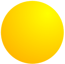
/* Spinning, gradient circle; CSS only! */
#advanced {
width: 200px;
height: 200px;
background-image: -moz-radial-gradient(45px 45px 45deg, circle cover, yellow 0%, orange 100%, red 95%);
background-image: -webkit-radial-gradient(45px 45px, circle cover, yellow, orange);
background-image: radial-gradient(45px 45px 45deg, circle cover, yellow 0%, orange 100%, red 95%);
animation-name: spin;
animation-duration: 3s; /* 3 seconds */
animation-iteration-count: infinite;
animation-timing-function: linear;
}
Voila. There's an awesome CSS circle!
CSS circles don't immediately appear as useful as CSS triangles, but they surely have value within design. An animated set of circles could act as a loading animation; creative use of the circle is up to you. Can you think of a good CSS circle usage? Share!


Few notes: percentages in border radiuses isn’t as well supported as other values (px, em, et al). Sorry I don’t know the exact browsers/versions.
Also, widths and heights don’t have to be the same. They do if you want to make a circle, but if not, you get an ellipse (also useful).
Chris “Captain Vague” Coyier
Per your points:
1. Likely, though using percentage is the “flexible” value.
2. Also correct; I was going to do a separate post about ellipsis’, so you just ruined it. Pfff. j/k
As I recall you could just set a really high number of pixels to get a circle (if you are correct about the % not being well supported). There is some point where you can’t set the border radius any higher, am I right?
As I recall you can just set a really high px count for the border radius to get the same effect (if you are correct about % not being as well supported). There is some point where eventually you can’t set the border radius any higher.
Chris, I had no idea that percentage values in border-radius wasn’t very well supported – I’ve never had any issues!
However I *have* had issues using 50% due to rounding bugs (particularly in Webkit) sometimes resulting in not-quite-round edges. I almost always use 100% as a workaround.
If you don’t want to use a percentage and you were using a preprocessor then you could get around it. Although I have never had any problems with percentages.
// Circle mixin with LESS
.circle(@size: 0) {
	width: @size;
	height: @size;

	-webkit-border-radius: @size / 2 + 0px;
	-moz-border-radius: @size / 2 + 0px;
	border-radius: @size / 2 + 0px;
}
Or you could of course just work it out manually…
.circle { width: 100px; height: 100px; -webkit-border-radius: 50px; -moz-border-radius: 50px; border-radius: 50px; }Safari 4 is one example I recently found.
Good one David…
You know a great idea when your first thought is: Why didn’t I think of that?
It’s worth noting that different mechanisms for CSS circles have potentially different anti-aliasing at the circumference. I remember finding 50% border radius circles to look best. At the time, though, Safari didn’t support percentage values for a border radius…
Awesome and simple! Nice one David.
Btw, if there are any CSS pre-processor-users out there (like LESS.js) you could make a simple function for it too:
.circle(@size: 50) {
border-radius: 50%;
width: @size * 1px;
height: @size * 1px;
}
Keep up the great work !
great work :) hope you can get it work on IE too :)
David
My only issue with making circles, shadows and gradients with css is my boss still doesn’t understand it, when I show him a new button and proudly announce that there are no images used in its creation he look at me like I just clubbed a baby seal.
You’re so right, Andy.
But then, the boss just can’t do what you do, right?
Ha ha! Andy, that is the best comment ever “he look at me like I just clubbed a baby seal”. I am a few years late for this one, but glad I finally stumbled upon it!
I have notice this interesting fact- (The generalized CSS for a circle of any size )
.circle{
             width:[width of the element];       /*The width Must be equal to the height*/
             height:[height of the element];
             border-radius:[more than or equal to 50 % of the width or height];
            -moz-border-radius:[more than or equal to 50 % of the width or height];
            -webkit-border-radius:[more than or equal to 50 % of the width or height];
            background-color:[circle color];
}
Note: The unit for the border-radius value should be in px/em because some browsers do not support %. (Safari win v 5.0.5 etc.).
I don’t know whether all the browsers will display the same result or not.
You’ve forgotten that Opera supports CSS animations now–and IE 10 will support animations w/o the prefix.
it was not work on IE7 what should i do?
Fantastic, never thought it can be that easy.
Thank you. However, I have one other question left. How can you create the circle image and add a hyperlink to a site you want viewers to look at?
how to make border style is circle look like this: http://i.imgur.com/zpQm3MG.jpg
i tried border radius 50% and border style dotted but result is not good
thank a lot.
Thank you so much for this article. I’ve been stuck creating hideous circles using CSS all morning.
Thanks. It help me a lot and save my time.
I am using them as a background for x on my close buttons. They sit neatly at one corner of my forms. The circle makes the x look more complete.
best way to create circle in css :)
http://sqeets.com/articles/making-a-circle-in-html-using-css/
where, is anybody can make an circle without predefined the box size?
e.g:
text leng 1
long long long text
thanks for the circle code. how do you add text to sit in the circle?