Spoiler Prevention with CSS Filters
No one likes a spoiler. Whether it be an image from an upcoming film or the result of a football match you DVR'd, sometimes you just don't want to know. As a possible provider of spoiler content, some sites may choose to warn users ahead of time. Sometimes the article title is prefixed with [SPOILER] text or a something similar. I've thought of a better way -- use CSS filters to blur spoiler content.
The CSS
CSS filters provide a simple way to blur the spoiler content so that the underlying image or text is not legible:
.spoiler {
	filter: blur(20px);
	transition-property: -webkit-filter;
	transition-duration: .4s;
}
.spoiler:hover, .spoiler:focus {
	filter: blur(0px);
}
You will also note that hovering over the offending content will animate the blur until it's been removed. Unfortunately CSS filters are only supported in WebKit at the moment, but we can no doubt expect more browser support shortly. Also note the :focus addition -- if you set tabIndex=0 on all .spoiler elements, you can support mobile touch to unblur as well!
This jQuery plugin tipped me off on how to achieve a similar blur within Firefox using SVG:
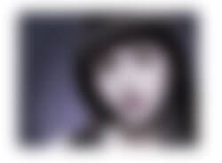
<img src="ricci.jpg" alt="Christina Ricci" class="spoiler" style="filter: url("data:image/svg+xml;utf8,<svg xmlns=\'http://www.w3.org/2000/svg\'><filter id=\'blur\'><feGaussianBlur stdDeviation=\'20\' /></filter></svg>#blur");" />
Not the most beautiful of code but works nonetheless. Changing the stdDeviation to 0 (via JavaScript) would present the element without blur.
Preventing spoiler content is a very limited case (even more limited in the case the photo is Christina Ricci) but it's good to have a strategy just in case. I like this strategy because it provides an easy option to the user (hovering) to view the obscured content.


I was actually going to write about this but my only issue is it’s a little buggy in that when you hover over the image initially it the blur radius might change, and then on mouse out the blur will not exceed the limits of the image. It’s a beautiful effect but unfortunately the implementation is not quite there.
Yeah, I like the effect. I did something similar quite a while ago using the text-shadow property to create a “blurry” kind of overlay (http://devseo.co.uk/blog/view/blurry-text-simple-snapshots-with-html-css3) this is a lot more effective, but I don’t like the way it “pops” at the end of the animation before completing the “faded” animation
Very cool but only works in Chrome for me. No dice in Firefox nor IE10.
Thanks.
As the post mentions, this is WebKit-only until Firefox and IE implement CSS filters.
Thanks for the svg filter code. This looks like it could be handy for lots of things. Like Lea Verou’s blurred background behind a semitransparent text–background overlay, over a background image.
The blurr effect is much similar with the “fade effect” like here: http://theweeblytricks.weebly.com/3.html