Responsive Images with Client Hints
It doesn't take being a performance fanatic to know that images can really slow down a page's load time. We've come a long way when it comes to images, from lazy loading them to using better image formats like WebP, but they all involve loading the same static image URL which may be good for desktops but not for mobile devices, and visa versa. We do have srcset with img tags now, but that can be difficult to maintain for dynamic, user-driven websites.
My experiments with Cloudinary have shown me than they have a solution for almost everything when it comes to media. My prior experiments include:
- Image Optimization with Cloudinary
- Generate Waveform Images from Audio with Cloudinary
- How to Deliver a Smooth Playback without Interruptions (Buffering)
- Remove Photo Backgrounds with Cloudinary
- HTML5 Video Player Best Practices
Another new way of optimizing image delivery is called "client hints": a new set of HTTP request headers sent to the server to provide information about the device, allowing more intelligent output. Here's the precise explanation of client hints from the standards document:
This specification defines a set of HTTP request header fields, colloquially known as Client Hints, to address this. They are intended to be used as input to proactive content negotiation; just as the Accept header field allows clients to indicate what formats they prefer, Client Hints allow clients to indicate a list of device and agent specific preferences.
Let's have a look at current "responsive image" hints and then image optimization with client hints!
Responsive Images with CSS
There are currently two ways I use CSS for responsive images. The first is by setting a max-width on images:
img {
    max-width: 100%;
}
The second method is by scoping background images with CSS media queries:
.logo {
    background-image: url('/path/to/tiny-logo.png');
}
@media (min-width: 1024px) {
    .logo {
        background-image: url('/path/to/large-logo.png');
    }
}
Both work each as their own issues: the first method always serves the large image file size regardless of screen size, the second method bloats your CSS (image scoping every image -- gross!) and requires the use of a background image.
Responsive Images with JavaScript
There are loads of libraries for responsive images:
There are many more libraries out there that will do the job, but my problem with these JavaScript-based approaches is that they can sometimes add huge weight to the page and they don't provide a "native" image approach, i.e. you have to wait for the DOM to load, then analyze the images, then set widths and make requests, etc. A more classic approach would be more performant.
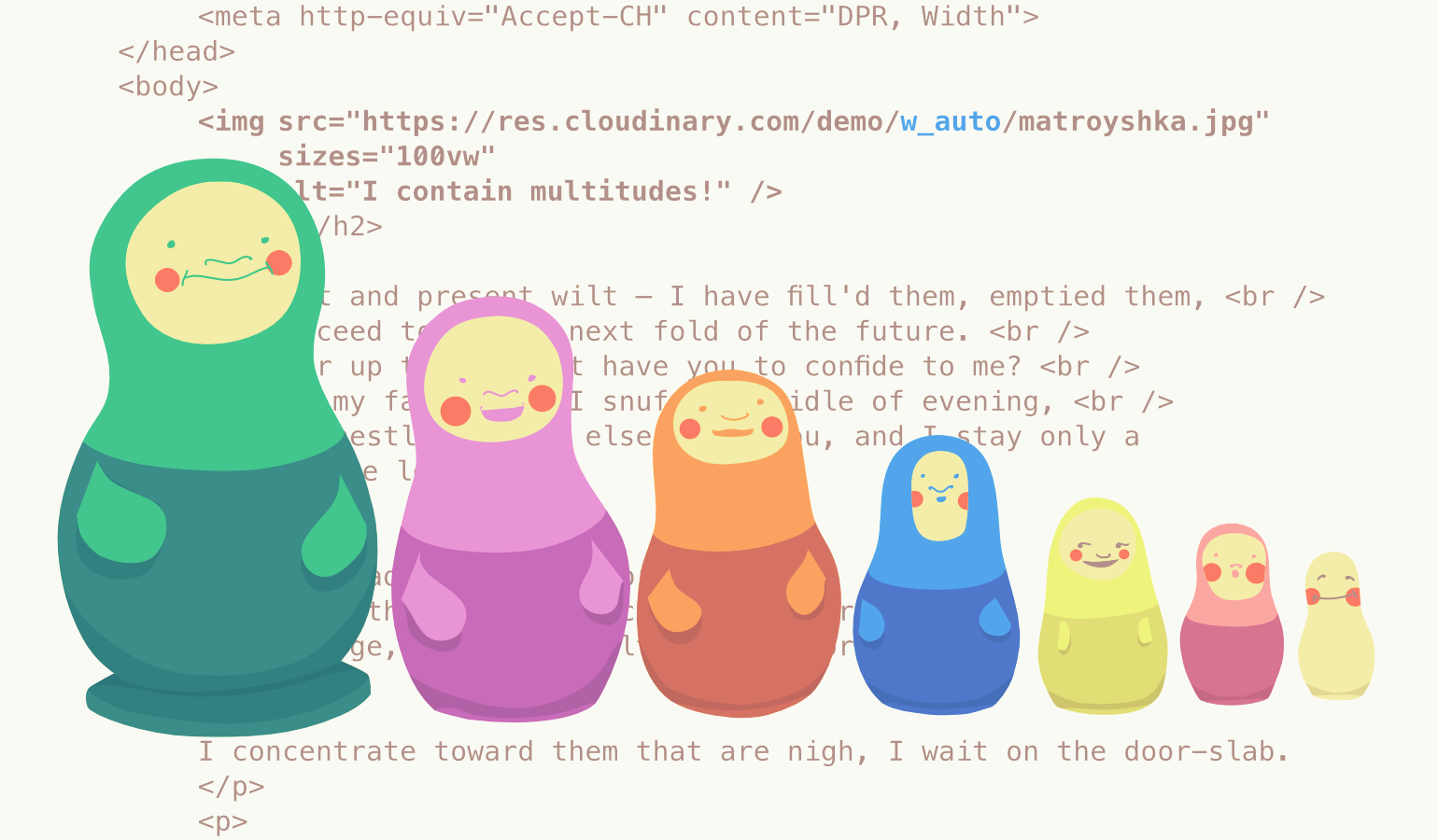
<img srcset>
The current method for providing responsive image paths is a bit ugly and can be tedious to create:
<img sizes="100vw"
     srcset="tiny.jpg      320w,
             small.jpg     512w,
             medium.jpg    640w,
             large.jpg    1024w,
             huge.jpg     1280w,
             enormous.jpg 2048w"
     src="fallback.jpg"
     alt="To each according to his ability" />
Essentially we specify a new image for specified widths in a sort odd single-string format. For this method you need to create separate images or engineer a smart querystring-based system for dynamically generating images. In many cases both options are impractical.
Using Client Hints
The first part of using client hints is providing a single meta tag with the hints you'd like to provide to the server:
<meta http-equiv="Accept-CH" content="DPR, Width">
With the snippet above, we direct the browser to provide width and DPR (device pixel ratio) hints to server during the request to the image. Using Chrome's "Network" panel we can see those headers being sent:
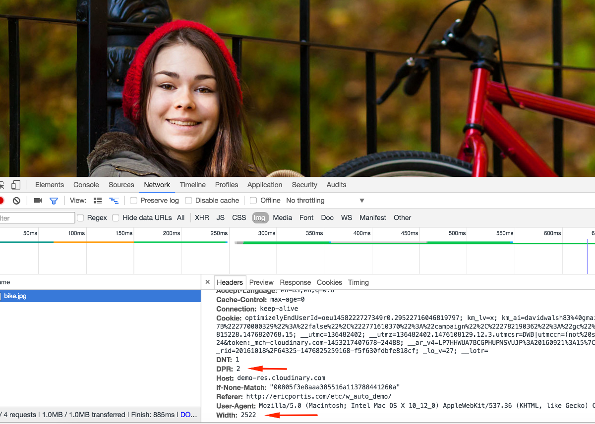
If we stop and think for a moment, there's a lot we can do by pulling the Width, DPR, and other hints from their headers:
- Store the data so we can analyze patterns and possibly cut different image dimensions
- Generate, store, and return a custom image for the given file size
- Return a different image type for a given device
The client hint is something we've always wanted: a tip from the client as to its size and other visual characteristics! I love that client hints are easy to implement on the client side: add a <meta> tag, add a sizes attribute to your image, and you're golden. The hard part is the server side: you need to add dynamic, optimized response logic -- that's where Cloudinary can help.
Client Hints with Cloudinary
Cloudinary wants to make creating and managing responsive imagery their problem. Cloudinary offers APIs for many languages (Python, Node.js, etc.), even allowing delivery of dynamic images via a URL. Let's create an image with an automatic DPR hint:
<meta http-equiv="Accept-CH" content="DPR"> <img src="http://res.cloudinary.com/demo/w_512,dpr_auto/bike.jpg">
The w_512,dpr_auto portion of the image URL triggers sending a different image resource to each user based on their context. For browsers that support client hints, 1x devices will receive 1x resources; 2x screens will receive 2x resources; display density triggers a difference in resource delivery.
Now let's do automatic image width with client hints:
<img src="https://res.cloudinary.com/demo/w_auto,dpr_auto/bike.jpg">
Same effect: w_auto sends a different image size from the same URL based on the client hint -- incredibly convenient when creating dynamic content -- no need for ugly srcset management!
Advanced Client Hints with Cloudinary
w_auto can take two optional parameters:
<!-- In the <head> -->
<meta http-equiv="Accept-CH" content="DPR, Width">

<!-- Image in the page -->
<img sizes="100vw"
     src="http://res.cloudinary.com/demo/w_auto:100:400/bike.jpg"
     alt="Smiling girl with a bike." />
Let's break down the code above, specifically the w_auto:100:400 piece:
100represents the increment by which the image is calculated with relation to the client hint, unless1is provided, in which case the image will then be scaled to the exact layout width (this is bad -- if the client isn't a standard device width, performance will be impacted). If the client hint forWidthis444, the image will round up and a500pixel image will be returned.400represents the fallback image width in the case that the client hints API isn't supported by the browser or a hint simply isn't sent (i.e.Widthisn't listed in the<meta>tag). If this argument isn't provided, the full image size is returned, so if your image is very large (i.e. an original photo), you'll definitely want to provide this argument.
Unfortunately only Opera and Chrome support client hints at this time, while Firefox and Edge are considering adding client hint support. I will say I find this new advancement a perfect marriage of server and client side communication when it comes to assets and device display. Let's hope client hints are globally adopted -- we'll be able to really tighten up image delivery, especially when you use an awesome service like Cloudinary!


Such a great post on images! I should add that images are really a corestone if we speak in terms of website speed and that around 70% of users visit the website with the help of their mobile devices.
Thank for sharing this Cloudinary service, I will definitely have a look at it.