
Judging the Candidates Based Upon What Else? Their Website!
As those of us in the States know, political fever is upon us. Digg is littered with political articles and the networks are doing everything they can to promote anything related to the upcoming election. I don't base my judgments on how the shortcomings are spun by people with agendas -- how misinformed. I judge them the only way a programmer can -- by their website.
I will judge each candidate's website by the following criteria:
- Code Quality
- Overall Design
- Quality of Content
- Javascript / AJAX Framework
- Overall Appeal
Barack Obama -- barackobama.com
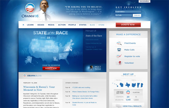
Overall Design: Obama's site is very new age and Web 2.0'esque. A lot of gradations are used and the website has a very "soft" overall feel. One giant shortcoming is that the site employs a splash page.
Code Quality: Though the site suffers from a bit of "DIVitis," the site's code is structured quite nicely. The website's programmer clearly knows what he/she is doing.
Quality of Content: Being a political candidate's website, the fluff is expected. The user's menu is very useful and the site sprinkles in flash video with all of the text content. Obama's site also offers many PDF documents that supports those who prefer to print content. Unfortunately the website itself is not printer friendly.
Javascript / AJAX Framework: Obama's website employs jQuery, Prototype, and Script.aculo.us -- clearly a diverse but solid mix (a sign of an Obama / Clinton ticket?)
Overall Appeal: Obama's website is a successful representation of who he is and what his campaign represents: a refreshing newcomer bound for success.
Hillary Clinton -- hillaryclinton.com

Overall Design: Clinton's website has some subtle Web 2.0 characteristics but does sport some old-fashioned, blocky elements. I'm quite impressed with Hillary's effort.
Code Quality: The code is not nearly as impressive as the design. HTML attributes use double quotes in some cases, apostrophes in others. Some tags capitalized, others not. And what's with the 10 line breaks between elements? And who needs stylesheets -- you'll see inline styles on every line.
Quality of Content: Hillary's website masterfully blends images, text content, and flash media. The best of any candidate by far. A weak attempt at printer-friendly pages is made but unfortunately it's not good enough.
Javascript / AJAX Framework: Mainstream JavaScript framework prototype makes an appearance on the website along with Behaviour and SWFObject.
Overall Appeal: Overuse of red, white, and blue is a given but the website content and supporting imagery makes the site a sight for sore eyes. Great showing by the Clinton camp.
John McCain -- johnmccain.com
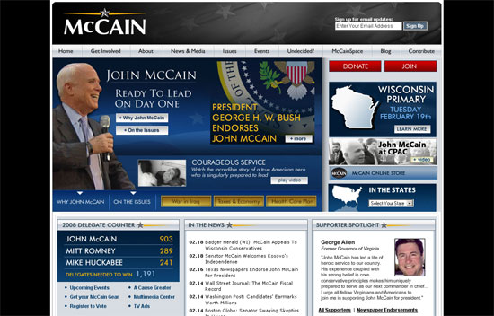
Overall Design: Like Obama's website, McCain's homepage is a splash screen that I can't stand. I'm not huge on the overuse of black and white either. A very boring, dull website design. Obama's website was impressive at first but at second look, the website is very blocky and gray.
Code Quality: McCain's website is comprised of lots JavaScript, much of it Dreamweaver-generated. The generated XHTML isn't formatted very well either. I'm not impressed with the coder (McCain himself?).
Quality of Content: McCain shines when it comes to quality and quantity of content. Though there are a few pages that would make you think the site was a link farm, those looking to find out what McCain is about wont be disappointed.
Javascript / AJAX Framework: Dreamweaver-generated JavaScript and loooooooots of it. Ugh.
Overall Appeal: As I stated above, McCain doesn't sport the most attractive website. I think black was an edgy choice that has come back to bite him in the end. He has great content but I don't know how many users will stick around long enough to read it.
Mike Huckabee -- mikehuckabee.com
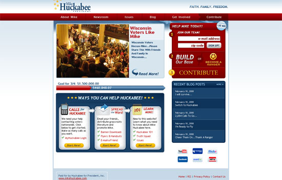
Overall Design: I'm extremely impressed with the design of Mike Huckabee's website. He uses the typical red, white, and blue, but in atypical shades. Huckabee's sites uses a lot of rounded corners you can tell the designer/developer put a lot of time into the site.
Code Quality: The website's code is actually pretty clean. There's plenty of XHTML indenting which makes the page source very easy to read.
Quality of Content: Huckabee's website uses a lot of mediums: flash video, Google maps, and state-targeted badges. The content is also well organized and easy to find. The one knock I'll hit Huckabee for is that there are a lot of links out to YouTube for videos about him--couldn't afford the bandwidth?
Javascript / AJAX Framework: Huckabee's developer went with the trusty Prototype / Script.aculo.us combination, although I don't see it being used anywhere.
Overall Appeal: I heart Huckabee's website. It's very pleasing to the eyes and you can see that the developer took a lot of time designing graphics and working with the CSS. Kudos to Huckabee's team.
And the winner is...
Mike Huckabee! It was easy to eliminate McCain's website after I'd established that the design may be older and more reserved than him. On second look, Obama's website is very blocky and gray, and the splash page still kills me. Lastly, Hillary's splash page isn't much better but it was difficult to give the edge to Huckabee. Hillary's site has great balance and flow but Huckabee's site just has more appeal.