HTML popover Attribute
Modals have been an important part of websites for two decades. Stacking contents and using fetch to accomplish tasks are a great way to improve UX on both desktop and mobile. Unfortunately most developers don't know that the HTML and JavaScript specs have implemented a native modal system via the popover attribute -- let's check it out!
The HTML
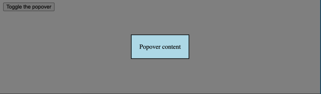
Creating a native HTML modal consists of using the popovertarget attribute as the trigger and the popover attribute, paired with an id, to identify the content element:
<!--
  "popovertarget" attribute will map to "id" of popover contents
-->
<button popovertarget="popover-contents">Open popover</button>
<div id="popover-contents" popover>This is the contents of the popover</div>
Upon clicking the button, the popover will open. The popover, however, will not have a traditional background layer color so we'll need to implement that on our own with some CSS magic.
The CSS
Styling the contents of the popover content is pretty standard but we can use the browser stylesheet selector's pseudo-selector to style the "background" of the modal:
/* contents of the popover */
[popover] {
  background: lightblue;
  padding: 20px;
}

/* the dialog's "modal" background */
[popover]:-internal-popover-in-top-layer::backdrop {
  background: rgba(0, 0, 0, .5);
}
:-internal-popover-in-top-layer::backdrop represents the "background" of the modal. Traditionally that UI has been an element with opacity such to show the stacking relationship.


I have com upon the popover element before and immediately I had a question: wouldn’t using a dialog element cover same use cases but with better styling, with the caveat that in the dialog case a little JavaScript is needed to show/hide the dialog in modal/non-modal behavior?
Im just glad you arent deceased and still posting :D
I have com upon the popover element before and immediately I had a question: wouldn’t using a dialog element cover same use cases but with better styling, with the caveat that in the dialog case a little JavaScript is needed to show/hide the dialog in modal/non-modal behavior?
css’ backdrop part isn’t working on Firefox :(
Is any workaround to this?
How was I not aware of this attribute!?
Very good write-up on this. Definitely opens doors for clearn and more semantic modal implementations.
Did a little looking into it. It looks promising, but it’s still under development and may not be widely supported yet. Any suggestions on broader compatibility? Maybe a fallback option like Bootstrap or some other JS library?