GSAP + SVG for Power Users 2: Complex Responsive Animation
Complete Series
This is the second article in a series about the GreenSock Animation API and SVG. This series isn't intended for beginners, but rather a deep dive into some of the more exciting and lesser-known features that one can work with after they've gotten past the initial introduction. The first article was about Motion Along a Path. Today we'll briefly explore some new GSAP features, and then go further and create a responsive complex animation from start to finish.
The number-one reason I use GSAP has to do with cross-browser support for SVG transforms. Stable SVG rotation is very cumbersome. In almost every browser, transform-origin problems persist, and are completely unsupported in IE at all. This problem is clearly exacerbated when attempting to use transforms in a responsive manner, as any small transform-origin anomalies are exaggerated and difficult to override.
Not only does GreenSock correct this behavior, but with support back to IE9, it offers a few more tools that make responsive design and development particularly solid. Currently, transforms on SVG elements with native rendering technologies (and subsequently, other JS libraries that use them) do not support correct rendering based on percentages. The latest (1.17.0) release of GSAP solves this issue with matrix calculations.
Let's first establish that by removing the width and height values from the SVG itself, defining the viewbox, and then using CSS or JS to control the width and height of the SVG, we can easily make an SVG adjust to percentage, flexbox, or any other kind of responsive implementation. You can also add preserveAspectRatio="xMinYMin meet" to ensure that all corresponding dimensions will scale appropriately and respective to one another, but since that's the default, it's not strictly necessary. Here's a great playground by Sara Soueidan if you'd like to get more background on the viewbox and scaling.
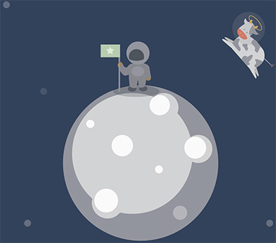
There are 3 particular strengths in this latest release as it applies to SVG, all employing the use of transforms. The first is, aside from transformOrigin, GSAP now has built in support for svgOrigin. This means that you can choose whether you want your element to transform based on the element itself (i.e. rotating on its own axis) or using a coordinate in the SVG viewbox. With svgOrigin, you would declare values according to the viewbox coordinates. In other words, if your viewbox is "0 0 400 400" and you want to spin around the SVG center, you would declare svgOrigin: "200 200"; Usually you will find that moving and adjusting a transformOrigin is enough. But in the case of the pen below, I made a cow spin around the moon at a certain part of the viewbox, and because I used an svgOrigin coordinate, it was very easy to make this animation responsive:
TweenMax.set(cow, {
	svgOrigin:"321.05, 323.3",
	rotation:50
});
(size the window down horizontally to watch the animation adjust to the viewport)
See the Pen Responsive Cow Jumps Over the Moooooon by Sarah Drasner (@sdras) on CodePen.
The next great feature we'll cover is smoothOrigin on SVG elements. Typically, if you change the transform origin on elements after they've already been transformed, the movement becomes complex and counterintuitive as seen below: (this pen courtesy of Marc Grabinski)
See the Pen Stacking Transforms with SVG by Marc Grabanski (@1Marc) on CodePen.
As explained in this video by Carl Schooff of GreenSock, smoothOrigin corrects for this problem. It makes sure that when you change the transform origin for an SVG element and subsequently move it again, it doesn't cause any kind of strange jumpiness. This solves a huge amount of counter-intuitive and hair-pulling behavior when working with a longer and more complex responsive animation. GSAP also leaves you the option of turning this off with one line of code, in the edge-case that you'd like to use the native rendering: CSSPlugin.defaultSmoothOrigin = false;
The last great feature for complex responsive animations in GSAP is the ability to do percentage-based animations dependant on the SVG elements themselves. CSS and SMIL don't have good support for this type of behavior. Just like Motion Along A Path, GSAP offers the most backwards-compatibility and cross-browser support for percentage-based SVG transforms. Check out this pen courtesy of GreenSock:
See the Pen SVG Percent-based translation by GreenSock (@GreenSock) on CodePen.
My original intent in this article was to discuss how amazing percentage-based transforms on SVG are and how useful they can be. But as I began to write demos for it, I realized that what's surprising, though, is the fact that you might not need them. SVG transforms rely on the SVG canvas, not absolute, browser-window defined pixel integers. If we couple the power of GSAP's timeline with SVG's ease of use for scalability, we can get some very interesting effects. Because we're moving our elements according the to the SVG DOM, elements aren't the only thing that's scalable. All of the corresponding transforms and movement are as well:
See the Pen Completely Responsive, Fluid Complex Animation by Sarah Drasner (@sdras) on CodePen.
There are no media queries to be found. I'm moving things based on the x and y axes like so:
tl.staggerFromTo($iPop, 0.3, {
		scale: 0,
		x: 0,
		y: 0
	}, {
	scale: 1,
		x: 30,
		y: -30,
		ease: Back.easeOut
}, 0.1, "start+=0.3")
Note that we're not moving things with percentage-based transforms. GSAP is establishing behavior based on the viewbox, and therefore, responsive animation becomes as easy as removing the width and height and declaring it elsewhere.
It's nice to just "squish" an animation to our viewport, but we all know that true responsive development is a more involved process than that. Let's take our new shiny tools and couple them with some responsive development, from start to finish.
There are a few ways we can do this. One is to take a large SVG sprite and shift the viewbox with a media query event handler. Another is to design our animation using interlocking parts, much like tetris pieces, and use multiple SVGs that can be reconfigured. Let's explore the latter.
See the Pen Responsive Huggy Laser Panda Factory by Sarah Drasner (@sdras) on CodePen.
In the pen above, Huggy Laser Panda Factory, we have 3 distinct parts of the factory. In order to keep our code organized, each section can accept one type of user interaction, which then triggers its own timeline. Keeping the inline SVGs distinct from one another also allows us to collapse them and move them according to percentage or integers on variable viewports, making our animation flexible for both mobile and future iterations. We've plotted out an initial view for desktop, as well as how it will be reconfigured for smaller displays, including a transform:scaleX(-1); to reflect the second portion on mobile so it will fit gracefully, with a mobile-first implementation.
@media (max-width: 730px) {
	.second {
		width: 70%;
		top: -90px;
		margin-left: 70px;
		transform: scaleX(-1);
	}
}


@media (min-width: 731px) {
	.second {
		width: 350px;
		margin-left: 365px;
		top: 370px !important;
	}
}
Each building block has its own function, named for what part of the animation it serves. This avoids any scoping problems and keeps everything organized and legible. The user can only trigger behaviors relative to the same SVG, or building block, of the animation. We pause the timeline initially, but use the button or group to restart it here:
//create a timeline but initially pause it so that we can control it via click
var triggerPaint = new TimelineMax({paused:true});
triggerPaint.add(paintPanda());

//this button kicks off the panda painting timeline
$("#button").on("click", function(e){
	e.preventDefault();
	triggerPaint.restart();
});
Keep in mind the SVG DOM is a bit of a mythical beast, and differs from regular DOM operations in some instances. You can't perform class operations with jQuery on SVG DOM elements (though that's coming down the pipeline soon, in version 3.0.0), so there are times when vanilla JavaScript will work better.
We also have a looping timeline that covers many elements in the document. We set a relative label to the beginning of it so that we can set loops on multiple objects. This is important because if we let loops follow one another in a timeline, only the first will fire, as it will run forever and the second one will wait to follow indefinitely.
function revolve() {
	var tl = new TimelineMax();

	tl.add("begin");
	tl.to(gear, 4, {transformOrigin:"50% 50%", rotation:360, repeat:-1, ease: Linear.easeNone}, "begin");
	tl.to(wind, 2, {transformOrigin:"50% 50%", rotation:360, repeat:-1, ease: Linear.easeNone}, "begin");

	// ...
	return tl;
}

var repeat = new TimelineMax();
repeat.add(revolve());
We now have four timelines in total; three that are cleanly associated with each section, and the global looping timeline. Our interaction and animations scale with each individual SVG, so we are free to move and adjust them in the configurations that we like for different viewports, and the code stays direct and organized.
This is the second part of a several-part series. As we move forward learning each of these techniques, we'll tie together different ways of working to create increasingly more complex and engaging work. Stay tuned!


About Sarah Drasner
Sarah Drasner is currently a Senior UX Engineer at Trulia (Zillow Group) in San Francisco. She spends most of her time thinking about engaging user interfaces, animation, and how to weld together pieces of the DOM. You can find her on Codepen as sdras, on Twitter as @sarah_edo, or at sarahdrasnerdesign.com.