Firefox OS Media Query
Firefox OS is an awesome new HTML5-based mobile operating system. Some would says it's epic, I just think it's...super epic. The "native" languages are HTML, CSS, and JavaScript -- it's enough to make a Web Developer weep. Anyways, it's important to know how to target currently released Firefox OS devices with CSS media queries. Here's how!
The CSS
The Firefox OS base media query (for popular released devices) is actually that of a common small mobile phone:
@media only screen and (min-device-width : 320px) and (max-device-width : 480px) {

	/* styles go here */

}
This media query accommodates for both landscape and portrait views of released Firefox OS devices.
As Firefox OS is ported to watches, tablets, and other devices, you'll need to keep accommodating other media queries, as you should already. Keep in mind that Firefox OS doesn't have set dimensions, but this will cover to released phones to this point.
![5 HTML5 APIs You Didn’t Know Existed]()
When you say or read "HTML5", you half expect exotic dancers and unicorns to walk into the room to the tune of "I'm Sexy and I Know It." Can you blame us though? We watched the fundamental APIs stagnate for so long that a basic feature...
![Serving Fonts from CDN]()
For maximum performance, we all know we must put our assets on CDN (another domain). Along with those assets are custom web fonts. Unfortunately custom web fonts via CDN (or any cross-domain font request) don't work in Firefox or Internet Explorer (correctly so, by spec) though...
![jQuery Comment Preview]()
I released a MooTools comment preview script yesterday and got numerous requests for a jQuery version. Ask and you shall receive! I'll use the exact same CSS and HTML as yesterday.
The XHTML
The CSS
The jQuery JavaScript
On the keypress and blur events, we validate and...
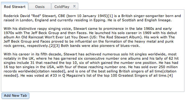
![Dijit’s TabContainer Layout: Easy Tabbed Content]()
One of Dojo's major advantages over other JavaScript toolkits is its Dijit library. Dijit is a UI framework comprised of JavaScript widget classes, CSS files, and HTML templates. One very useful layout class is the TabContainer. TabContainer allows you to quickly create a tabbed content...


But why *would* you target Firefox OS? It seems to me that the best approach is to build a web app that works great across all viewport widths. It’s useful to know which MQ widths are currently used on Firefox OS devices, but hard-coding it into the CSS? I don’t know.
Yes, building a site that looks good everywhere is still the key, but knowing the media query that targets those devices is still important. :)