CSS Vertical Centering
Front-end developing is beautiful, and it's getting prettier by the day. Nowadays we got so many concepts, methodologies, good practices and whatnot to make our work stand out from the rest. Javascript (along with its countless third party libraries) and CSS have grown so big, helping us create things that even a couple of years ago were deemed impossible. But there's one thing that's often left in the dark, I'm sure you've stumbled with it at least once, and we know its fix is not always very good looking: vertically centering elements.
Now, there are many ways of addressing this issue: the table method, the height and half height method, the inserting-another-element-slash-pseudo-element-with-vertical-align-and-height-100% method, the calculate on load method, and more. Each of these seems dirtier than the last, it gets even more complicated when the element's height is unknown (be it a parent's or children's), and don't get me started on how bad it looks like when working with responsive layouts.
For a good time I went with the "calculate on load" method. The premise was simple: get the parent's height, subtract the children's height, divide by 2, and inline the top property with the result as a px value. Essentially, 50% of the parent's height - 50% of the children's height, done. Here's a visual representation of it:
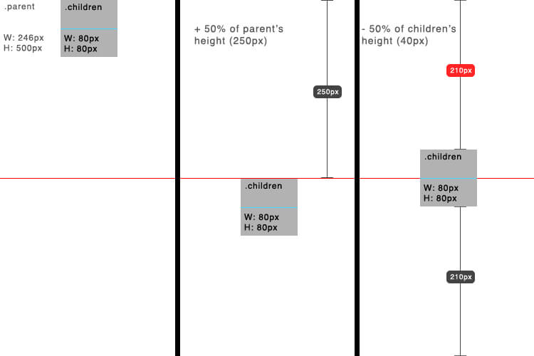
Figure 1 - The red "210px" is the value we need to set on the "top" property.
And I know what you are thinking, "Inlining CSS is bad!!!", but this was the least ugly solution. It didn't require to change any element's box model, waste its pseudo-elements, insert another element just for the sake of a fix, nor any other hackery. But as I said before, things got trickier when the element's dimensions were unknown.
Sure, you could get over this by using a script that runs after the window has loaded, or on window/object resize, and then recalculate the positions. But what if you've got hundreds of elements, each getting resized to fit their parents frames? The script will take a huge performance hit. And more importantly, why complicate things so much when there's a simple, pure CSS solution?
Sample HTML
Our example will be base on the following HTML:
<div class="parent">
  <div class="children">I'm vertically centered!</div>
</div>
This is a frequent case: a parent with children we desire to be vertically centered.
Enter CSS3 Transforms
One interesting thing about CSS transforms is that, when applying them with percentage values, they base that value on the dimensions of the element which they are being implemented on, as opposed to properties like top, right, bottom, left, margin, and padding, which only use the parent's dimensions (or in case of absolute positioning, which uses its closest relative parent).
Knowing this, we could apply the same "calculate on load" method's small equation, but now adapting it to just CSS. First, we move the element in question down to the middle of it's parent using top: 50%, then we pull it back up by half of said element, with transform: translateY(-50%). Of course, the element must be relative, absolute, or fixed. If we look back to Figure 1, this is exactly what we have achieved.
.children{
	background: #ffdb4c;
	height: 300px;
	position: relative;
	top: 50%;
	transform: 			translateY(-50%);
}
As we are using percentages, these elements will be vertically centered no matter how tall their parents are, or what unknown and random changes they experiment while the user interacts with them.
Finally, a few warnings: If you want to centralice a relative positioned element, its parent must have a height value, i.e., it won't work if said parent's height is set to auto. And of course, as most CSS3 features and properties, transforms don't work in IE 8 and earlier versions.


About Brian Gonzalez
Front-end developer and designer originated from a small and proud island in the Caribbean, Dominican Republic, who recently moved to the US in search of broadening it’s horizons as a web developer, push his career to new heights, and hopefully meet and work with great, passionate developers and designers along the way. Currently a freelancer, started designing and mocking up websites in early 2011 while still in college, but later discovered that making design come to life, and creating great experiences for the end user was even more gratifying, so soon after he was building full, interactive sites along a small team of colleagues. Since then, has helped build and lead several web projects from the ground up, exceeding the client’s expectations on each of them, and delivering best in class user experience. His interests include working on big and challenging projects, listening to loud, fast paced music, and eating inconsiderable amounts of asian food.


More often than not I use the very simple “Absolute Centering” solution explained at http://coding.smashingmagazine.com/2013/08/09/absolute-horizontal-vertical-centering-css/. It only requires a set height for the element you want centered, is CSS only and has great browser support. And if you don’t know the height, this one-liner solves that too for you:
$('.myElement').css('height', $('.myElement').prop('scrollHeight') + 'px');Yes that’s for jQuery, but you can do the same easily with vanilla JS too.
If you don’t support IE8, there are not a lot of reasons to care about IE9 that is so less used. And if youdrop IE9, you have Flexbox which solves this all without any hacks.
Correct me if I’m wrong (I know someone will), but it makes sense that IE9 has less use than IE8 because if you are still running XP(32), you cannot upgrade to IE9 or higher, but if you are running Vista, Win7, etc, you have more than likely updated IE along the way. Just an observation. But your point is still valid, but I’ll say that our shop only supports IE9 and above, unless we have a specific request from the client to support it, and we charge accordingly… I think.
Sorry, that was a bit off topic…
On topic now: I like this approach. I’ve used the 50/50 approach many times and works fine, but I’m in on a pure CSS approach. Codemaster D-dub on it as always.
What about centering via positioning absolute with top, bottom set to zero and margin to auto in relative positioning container…
This is a great solution! And I personally have used it before, but sometimes you need more flexibility on your elements, like centering numerous elements in a row, so absolute positioning would turn it trickier. The good thing is that there are *many* ways to work around centering with CSS, so this is just one of ’em.
Nice detailed article about this technique. I’ve made an article earlier about alignment in CSS but doing the exact opposite: http://timseverien.nl/2013/10/css-alignment-and-sizing/
Instead of explaining it in detail, I just smacked several techniques and browser support in a post… hehe. I might add a link to this item if any of my users wishes to read more about this technique :)
Great idea, I have different idea to make element in the vertical center
.children{ margin-top: -45%; /* height / 2 + padding / 2 */ top: 50%; }I faced a similar issue at work yesterday: I had to vertically center images in squares, sized according to the viewport’s width for a thumbnails gallery. Of course I didn’t want to use any JavaScript, and it had to work back to IE 8.
After a couple of tweaks, I ended up using the translate way. The main problem I see is it won’t work in IE8 so I switched back to
margin: automagic voodoo: http://codepen.io/HugoGiraudel/pen/870d62300c760d3e7ee998fdd49a1d16.The fact we have to do stuff like this shows how fucked up CSS can be sometimes…
Nice article by the way. Cheers. :)
@Hugo That’s one way to do it. Another method is setting the image as background of *any* block element, set a width and padding top or bottom, like so:
.thumb {
  background-image: url(my-img.jpg);
  background-position: center;
  /* is this supported by IE8? I don't know */
  background-size: cover;

  height: 0;
  overflow: hidden;
  padding-bottom: 50%;
  width: 50%;
}
Padding is based according the viewport width (don’t ask why), so using a vertical padding and width, you can create a fluid element that keeps it ratio at all times.
I guess the preferred method depends on the situation. In case of a gallery, I prefer your method when dealing with a gallery because you’re using img tags. This method however is nice for giant hero images and such.
The code in the article didn’t work but this did! Thanks Hugo
First of all, a huge thanks to all contributors! That being said, Hugo’s solution takes the gold.
The problem with this technique is if your children has an odd height value.
Let’s say it’s 99px height and when you move -50%, the children will be positioned on a broken number (49.5px).
It does not affect images or text, but any other elements inside that contains a background color, border or anything like this will look blurred – SVGs are also included on the “blurred” list.
You can check a simple example here:
http://codepen.io/lucasmotta/pen/hBcEw (notice on the second item, where the top border is blurred).
It’s a really simple and good technique, but you got be careful with what do you have inside your children.
As your children’s height is 300px, you could use this method (which is more beautiful ahah but not compatible with old IE) :
.children {
margin-top: calc(50% - 12.5%);
}
Why -12.5% ? Because when margin of 50%, you got 25% on top and on bottom. So get back 12.5% on top and you’re centered.
Et voilà :)
Oups a mistakes appears. In that case, it is note -12.5% but -150px. I copied/pasted some code.
There’s a bug for this solution
http://clip2net.com/s/6APDo6
Normally I use boxed elements and margin: 0 auto; or text-align: center.
I’ll test out css3 transforms and see how it goes.
Look at this:
http://s.codepen.io/shshaw/fulldetails/gEiDt##
http://codepen.io/HugoGiraudel/pen/870d62300c760d3e7ee998fdd49a1d16
http://codepen.io/lucasmotta/pen/hBcEw
Have fun!
http://jsfiddle.net/qbel/VdS9Q/
Great solution but gotta be careful with hogging up the vram. Since CSS transform promotes a render layer to a GPU accelerated composite layer, if there are many elements vertically centered in this manner in the DOM, it may be taxing the vram a bit too much.
A big problem with the use of this is that when you have text inside the vertically centered div then you get a blurred text that happens.
Hey,
if you write “IE” you mean IE8 and below, right? Because this works fine in IE9 with the -ms- prefix. :)
Ah man, I read the post in my RSS reader. Sorry, you have already fixed it.
Thanks, this is exactly what I was looking for. I know that lots of people have their own little shortcuts on how to do things like this, but I was looking for an easy to understand and use technique that my team could use (for consistency and the like, you know?). Haven’t tried it any IE versions as of yet, so will keep my eye out for problems.
Very useful post and I’m sure your post answered lots of designer’s question about CSS vertical alignment.
or just use a table-cell display
no need to be hacky
great new technique for when table-cell and “absolute centering” are not an option! (sad we need transforms for such things, though)
What about flexbox?
Where is the class “parent” defined?
Nowhere?
It isn’t here, and its styles aren’t important — just the children styles are.
I dont know why but it does not work for me.
I have a div that I want to center, I have put div inside another one (parent) and also I tried with only one div inside body. It only moves div 50% down. Seems transform: translateY(-50% does not work.
I tried Chrome and Firefox.
You might need to add vendor prefixes:
.center-me { position: relative; top: 50%; -webkit-transform: translateY(-50%); -ms-transform: translateY(-50%); transform: translateY(-50%); }Unfortunately when using
transform: translateY(-50%);Firefox won’t display flash insidediv, and I need it.I have now simple method for vertical centering from one website
(must set height):
.centerMe {
    margin: auto;
    position: absolute;
    top: 0;
    left: 0;
    bottom: 0;
    right: 0;
}
Now, if you want to move a div a little bit down, just change
So this would be a perfect solution, but bad thing, you must set the height.
And sorry for my bad english
I’m successfully using this method, except on iOS devices. In iPad and iPhone safari the .children for some reason needs to have position: absolute to center the content.
I’m a bit confused here, can someone explain me the behavior?
I have been using the following solution (with no positioning, no
table-cell/table-rowand no line height) since over a year, it works with IE 7 and 8 as well..outer { font-size: 0; width: 400px; height: 400px; background: orange; text-align: center; display: inline-block; } .outer .emptyDiv { height: 100%; background: orange; visibility: collapse; } .outer .inner { padding: 10px; background: red; font: bold 12px Arial; } .verticalCenter { display: inline-block; *display: inline; *zoom: 1; vertical-align: middle; }If you have something
position: relativeinside aposition: absolute, something like this will work….customNavigation-right { position: absolute; /* For .nav-control-prev/next position:absolute positioning */ top: 50%; } .customNavigation-left { position: absolute; /* For .nav-control-prev/next position:absolute positioning */ top: 50%; } .nav-control-prev { position: relative; -webkit-transform: translateY(-50%); -ms-transform: translateY(-50%); transform:translateY(-50%); } .nav-control-next { position: relative; -webkit-transform: translateY(-50%); -ms-transform: translateY(-50%); transform:translateY(-50%); }Great tutorial! Thanks :)
Whay can’t u just use:
.className { vertical-align: middle; }The idea was just stolen from Chris Coyier’s article published half year before the current- http://css-tricks.com/centering-percentage-widthheight-elements/
Hey, I’m the guest author of this post. Sorry, but I never implied I invented the method, as a matter of fact, I was trying to find the original article from where I learned this so I could link to it, but I failed to find it again as so much time had passed after reading it.
It wasn’t from the css-tricks article, but from the Codrops tutorial: http://tympanus.net/codrops/2013/06/25/nifty-modal-window-effects/ and I’d be glad if David could update the post and reference that tutorial :)
I have a social bar that I wanted to center vertically and I did the following:
#social_bar {
	position:absolute;
	left:0px;
	width:66px;
	top: 50%;
	-webkit-transform: translateY(-50%);
	-ms-transform: translateY(-50%);
	transform: translateY(-50%);
}
It seems to work great though I’m still testing before deploying… Thanks!
Somebody probably said it before, but here’s a BIG FAT warning about the “transform” approach: As this will essentially convert your element into a bitmap, which is then converted into a texture and moved to sub-pixel positions, it will almost certainly get your fonts blurred, which most of my customers (and sometimes, even I myself) find unacceptable…