Automated Tests for Visual Responsive Layouts
Today it's all about testing. In 2015, many developers knows about TDD and I personally think that testing is one of the key for quality products. But what about testing in a Front-end environment? How do you guys write your tests for a responsive page or for a specific layout? How do you know if a layout breaks or not without browser checking?
Nobody's knows. (At least a majority of front-end developers...)
Today I found the answer and it's called Galen Framework. We can write a specification that describe the layout of a given page, and then the framework will run tests based on that specification, awesome isn't it? Let's see together how can we use it.
This article is a different view from the great article Visual Test-Driven Development For Responsive Interface Design written by the Galen Framework author, Ivan Shubin. I wanted to share my personal opinion about this framework and how it can be used today in a quick overview.
About Galen Framework
I will not going deeper about how this framework works but Galen was designed in order to test responsiveness in mind.
It's pretty easy to use it and the main idea is that Galen test objects location relatively between each others.
When all tests are complete, Galen provide a clean report with failed and passed tests. The report file can be opened in a browser and Galen provide some screenshots when a test failed.
Testing Philosophy:
I'm not an expert in TDD concept but I have a couple of notions. We should always write our tests before starting coding. A test is like the specification of the product or of a given functionality and that's why we will write our specification test before we write the code.
Initialization:
For the example, we will create a quick HTML sample that provides a box with an introduction text and two buttons designed in a mobile-first methodology in mind.
The scenario we'll design is just a quick way to see how Galen works in order to have an overall understanding of this product.
We will test this sample in two environments: Mobiles & Tablets.
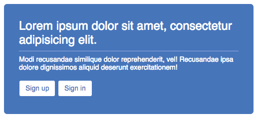
Preview of the tested scenario.
1 - Folder Structure
Here is the folder structure we need to have:
automated-tests/
|
|--- page/
|      |--- css/
|            |--- normalize.css       /* 1 */
|            |--- main.css            /* 2 */
|      |--- example.html              /* 3 */
|--- galen/
|      |--- reports/                  /* 4 */
|      |--- specs/
|            |--- spec-example.spec   /* 5 */
|      |--- tests/
|            |--- test-example.test   /* 6 */
- CSS reset, you can grab it from http://necolas.github.io/normalize.css/
- CSS file used in example.html, empty at this stage.
- HTML page example. Our scenario and tested page, empty at this stage.
- Report directory. Galen will generate all the reports here.
- Specification file, this is where we write our tests, empty at this stage.
- Test Suite file, this is where we write what we expect from Galen to test, empty at this stage.
2 - Galen Install
In order to be able to run our tests we'll need Galen 1.6+ installed on our machine. Just follow the instructions on the Galen installation page.
Tests Setup:
First step, we need to write a specification test file. Galen will follow these instructions during the tests.
So let's fill the spec-example.spec with this bunch of code:
==================================================
login-box         css           .login-box
sign-up           css           .buttons .sign-up
sign-in           css           .buttons .sign-in
==================================================
@ mobile
-------------------
login-box
    width: 100 % of screen/width
sign-up
    above: sign-in
@ tablet
-------------------
login-box
    width: 500 px of screen/width
sign-up
    aligned horizontally all: sign-in
Code Explanations:
The first 3 lines we have declared is the Object Definition, this is where we link our DOM elements to Galen. Then, we declare our test specification following the Galen documentation.
In a plain english, we have declared:
- I want the login box width 100% of the viewport in Mobile case.
- I want the "Sign Up" button located above the "Sign In" button in Mobile case.
- I want the login box width 500px of the viewport in Tablet case.
- I want both "Sign Up" and "Sign In" buttons horizontally aligned in Tablet case.
Galen also needs a Test Suite file for running the test we just write. It's like a config set-up before running test. We need to indicate where our working environment is hosted and what "Mobile" and "Tablet" means. This Test Suite file will be invoked from a terminal to run our tests.
Here is the Test Suite we should write for the test-example.test file:
@@ Set
    page_name       example.html
    page_url        http://localhost/automated-tests/page/${page_name}
    page_spec_url   ../specs/spec-example.spec
@@ Parameterized
    | viewport  | size      |
    | mobile    | 320x480   |
    | tablet    | 768x1024  |
${page_name} ${viewport} viewport ${full_name}
    ${page_url} ${size}
        check ${page_spec_url} --include "${viewport}"
Code Explanations
- The Test Suite file can be created in a couple of different ways. You can find all the details on the Galen Test Suite Syntax page.
- First lines are like variables, we define the page name we want to test and the absolute URL where the tested page is hosted. In my personal configuration I have hosted my current directory on a local server so you will need to update the page_url statement. We also provide the URL where the specification file we just created is located.
- Then we declare our viewports size which is relative to our specification file.
- Finally, the last 3 lines of code indicates Galen to run the test. (A loop for each declarated viewport will be invoked).
Code Example Setup
Since we have our test specification and Galen installed, we will create a simple scenario based on the example we have in the #Initialization part.
So let's create the example.html file with a couple of HTML:
<!DOCTYPE html>
<html lang="en">
<head>
    <meta charset="UTF-8">
    <title>Example</title>
    <link rel="stylesheet" href="css/normalize.css">
    <link rel="stylesheet" href="css/main.css">
</head>
<body>
    <div class="login-box">
        <h1 class="title">Lorem ipsum dolor sit amet, consectetur adipisicing elit.</h1>
        <p class="desc">Modi recusandae similique dolor reprehenderit, vel! Recusandae ipsa dolore dignissimos aliquid deserunt exercitationem!</p>
        <div class="buttons">
            <a href="#" class="btn btn-success sign-up" title="Sign up">Sign up</a>
            <a href="#" class="btn btn-success sign-in" title="Sign in">Sign in</a>
        </div>
    </div>
</body>
</html>
...and then adding few CSS (main.css file):
/* Main CSS
---------------------------------------*/
html {
    box-sizing: border-box;
}
*, *:before, *:after {
    box-sizing: inherit;
}
.login-box {
    padding:20px;
    margin-top:50px;
    background-color: #337AB7;
    border-radius: 6px;
}
.login-box .title,
.login-box .desc {
    margin-bottom:8px;
    color:#FFF;
    font-weight:normal;
}
.login-box .title {
    padding-bottom:8px;
    border-bottom:1px solid #92B3DD;
    font-size:20px;
}
.login-box .desc {
    font-size:12px;
}
.login-box .buttons {
    padding-top:10px;
    text-align: center;
}
.login-box .btn {
    display: inline-block;
    margin-bottom: 5px;
    padding: 6px 12px;
    font:normal 14px/1.4 Arial, Verdana, sans-serif;
    text-align: center;
    vertical-align: middle;
    border-radius: 4px;
    border:1px solid transparent;
    text-decoration: none;
}
.login-box .btn-success {
    color: #337AB7;
    background-color: #FFF;
    border-color:#337AB7;
}
/* Medium Breakpoint */
@media all and (min-width:480px){
    .login-box {
        margin:50px auto;
    }
    .login-box .title {
        font-size:24px;
    }
    .login-box .desc {
        font-size:14px;
    }
    .login-box .buttons {
        text-align: left;
    }
    .login-box .btn {
        display:inline-block;
    }
}
Let's Run the Tests:
Everything is ready so we should start our tests now. Open a terminal and move to /automated-tests/galen/tests directory using cd.
Then, just hit the following command:
galen test test-example.test --htmlreport ../reports
Galen will run the tests in Firefox using Selenium so you need to have Firefox Browser installed.
(n.b.: Galen can also execute these tests on different browser but Firefox is the default. This test has also been tested on a Mac, for windows users you may have a different setup).
When the test is complete, a report is created in the reports directory. Just open the report.html file, and here is what you should have:
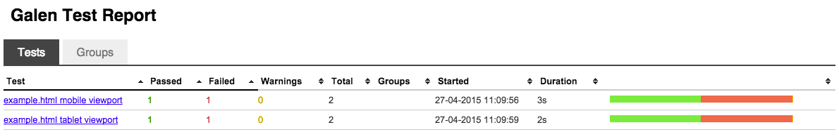
After reading the report, we can see that all tests are not passed. If you click on page links, you will open a more detailed version of each viewport test.
Here is what you can see if you click on "example.html tablet viewport":
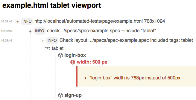
What's wrong here? 2 tests failed: Galen says that our buttons are not above each others in mobile viewport and our "login-box" width isn't 500px in tablets viewport.
Galen provides good explanations using Object Definition names in reports when a test failed or passed. You can also have a nice screenshot in a popup after clicking on the failed test. It will show you what's wrong at a glance.
Now let's fix the last test by updating our main.css file:
.login-box .btn {
    /* display: inline-block; */
    display: block;
}
/* Medium Breakpoint */
@media all and (min-width:480px){
    .login-box {
        max-width: 500px;
        margin:50px auto;
    }
}
(We just updated our previous CSS with these new properties).
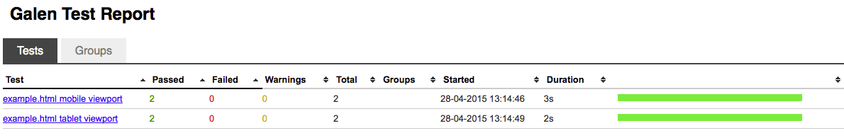
As soon as our issues may be fixed, we have to run our test again to verify using the previous command:
galen test test-example.test --htmlreport ../reports
Galen will now run the same test as before but our CSS is now updated. A new created report will override the previous one.
Now, all of our tests passed:
At this stage, only Firefox has been tested but Galen can be started in different browsers using Selenium. It can also be runned with BrowserStack which is a great news to run your tests on real devices.
Conclusion:
Running automated tests in a Front-end environment should be a new habit and after trying Galen, I really enjoyed it. But be sure not to write too much detail on your specification file. It can be very handy at a first glance to write tests but it can very easily become a nightmare to maintain.
In my personal opinion, I would use it for the main lines of a project like the global layout of a given page or when a feature really needs a particular layout.
I would recommend using Galen aside your daily tests, it's just another security before going in production. But don't forget to test by yourself.
This article was a really quick example on what you can achieve today using automated tests for visual responsive layouts. Coupled to an automation tasks runner like Grunt, you can build a test environment easier to maintain.
For an advanced visual testing scenario using Grunt, I have hosted a directory called visual-responsive-testing on GitHub. All the source files are available and follow the main lines of this article.


About Sébastien Axinté
Hi, I'm Sébastien. I live in London and work as a Front-end Developer at BBC. I like building scalable and maintainable applications in various environments; web, desktop and mobile. I'm also a huge Quake 3 fan. Let's chat about development on Twitter.


What sort of use cases would you find this testing to make the most sense? For example, if I primarily build WordPress sites for clients which aren’t super huge am I going to benefit from the time it takes to set a testing process like this up?
This is definitely something I am going to look into more, especially for the few larger projects I maintain that really depend on their layouts meeting specific standards. Thanks for the write up.
Hi Luke, to be honest I never worked with WordPress but I think (and they should) WordPress have been tested already before developers can use it.
But if you plan to add features in WordPress which are you *own* features, so then you should test it yep.
So in your case, I think there is not a lot of benefits because WordPress is known to work as expected and you can avoid setting up tests.
I’m curious how you think this compliments/compares to Visual Regression testing with tools like PhantomCSS/Shoov/Applitools/etc.
Ryan Cross, those are good tools. As far as I can see they all based on image diff from screenshots. But Galen Framework uses a bit different approach even though it also provides an image comparison functionality. The fundamental idea behind Galen Framework – anyone should be able to write visual tests instead of configuring. And the tests should not be bound to some specific device or resolution. That is why the Galen Specs language might get so complicated as it has to serve any possible complex website layout.
As for image comparison – it is applied differently. Instead of comparing the complete page screenshot you can choose which specific element you would like to compare. And for each image comparison you can tune the algorithm with different settings (e.g. color tolerance, error rate etc.) and custom image filters (e.g. blur, saturation, quantinize, denoise). If you want to know more you can watch the video where I explain how to prepare individual image samples and configure the image comparison for elements with noise background https://www.youtube.com/watch?v=bheFQfEGR6U