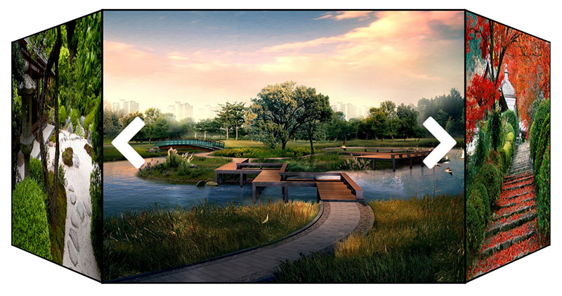
Crafting a 3D React Carousel
There is something in me that is amazed but beautiful 3D interfaces. And it doesn't matter whether they're functional like Gyroscope features menu, technology demonstrators like the amazing periodic table demo from famous or they're artistic representation pushing the limits of the current CSS technology like pens from Ana Tudor or Hakim El Hattab. I love them all and look for an excuse to use something similar in my applications.
Few months ago I tried React, it amazed me how quickly I become productive with it and enabled me to concentrate on writing my application. I quickly adapted a bootstrap theme, orchestrated interactivity and application interface was done in no time. However I felt that something was missing. As soon as the basic look and feel could be done with so little effort the little voice inside me felt unsatisfied. The goalposts were moved, I wanted animation.
"If everything seems under control, you're not going fast enough."
― Mario Andretti
Learning the Ropes
I decided to make a 3D carousel with React, as a standalone exercise how the framework works with small but self sustaining component. My first rule was the animation wont reset when I add and remove elements, change the layout or rotate the carousel. This hard constraint that was missing even from the commercial carousels made the underlying design difference.
At first I took a look at React ReactCSSTransitionGroup but somehow it didn't feel right and the comments on the forums regarding adding and removing elements were scary. So I started to work manually using the Dave DeSandro tutorial regarding 3D transformations. Drawing the carousel with the suggested layout wasn't too hard, and I've managed to transform DeSandro CSS rules into JavaScript functions without much problems.
Achieving 3D Effect
The carousel is made of the four elements:
1. A section that contains the images and controls, has static length and width, contains perspective and its relativeto the parent element.
// Static styling
.react-3d-carousel {
    width: 400px;
    height: 300px;
    position: relative;
    perspective: 1000px;
}
2. A div containing the shown figures, its position is absolute and has transform-style: preserve-3d property. This element is translated over Z axis in order to have the carousel on the correct distance from the viewer.
// Static styling
.react-3d-carousel .carousel {  // image container
   width: 100%;
   height: 100%;
   position: absolute;
   transform-style: preserve-3d;
}
// Dynamic styling  example
  transform:translateZ(-347px);
For the prism layout distance is calculated as the apothem of the polygon. For the classic carousel layout I've experimented with few formulas until I made something that looked about OK.
function apothem(width, sides) {
     return Math.ceil(width / (2 * Math.tan(Math.PI / sides)));
}
function magic(width, sides) {
    return Math.round(width * Math.log(sides))
}
3. Figure tag represents the single image shown. It's dynamically styled according to the provided layout and the state of the animation. Since the function definitions are too large, check the layout file for the corresponding calculation. Below I present the static styling with example of the generated element style from the layout functions.
// Static styling
.react-3d-carousel .carousel figure { // single image
   display: block;
   position: absolute;
   width: 400px;
   height: 300px;
}
// Dynamic styling
// Prism layout figure example styling
transform: rotateY(1.047rad) translateX(0px) translateZ(347px);
opacity:  1;
// Classic layout figure example styling
transform: rotateY(0rad) translateX(620.94px) translateZ(358.5px); opacity: 1;
4. Controls - Currently the controls are statically styles using two white chevrons as backgrounds, if you have other preferences simply change the CSS into the style.css file. Below is the snippet representing directional chevrons.
.react-3d-carousel   .prev:before {
      content: url("chevron_left_white.png");
}
.react-3d-carousel    .next:before {
      content: url("chevron_right_white.png");
}
Adding layouts
If you want to add additional layout say the one used in the Royal 3D carousel or the star topology of the Ultimate 3D carousel you have to implement two functions which calculate the distance from the viewer and the position of each figure.
// Receives width of the image and number of sides returns
// distance from the viewer to the carousel
function distance(width, sides) {
// Receives width of the image, images and initial rotation
// of the carousel, return array of all images with their
// corresponding transformations & rotations
function figures(width, images, initial) {
This enables the carousel to be extensible with additional layout, but the user will have to find a way to express the layout as a function.
Managing state
On the other hand managing state was problematic from the start. The carousel has intermediate state when it rotates and when it adds or removes sides, which are made worse by ability to change layout on the fly which completely changes the look of the carousel. My first approach was to use animation library or engine to manage state. There was some nice libraries that could have made my life easier, but since the carousel was a component I was very familiar about forcing people to add dependencies that are magnitudes larger than the functionality they really need. Since RxJS didn't seemed so heavy at the moment I made my first iteration using Paul Taylor port of Robert Penner easing functions and using Ramda for low level functional tasks.
The carousel state is stored in the depot file which enables the user to pass new properties and/ or to rotate the carousel.
Removing dependencies
The code worked but it was a mess and RxJS and Ramda still felt as too much baggage, so in the second iteration I've extracted all the functionality I needed and refactored the code. The ability to change layout on the fly led me to very functional design. Working directly with requestAnimationFrame revealed some very interesting problems like why is my code called only once.
Publishing and clean up
My component was ready, so I've bundled the demo that was used during development as an example and published it on Github. At first there were a lot of issues that I haven't foreseen, most of them pointed by Juho Vepsäläinen with his helpful advice how to fix them. I was very surprised when another user was unable to install the carousel. But I guess bugs come with the users, in the end I managed to fix them and make the carousel usable.
Conclusion
The carousel represents the miniature example of the unidirectional data flow and ability to manage intermediate state. Its just a small step toward next generation of user interfaces, where animation will be the backbone of the interaction instead of sprinkled eye candy for the user to enjoy. With growth in processing speed in hardware the browsers are ready, the rest is up to the software.
You can find the source at github and see the finished carousel at codepen. Try changing layout, easing functions, number of sides and of course rotate the carousel.


Great tutorial and blog post on learning about 3D carousels.
I’m currently working on a project and I was having trouble with pre-made carousels installing too much dependencies.
This post a lot in structuring the files and removing the dependencies.
Thanks!
Thanks for the kind words Kelvin. If you plan to use it in production please note that it doesn’t work in internet explorer and I don’t have a Mac to test Safari. If you used would love to see it in the wild.
Just saw your response.
We used parts of your carousel code to display information.
You can see it at http://mealette.herokuapp.com
It’s optimized for mobile devices, so you’ll have to click and drag to get the wheel to turn.
Hi,
Great idea!
Could you use React tables instead of images?