A Web Developer’s Life in FoxTrot
My girlfriend knows that I make websites but not a whole lot more about how I spend so much of my time. She at least knows the basics:
- Calling me a "webmaster" is the biggest insult you can hurl at me.
- I'm a MooTools fanatic.
- I have little design skill but mad programming skill.
That's why I was shocked when she found my life in a FoxTrot comic! Here it is:
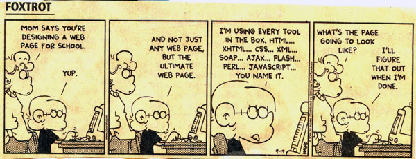
It's as if Bill Amend was in my head. Anyone else feel this way sometimes too?
![Write Simple, Elegant and Maintainable Media Queries with Sass]()
I spent a few months experimenting with different approaches for writing simple, elegant and maintainable media queries with Sass. Each solution had something that I really liked, but I couldn't find one that covered everything I needed to do, so I ventured into creating my...
![CSS @supports]()
Feature detection via JavaScript is a client side best practice and for all the right reasons, but unfortunately that same functionality hasn't been available within CSS. What we end up doing is repeating the same properties multiple times with each browser prefix. Yuck. Another thing we...
![jQuery Chosen Plugin]()
Without a doubt, my least favorite form element is the SELECT element. The element is almost unstylable, looks different across platforms, has had inconsistent value access, and disaster that is the result of multiple=true is, well, a disaster. Needless to say, whenever a developer goes...
![Input Incrementer and Decrementer with MooTools]()
Chris Coyier's CSS-Tricks blog is everything mine isn't. Chris' blog is rock star popular, mine is not. Chris prefers jQuery, I prefer MooTools. Chris does posts with practical solutions, I do posts about stupid video-game like effects. If I...




It’s so true it’s frightening…
so true so hillarious.
Absolutely true, it’s like looking in a mirror.
You should see the follow up strip. It’s even better. (Btw, that’s quite an old strip. I am surprised you see it now.)
I feel like that just a little too often…
Please add that calling you an evangelist insults you, too :D
Eeek. Yeah, that’s about right ;)
I got my degree in design while learning web development on my own, which eventually evolved into my job now, so I think I have a pretty good balance but I definitely do have to fight off the design-skipping urge sometimes.
Lol this is great! That was me 2 years ago! Then i realized that the design is actually !important :)
Hilarious.
Spot on.
Someone is talking about a follow up strip.
Must….. ……see…… …….now!
ROFL
HILARIOUS
ha, so true
everything i’ve done that ends up looking good it’s because i
copiedmodified the design from something elsehaha. its funny.
thanks man. i bookmarked the website.
i found some other interesting stuff too.
I was literally just thinking about how great my Javascript web framework is when that image popped up! It didn’t even seem to load..
It’s Very Versatile Electronic Document – VVED.. get it?