5 Usability Suggestions For DZone.com
DZone.com has quickly become one of my favorite programming-related internet websites. DZone provides a wealth of fresh, interesting development-related links to articles, announcements, and code snippets. DZone also provides bloggers a great way to get their articles the credit and attention they deserve. Unlike Digg, DZone has a specific target audience and since I fall into that audience, I continue to be a loyal visitor to the website.
My appreciation for the DZone website doesn't, however, prevent me from seeing some big holes in DZone. Usability is a major concern among DZone users and it's clear there are some issues on the website that need attention. I've compiled a list of usability issues on DZone in the hopes that other DZone users will comment and add to this post. This post isn't a giant bitchfest about DZone -- it's a place where users can suggest solutions to issues they see on the website.
Remember My Place In The Article List
DZone uses an unique system for browsing its list of articles: when your scrollbar hits the bottom of the page, you see an image that tells you that more articles are coming and viola -- the power of AJAX places more articles at the end of the page. A system like this has many positives: less bandwidth usage, the "wow" factor, and quicker load time. The problem is that if you refresh the page or click into an article and click back, you lose your "place" in the list. Essentially, if you click on the 51st article in the list and click your back button, you need to scroll down to the bottom of the page and wait for two more "cycles" of articles to load into the page. Keeping your place in the article list has become a task.
My solution is to save the user's place in the list when you make the AJAX call. Saving the user's place in the list should be relatively easy -- simply use a session variable. When the index page loads (from either a new visit or from someone clicking "back"), simply request the number of articles plus a chosen page increment (25) that's recorded in the session. If no value is present in the session, use your default of 1 - 25.
Create A Rising Links Page

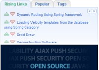
The "Rising Links" tab on the left is great. I can see which articles are likely the most worth reading by the number of views and votes an article receives. I can quickly give an up or down vote to the article and move on. I can also request the next page worth of rising links with one click. The ease of use of the functionality within the tab is great. The main issue is that a user with a small vertical resolution (like myself with my laptop -- 1280x800) can't see most of the rising links because the advertisement on the left is z-indexed above the articles. Quite frankly, I can't use DZone on my laptop.
My solution is to create a separate "Rising Links" page. This will prevent the advertisement on the bottom left side of the screen from obstructing my view of the popular articles.
Allow "Save" & "Share" Links To Be Accessed Via Tab On The Homepage
Any frequent visitor to my site knows that I post a summary of great programming articles and announcements in my Weekend Links section. DZone has always been a great place for me to find these articles and the "save" feature has been an especially useful function of the DZone website. Unfortunately, neither "Save" or "Share" are accessible by using the [tab] key on the homepage. Pressing "tab" skips over "Save" and "Share", from the number of comments to the first "tag."
Unfortunately I don't have a solution to prescribe -- I'm confused as to why both Firefox and Internet Explorer skip over these two links.
Place More Space Between The Affiliate Tabs And The "Rising Links"/"Popular"/"Tags" Tabs
Whenever I move my mouse toward the "Rising Links" area of the page, I need to be careful not to trip the Sun and Nexaweb tabs. Why? Because I don't want the tab to drop down and cover up all of the content I was trying to get to. I have no interest in the content of these advertiser / affiliate tabs.
My solutions is to add top margin to the "Rising Links," "Popular," and "Tags" tabs. I'll check out the affiliate links if I'm interested.
Make The "Send" Link Modal
I send articles I've found on DZone to my friends often, but why do I have to go to another page to do it? AJAX and JavaScript functions are used all over your website -- why not here?
My solution is to make the "Send" link page content go to a modal window without changing pages. A modal window will allow me to still see (although faintly) the article description which will allow me to write a better summary of the article to my friends. A better summary means more clicks into the DZone website.
At the time of writing this article, clicking the "Cancel" button on the "Share This Link" screen (email) triggers a 404 error. Ooops! May want to fix that!
The above detail what I have observed on DZone. Coupled with my proposed solutions, I belive DZone can easily be improved. If you have any other suggestion or solutions, please contribute by way of the comment box below. Remember, complaints don't improve the site -- solutions do.


Good points, especially remembering my place. Many times I get frustrated when clicking on an article and then coming back and losing my place. At that point I usually just leave and go to other sites.
Hi David. Those are great suggestions and mirror some of the ideas we’ve been tossing around internally. We’re about to start on another round of major UI changes and the infinite scroll list is likely to be worked over in that revision :)
Regarding the affiliate links, we have some ideas on how to make it not be so aggressive on your mouse overs.
Thanks for the feedback! I gave this a vote.
FWIW, my solution to the “losing your place” problem is middle clicking links (= open in new tab in Firefox).
A solution to the advertiser annoyance is Adblock (sorry Rick and co. ;) )
While we’re looking at suggestions, it’s not a usability suggestion, but either expanding the existing list of tags, or allowing user-defined tags, would be really helpful. I’m kind of tired of there not being a ‘spring’ tag, for example.
@Peter: I currently to control-click a link into an article on the website and I’m aware of Adblock, but that isn’t improving the website. Sure it improves my usage of the site, but what about everyone else? Making everyone do something to cater to the website is the reverse of how the system should work.
I do like your idea of more specific tags.
@David
Well yes, I agree, but until these changes take effect, those are some reasonable workarounds…
Usability suggestion #0: DZone should keep users logged in for a reasonable length of time! I’d like to vote, but I’m not going to keep logging in every hour or so to do so.
Thank you for mentioning that Matt. I wasn’t sure if it was a problem with my browser but the login “remember” functionality always seemed off.