Don’t Forget About Favicons on Retina Screens
Thomas Fuchs needs no introduction. I've looked up to Thomas' animation artistry since his Prototype/script.aculo.us days. He's more recently created Zepto.js, a micro multipurpose library for desktop and mobile devices. His latest creation, however, is an awesome eBook called Retinafy Your Websites and Apps, a guide to creating, using, and optimizing images for mobile and desktop devices. The following is a snippet from Retinafy Your Websites and Apps, accompanied by a coupon code to receive $5 off the eBook.
Favicons are the ugly step-child of the web, a leftover from early Internet Explorer days and a bit awkward to handle as they don't use web technologies you know and love, but rather fall back to the Windows .ico file format. However, it's an important part of your web site, and it's literally the first thing a users sees when looking at the URL bar in the browser. The favicon is also used in various other places, like tabs and bookmarks.
To get it right for Retina screens, some extra work is required, but it's easy enough to do! To make proper favicons that work across all browsers, notably older versions of IE, you'll need to create
an .ICO file with two size variants: 16px by 16px for standard screens, and 32px by 32px for retina screens.
First, create the two icon variants in any image editor (I use Photoshop), and save them as 32-bit PNGs with an alpha channel. Next you need to use a specialized icon editor application to create the actual .ICO file. http://xiconeditor.com/ is a free web-based app that works well for this:
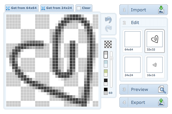
Import both size variants, and save your .ICO file as favicon.ico in your site's root folder.
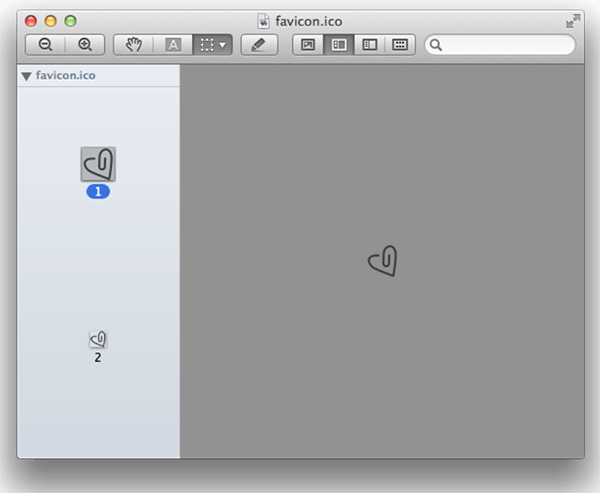
You can easily check if your favicon is retina ready, just use Preview.app to take a peek.
All size variants will show up.
When it gets to favicons, the devil is in the details for example I had to manually tweak the 16 16 heart for our app Charm (http://charmhq.com/) pixel-by-pixel to make sure it stayed sharp and crisp. You can learn a lot about good icon design for various sizes from desktop apps, where icons have traditionally been available in varying sizes. Here's an icon from Fantastical, a OS X calendar app I use (and love!), showing both the smallest (16 16) and the largest (512 512) variation:
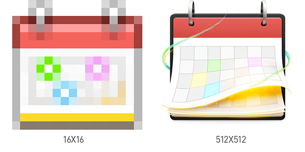
You can clearly see that the smaller version is not just an automatically scaled-down version of the big icon that would result in a complete blurry mess. Instead, the small icon is hand- drawn, with unnecessary details removed and greatly simplifed.
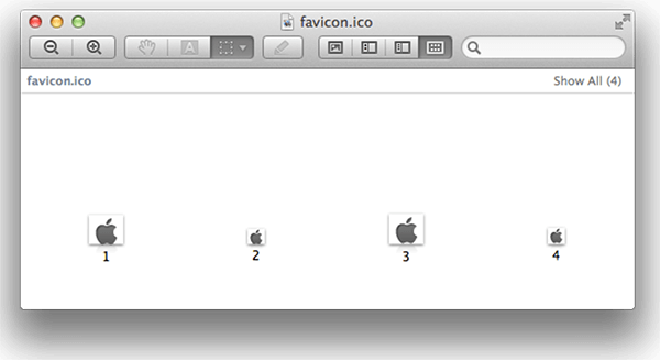
Note that you can have the same icon size in your favicon file more than once, with different alpha channels. For example, Apple.com s favicon.ico file has four different variants, with 1-bit and 8-bit transparency for both icon sizes:
In practice, you can get away with just two icons, 16px by 16px for standard screens, and 32px by 32px for retina screens, both using 8-bit transparency only really old browsers won t be able to use this format.
Touch Icons
Additionally, you will want to create a series of resolution variants for mobile home screen icons. This is separate from favicons and is conigured via a meta tag.
For the widest support, you ll need to create four icons, in 57 57, 72 72, 114 114 and 144 144. You probably want to use a good photoshop template for this.
Once you have those saved as PNGs, use the following HTML snippet. This snippet is from Mathias Bynens' excellent post about touch icons, which has a lot more information about this topic.
<!-- For third-generation iPad with high-resolution Retina display: -->
<link rel="apple-touch-icon-precomposed" sizes="144x144" href="apple-touch-icon-144x144-precomposed.png">

<!-- For iPhone with high-resolution Retina display: -->

<link rel="apple-touch-icon-precomposed" sizes="114x114" href="apple-touch-icon-114x114-precomposed.png">

<!-- For first- and second-generation iPad: -->

<link rel="apple-touch-icon-precomposed" sizes="72x72" href="apple-touch-icon-72x72-precomposed.png">

<!-- For non-Retina iPhone, iPod Touch, and Android 2.1+ devices: -->

<link rel="apple-touch-icon-precomposed" href="apple-touch- icon-precomposed.png">
Note that you need to specify the various sizes in this exact order for maximum compatibility. The icons will look gorgeous on any iOS or Android device when the user adds your URL as a home screen link.
And that's it beautiful, high-resolution icons that look great on desktop and mobile!
Retinafy Coupon Code: RETINANOW

Presentation can be everything, especially with mobile apps. Retinafy Your Websites and Apps shows will teach you how:
- Why you should use high-resolution images by default
- The most efficient way to target retina screens in CSS
- Testing a site when you don't have a Retina device or laptop
- How to use CSS and SVG to replace bitmapped user interface elements
- Deciding if you need two versions of an image
- Creating beautiful favicons that work great on any screen
- Optimizing JPEG quality
- How to keep file sizes of images in check
- Falling back to PNGs if SVG is not supported
- Avoiding common pitfalls
- Why JavaScript-based image replacement techniques are a bad idea
- Keeping your sanity while making awesome, responsive & retinay-ready sites
Use the coupon code RETINANOW at checkout and receive $5 off!


About Thomas Fuchs
Thomas has been creating websites and writing hard-core JavaScript since waaaaay back in the mid-1990s. His famous script.aculo.us framework was created during the development of one of the most highly interactive applications the Web had ever seen. He's continued to push the boundaries of what is possible with HTML and JavaScript with libraries like Vapor.js and Zepto.js. He is a self-described “artsy wanker.”


Wow, a great post by the great Thomas. :)
Only 1 thing : on .gb-top elem, shouldn’t it be ‘guest’ instead of gust?
Why are screenshots in an article about Retina graphics _not_ retina? ;)
you might want to add an optimize 16×16 icon to your favicon, i can’t tell what it is without staring at your logo and comparing…scratching my head and guessing that *might* be what it is. :-) good article though! thx.
The PSDs from the HTML 5 Boilerplate project @ http://drublic.de/blog/html5-boilerplate-favicons-psd-template/ can be a nice addition for automating the creation of the different sizes formats .
I need some time to figure out that it is possible to create only one favicon from various sizes of PNGs. It is a little bit confusing, since you mention in the beginning of the article, that you need two different sizes of favicons. Maybe more explicitly mention that the xiconeditor.com can do just that.
Will start using this tool, a great approach for mobile.
Nice tip, thanks. With the new screens resolutions showing up, we have to think of pictures and graphic display as well.
how can you upload 2 files called favicon.ico to the same folder? the second to upload would overwrite the first. am I missing something there?
Kind of late to the party here, but Slicy is a wonderful app for creating these .ico files.
Hi, I
great post and useful, thank you so much, but i have one quation what deference between code
/*
<link rel="apple-touch-icon-precomposed" sizes="114×114" href="apple-touch-icon-114×114-precomposed.png" */
and
/*
*/
great post and useful, thank you so much, but i have one question what deference between code
and
I have to ask, why not compile the multiple sizes into a single icon which the .ico format has always supported? That way you know your hard-work will be supported on ALL devices
And trust Apple to have deviated from the standardised icon sizing format …. 144 & 114 FFS??
If you like scripts, I wrote one to convert any image to a multi-resolution favicon using ImageMagick.
http://blog.lavoie.sl/2012/11/multi-resolution-favicon-using-imagemagick.html
If including details for iOS, Windows8 details shouldn’t be left out: http://kremalicious.com/add-your-web-site-to-the-windows-8-metro-ui/
Sure the .ico format is an inheritance of the old days when IE was dominating the browser’s world like t-rex in the cretaceous, but the same goes for the mobile as it was never officially supported by the W3C, because being a visual attribute it was meant to be manipulated via CSS, it just got spread together with the iPhone.
In this regard the apple specific touch-icon-precomposed should be more hateful than the .ico format as it’s a specific propietary technology only for apple from the very name of the attribute.
Yet the .ico was the first alpha/multilayer img supported in all of browsers, and since the browser is capable to pick the largest version one it can handle in a specific context did anyone tried to use a multi-res .ico file for the apple touch specific meta?
Maybe we can avoid that way to create export four specific png/svg files for apple devices and rely on one single favicon alone (but apple might have put specific restrictions, so it might be wishful thinking)