Getting Dicey With Flexbox

What if you could build complex CSS layouts in minutes? Flexbox is a new CSS layout spec that makes it easy to construct dynamic layouts. With flexbox, vertical centering, same-height columns, reordering, and direction agnosticism are a piece of cake.
There's a popular myth floating around that flexbox isn't ready for prime time. Wrong! 93% of people are now running a browser that supports flexbox. That's better than the support for the HTML5 <video> element.
In this article, I'll walk you through the basics of flexbox by showing you how to build the faces of a die. For now, we'll skip some of the trickier parts of flexbox such as vendor prefixes, old versions of the syntax and browser quirks. I'll cover those in upcoming lessons.
This is the first lesson in a seven-part series on flexbox. If you like this article, be sure to subscribe to the entire course over at Free Flexbox Starter Course.
The First Face
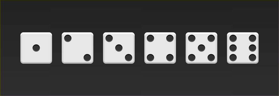
A die consists of six faces (sides). Each face has a number of pips (dots) which determine the value of the side. The first side consists of a single pip in the center of the face.
Let's start with the HTML.
<div class="first-face">
  <span class="pip"></span>
</div>
To make life a little easier, I've added the basic styles for the faces and the pips. Here's what this face looks like:

The first step is to tell the browser to make the face a flexbox container.
.first-face {
  display: flex;
}
That doesn't look any different, but there's a lot going on under the hood.
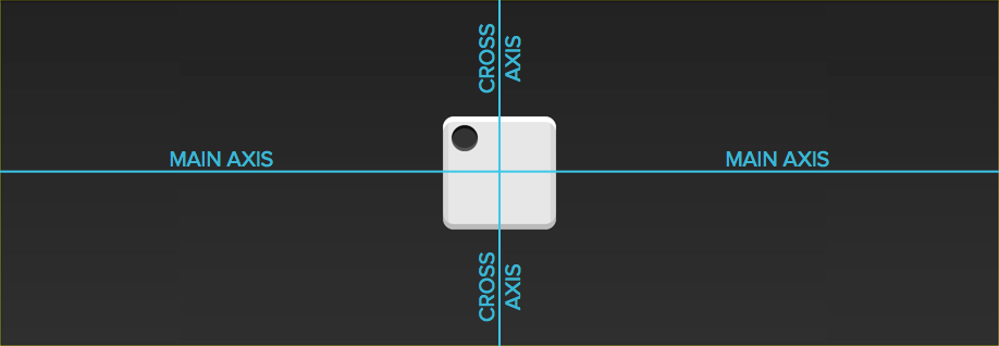
The first-face container now has a horizontal main axis. The main axis of a flexbox container can be either horizontal or vertical, but the default is horizontal. If we added another pip to the face, it would show up to the right of the first one. The container also has a vertical cross axis. The cross axis is always perpendicular to the main axis.
The justify-content property defines the alignment along the main axis. Since we want to center the pip along the main axis, we'll use the center value.
.first-face {
  display: flex;
  justify-content: center;
}

Hey, cool! Since the main axis is horizontal, the pip is now centered in the parent element.
The align-items property dictates how the items are laid out along the cross axis. Because we want the pip to center along this axis, we'll use the center value here too.
.first-face {
  display: flex;
  justify-content: center;
  align-items: center;
}

And just like that, the pip is centered!
Getting Trickier
On the second face of a die, the first pip is in the top left corner and the second is in the bottom right. This is also pretty easy to do with flexbox!
Again, let's start with the markup and the basic CSS.
<div class="second-face">
  <span class="pip"></span>
  <span class="pip"></span>
</div>
.second-face {
  display: flex;
}

Now we have two pips right next to each other. This time around, we want the pips on opposite sides of the die. There's a value for justify-content that will let us do just that: space-between.
The space-between property evenly fills the space between flex items. Since there are only two pips, this pushes them away from each other.
.second-face {
  display: flex;
  justify-content: space-between;
}

Here's where we run into a problem. Unlike before, we can't set align-items because it will affect both pips. Luckily, flexbox includes align-self. This property lets us align individual items in a flex container along the cross axis however we'd like! The value we want for this property is flex-end.
.second-face {
  display: flex;
  justify-content: space-between;
}

.second-face .pip:nth-of-type(2) {
  align-self: flex-end;
}

Looks good!
Horizontal and Vertical Nesting
Let's skip the third face and tackle the fourth. This one is a little trickier than the others because we need to support two columns, each with two pips.
There are two things about flexbox that will save us here: flex containers can have vertical or horizontal content, and flex containers can be nested.
Unlike before, our markup will now include columns.
<div class="fourth-face">
  <div class="column">
    <span class="pip"></span>
    <span class="pip"></span>
  </div>
  <div class="column">
    <span class="pip"></span>
    <span class="pip"></span>
  </div>
</div>

Since we want the two columns to be on opposite sides, let's go ahead and use justify-content: space-between like we did before.
.fourth-face {
  display: flex;
  justify-content: space-between;
}

Next, we need to make the columns flex containers. It might seem like they already are, but remember that we haven't set display: flex yet. We can use the flex-direction property to set the direction of the main axis to column.
.fourth-face {
  display: flex;
  justify-content: space-between;
}

.fourth-face .column {
  display: flex;
  flex-direction: column;
}
It doesn't look any different, but the columns are now flex containers. Notice how we stuck a flex container directly inside another flex container? That's okay! Flexbox doesn't care if the containers are nested.
The final step is to space the the pips inside the columns apart from each other. Since the main axis is vertical, we can use justify-content again.
.fourth-face {
  display: flex;
  justify-content: space-between;
}

.fourth-face .column {
  display: flex;
  flex-direction: column;
  justify-content: space-between;
}

Note: This face could have been built without columns by using wrapping. I'll cover wrapping in more detail in a future lesson.
Wrapping up
Woohoo! Three faces down and three to go. At this point, you should have everything you need to build the other three. Your homework is to write the CSS for the missing faces. When you're done, you can look at the CodePen below for the answers. Let me know how it went in the comments!
See the Pen Flexbox Dice by Landon Schropp (@LandonSchropp) on CodePen.
My next lesson will cover how to write flexbox without vendor prefixes or old syntax. To make sure you get it, head over to Free Flexbox Starter Course and sign up.


About Landon Schropp
Landon is a developer, designer and entrepreneur based in Kansas City. He's the author of the Unraveling Flexbox. He's passionate about building simple apps people love to use.

> **93% of people are now running a browser that supports flexbox.**
Does that number include mobile browsers?
It includes mobile browsers with vendor prefixes and old syntaxes. http://caniuse.com/#feat=flexbox
That percentage is highly dependent on your target audience of course. Going by global caniuse.com statistics, the percentage is less than 4%. For my country (The Netherlands), the percentage is only 2.5% !
What do you do about version of Internet Explorer older than 11? According to caniuse.com, 10 supports flexbox but a different syntax and 8, 9 don’t support it at all. Or are you not supporting older versions of Internet Explorer?
Good tutorial though, thank you!
If really needed, you can use
floatand/ordisplay: tableproperties as fallback to old browsers. Of course they don’t have all the features flexbox has, but can at least make your website/app usable to these users.Great question! As you mentioned, there’s an older version of the syntax that works for IE10 (as well as older Android browsers). So if you wanted the best possible browser support, you’d write code that looks like this:
.fourth-face .column {
  display: flex;
  flex-direction: column;
  justify-content: space-between;
}
Like this:
.fourth-face .column {
  display: -webkit-box;
  display: -webkit-flex;
  display: -ms-flexbox;
  display: flex;
  -webkit-box-orient: vertical;
  -webkit-box-direction: normal;
  -webkit-flex-direction: column;
      -ms-flex-direction: column;
          flex-direction: column;
  -webkit-box-pack: justify;
  -webkit-justify-content: space-between;
      -ms-flex-pack: justify;
          justify-content: space-between;
}
Since that’s a huge pain, I use a tool called Autoprefixer which automatically adds the prefixes for you. My next article will go into detail on how to set up Autoprefixer so you don’t have to worry about any of this.
For IE9 and below, I prefer to let the browser fall back on block displays, which ends up looking like a larger mobile layout. It’s not the same layout, but it’s functional on older browsers while still using new techniques. That technique is called graceful degradation. That technique is a bit too much for a blog post, but I plan on covering it in detail in the Unraveling Flexbox book.
Hi guy ! Perfect example, I worked on a CSS3 cube when I found your tutorial so I introduce the CSS3 Flex Dice ! Thanks mate :)
http://codepen.io/shug0/full/XJJGeW/
That’s awesome! Thanks for sharing this. :)
Looks cool! BUT just a wee factoid. Any two opposing faces added together should equal 7.
So 6 should be opposite 1
2 should be opposite 5
etc :)
Nice!
But your dice is wrong! Opposite sides should add up to 7! (ie 16; 25 etc)
Hi @Sean & @Matt, yes a friend said me this too, I need to change it ^^”
I’ve attempted to do it using
flex-wrapand not having any column divs, but I haven’t quite managed it. Anyone care to take up the challenge?http://codepen.io/karaken12/pen/wazvbm?editors=110
Tom, your pen works for me (except for old gradient syntax for body which can easily be fixed). Here is a little modidication of your pen with no extra row wrapper for 5:
http://codepen.io/SelenIT/pen/rVMOog
Nicely done!
Interesting and entertaining! Thanks! I must say, I’m a bit surprise about the fifth face. I kept trying to center it using “align-items” since that’s what you used for the first face. Selecting the pip in the second column and setting “align-self: center;” also didn’t work. Could you please explain that?
You’re welcome. :)
In the first example, the main axis is horizontal (the default). Since align-items aligns on the cross axis, which is vertical in that example, the it centers the pip vertically.
In the fifth face, the pip is inside a column. Because we set the flex-direction of the column to column, the main axis is vertical and the cross axis is horizontal. So, if you use align-items it centers horizontally and justify-content centers vertically.
Does that answer your question?
I totally missed that! Thanks for the explanation, it really made me consider the complexity and awesomeness of flexbox.
You’re welcome! With the book and starter course, I’m really hoping to take some of the magic and mystery out of this stuff.
Great article!
Is it possible to polyfill for IE9? How is best to achieve that?
Hey Matt, great question. At point there was a polyfill called Flexie that promised cross-browser support. However, the flexbox syntax change and the polyfill wasn’t updated.
Here’s my comment from above on how I like to deal with IE9 and below:
Best article I’ve read on flexbox. Thank you.
Thanks Jonathan! I’m glad you enjoyed it.