How to Design Responsively
Introduction
In this article I want to share my thoughts regarding responsive design. I made several talks on this subject and this post is some kind of summary. The article presents concepts like mobile first and design in the browser.
What is responsive web design
Scott Kellum said something which I think describes the responsive design perfectly:
Responsive web design isn't your site working on phones and tablets. It's about your site working everywhere.
Nowadays there are dozen of mobile devices, a lot of different resolutions and still several browsers. It's kinda wrong to make design based on specific device or resolution. Which means that it's wrong to equal responsive with mobile, phone or tablet design. Responsive design means building something today and be sure that it works tomorrow. The applications which we are working on should adapt to the environments which they are placed in. If they not, then your job is not done. I think that responsive design is not only how your site looks like. The usage of content delivery networks to serve the needed javascript libraries is also responsive approach. A lot of experts said that the responsive design starts initially on the server. I'm willing to agree with that.
The tools
Like every new thing, responsive design is not something that you can jump in for just a hour. The good news is that you are already doing it :) Every time when you use percentages for your containers or use media queries you are basically making responsive design.
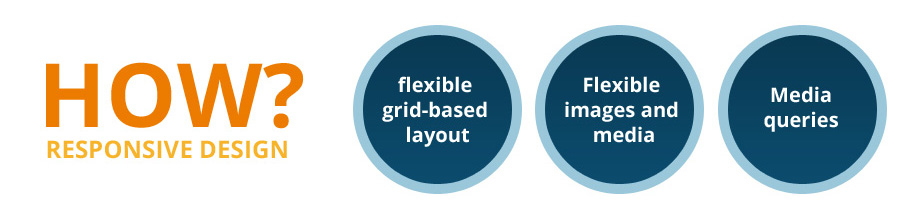
In general there are three instruments which we can use to achieve responsiveness:
- Flexible layouts - i.e. your containers should use percentages and they should scale, reorganize, show or hide based on your content or design ideas.
- Flexible images and medias - your images and media should be resized, so the user could see them properly on the different devices
- Media queries - very often the people equal media queries with responsive design. But they are just tool for reaching the goal. I.e. applying different css styles based on specific conditions.
Why we should care about the responsiveness
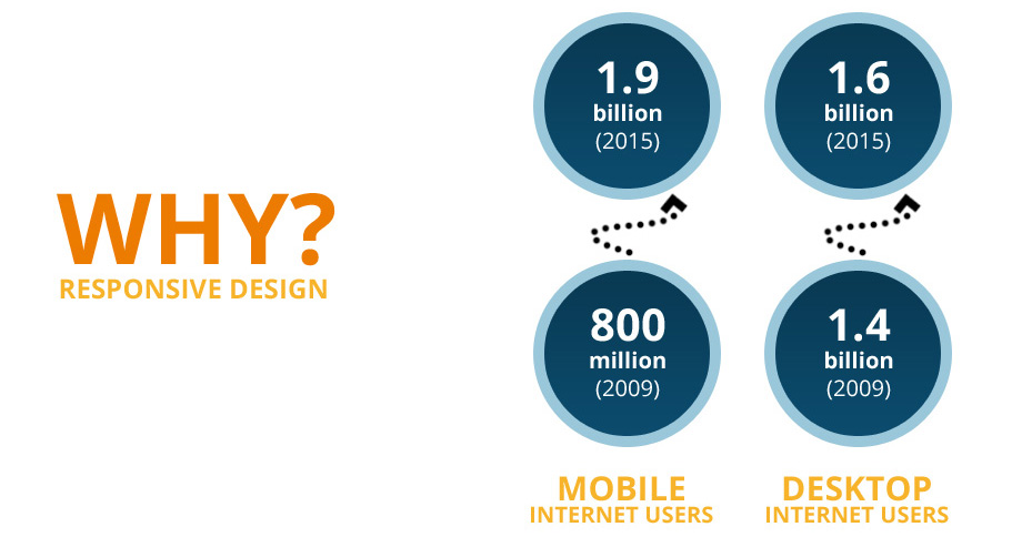
I don't think that I have to convince you to make your site/application responsive. We are living in an interesting times. There are new devices coming almost every week. All of them with different capabilities, but they have one common thing - the people use them to browse the web. As you can see on the picture below the number of mobile internet users increases very fast. The responsive design became so popular mainly because the needs of all those users. They want to use your service on the desktop computer at home, on the tablet in the train or via his phone in the bus. They just want to reach your content no matter how and when.
The main function of the Web is to deliver information to the users. No one likes to see broken pages. And if your site is not made with this in mind then very soon you will find out that it's not looking good on the new iPad6. Even, from a business point of view, it's not very efficient/cheap to develop different versions for the mobile or desktop users. You should build one application for all the cases.
So, who is responsible for all this responsive craziness .. the Mobile Web?
Actually the answer is no. We changed our vision about the web, because the highlighted unknowns. I heard several times designers saying:
How to web design when I don't know the the resolution, the browser's capabilities and internet connection speed.
The truth is that we never knew all those things. We build tools which only assume what we are designing for. I was nicely surprised by the talk of Jeremy Keith. It's called There is no Mobile Web and I strongly recommend to watch it. I also totally agree with him that we have only one Web. Every device has a browser and this browser makes http requests, it fetches html, css, javascript and images. It processes them, it still reacts to clicks and selections. Yes, the input is different, but it still does the same job on every device - it shows content. There is something fundamentally wrong with how the web designers think nowadays. I think that they should be more web then designers. The good web design is not an art. It's a problem solver and has a function. It communicates with the users and adds value to the entire user experience.
So ... what?
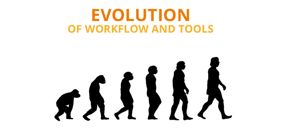
It's time for change. There is no way to adapt to the new requirements without evolution. Evolution of our workflow and tools. Sometimes it's a little bit difficult to leave your favorite tool or change the way of how you do your job. Of course, you are free to choose, but I think that the change will come sooner or later. So, you better make this steps now.
Workflow
The first step is to change your workflow. The picture below shows a typical one:
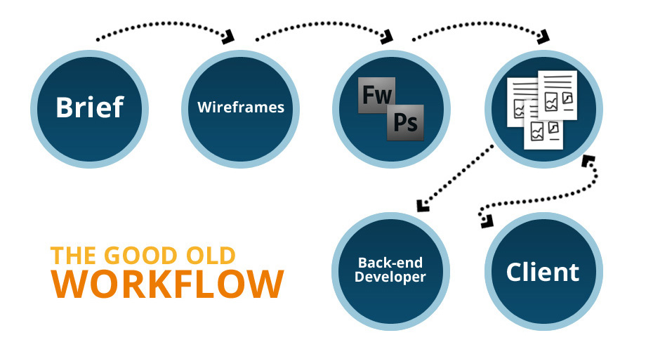
The team receives the brief and makes wireframes. If you are lucky, you have a good document describing the product. The document is passed to the designer and he starts designing in his favorite graphic software - usually Photoshop or Fireworks. Very soon he produces the first layouts - static images which he sends to the client. Of course the client has something else in mind and there are few revisions till the design is approved. When this is done the layouts are send to the front-end developer, which uses his magical skills and transforms the images to good looking perfect pixel html/css pages. The next tasks are reserved for the back-end developer who adds the business logic. We all know the problems of this workflow and I'll mention some of them later.
After two experiments, a lot of read articles and watched screencasts I could define the responsive design workflow like that:
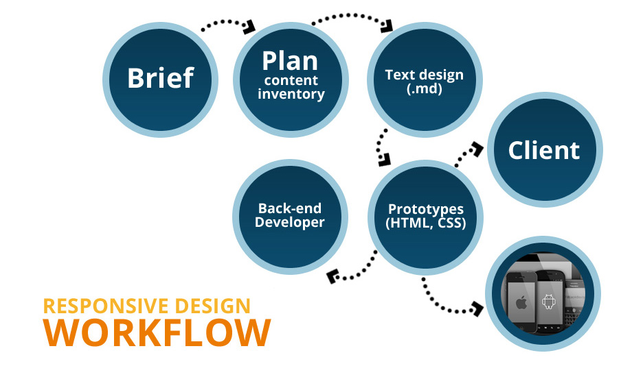
It still starts with a brief, but it is followed by a good plan and good content inventory. By content inventory I mean a clear idea of what information should be published. It will be good if you have texts and images which will be used in the real application. The next step is to create the text design. I.e. to put the content in a simple text file or better in markdown document. It will be good if you define some titles, subtitles, paragraphs and set the images to their places. It is clear that you can't create the text design without to know something. I always said that the content should lead the design, not opposite. I saw how designers take decisions based on the good looking layout or graphics while they have to make design based on the content. I bet you that you have client, which said:
Right now, I don't know what to put in the site ... just create something cool.
If your company follows responsive design workflow you will be able to say NO and wait till you receive enough information about the project.
Once the text design is finished you could continue with prototyping. I.e. you start designing in the browser by using HTML and CSS. Of course for the complex graphics, software like Photoshop is more appropriate. Two things should be done during the process of design. The first one is to test your prototype in different devices. The second one is to ask the client for opinion. By doing this you will get immediate feedback and avoid the big
No, I don't like it. Start over again.
At the end but not least is the fact that you skip the front-end slicing. I.e. once the design is done you actually have the HTML+CSS pages. This could be send directly to the back-end developer for business logic implementation.
The next graphic shows the both workflows next to each other with their differences.
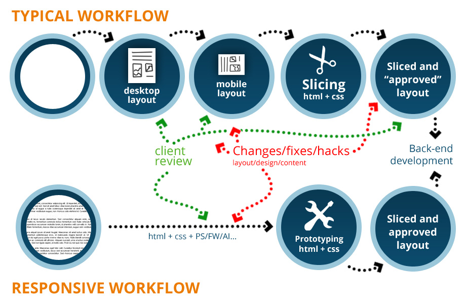
The first thing that you will notice is that the old workflow could start with a blank page while the responsive design workflow requires content. In the typical approach the client reviews the created static images, approves them and after the slicing he again sees the design, but in a different place - in the browser. In most of the cases the client and even the designer finds problems which weren't visible on the static images. And that's because till then they see only static layouts without any real interaction.
- On the picture, the whole content is visible, but in the browser you need to scroll down to see everything. I.e. there is a good amount of content below the fold. This brings different perspective and could lead to reorganization of the whole layout.
- The containers with dynamic content doesn't look good when you have too much or too little text
- The fonts may look different
And these are only three of the common issues. What if you have ten or more problems to solve. It looks like you are making the design twice.
In the other workflow the client is involved in the design process all the time. Everything is happening in the browser - the media which the final product will be placed in. There are a lot of answers coming from this. Problems like elements priority, layout organization, browser bugs are solved in the early stage. Your application lives in the browser and you can interact with it. You are able to see the elements' animations, the transitions, the hover effects. Pretty much everything, which is part of the final pages. While in the old workflow all those things are left to the imagination, which is kinda risky because the client is not thinking the same way as you do.
Mobile first
Mobile first concept brings the idea to start designing from lower resolution to higher. Maybe it looks strange, but once you start working like that you will realize how many benefits it has.
Mobile first should be called content first, focus first or performance first.
Why I'm saying this? First, because the word mobile doesn't fit very well. I believe that the responsive design is not device related. It's something that you do to make your application works everywhere. Second, because when you have only 320px by width you really don't have enough space for everything. You start thinking about priorities, what is more important or less. You are designing from content out. You are shifting the focus to just a few target points. And as you may notice later, those points are actually the key moments of your site. At the end but not least you're thinking more about the performance of the application. By using mobile first concept you start from something small and build over it. While, if you start from the higher resolution version you will have to remove elements - degradation.
Innovation
Mobie first put some interesting cards on the table. One of the most creative solutions in the design are born, because of the constraints. The lack of space on the mobile devices was the reason for all those innovative types of navigation. The small screen encourage you to think out of the box and find new ways to present the information. It's a new thing to fight with and makes your job a little bit more interesting.
Things to consider
You should definitely change your usual layout organization. Even your markup needs some changes, because when you increase the resolution your content should be transformed. Some elements will be added, others removed or scaled. You will see that if you want to do such things the HTML should be properly structured.
Put your content over the navigation. It's much more important to deliver the needed information to the users. It's better to show some content instead to use half of the viewport for buttons.
Remember that the input is different nowadays. The devices support touch and gestures. It's not only the keyboard or the mouse. For example, on the phones the lower right corner is one of the most used area.
It's not only you.
Don't think that mobile first is an exotic concept. Many of the big companies uses this approach.
The simple guideline is whatever you are doing—do mobile first
/ Google Chairman Eric Schmidt /We're just now starting to get into mobile first and then web second for a lot of our products. What we're finding is that the designers on mobile are really embracing the constraints [and] that it's actually teaching us a lot about how to design back to the desktop.
/ Kate Aronowitz, Facebook's Director of Design /We really need to shift to think about mobile first....This is a bigger shift than we saw with the personal computing revolution
/ And Kevin Lynch, Adobe's CTO /
Designing in the browser
Web applications run in the browser. Why not make the design there. It's actually a little bit strange that we didn't think about this earlier. Maybe, because the browsers weren't so helpful, but today they have a lot of tools. For example the Chrome's Dev Tools panel contains a bunch of useful instruments like DOM inspector or CSS editor. So, it's not only a software for browsing, but it takes a good place in our daily work as web developers.
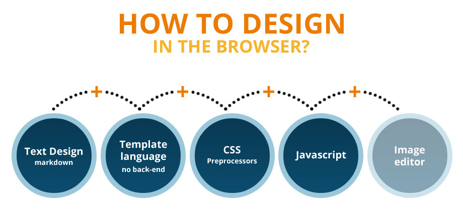
There are several things which I notice using the browser for design. First of all, it will be nice to use Markdown for your text design. It's because it could be easily translated to HTML. It saves you some time in writing markup.
You should consider the usage of some template language. If the project is big you will have a lot of prototypes and there should be any way to divide your HTML to small partials and reuse them. Also, if you need to change something you will do it only once, not repeating the same change in dozen of files. It will be good if the template engine doesn't involve any server-side language. Otherwise the designer should install additional things which will make the process complex.
Use CSS preprocessors like SASS or LESS. I think that this is mandatory. Without them you will have to write a lot of CSS. As a designer that's what you will do most and should be painless.
In order to present your ideas some JavaScript knowledge is required. There is no need to be a guru and use Backbone or Angular. Knowing of click handling and adding/removing CSS classes is enough.
Technical tips
Keep your HTML markup as simple as possible. You will get a chance to add new elements very soon. No need to add things just because you think that you will need them later.
Use media queries bubbling. Most of the CSS preprocessors support it. For example:
header {
    width: 120px;
    font-size: 20px;
}
...
@media all and (min-width: 480px) {
    header {
        width: 180px;
        font-size: 26px;
    }
}
Could be transformed to:
header {
    width: 120px;
    font-size: 20px;
    @media all and (min-width: 480px) {
        width: 180px;
        font-size: 26px;
    }
}
Yes, it could lead to a little bit more writing, but it separates your elements in blocks. Also it's much more readable. It is also a good idea to distribute the main application's parts in different files. If they have meaningful names then the process of editing will be pleasant.
Drawbacks
Of course designing in the browser has its own disadvantages.
- Designers should learn HTML, CSS and javascript. And many of them don't want to do that. It's really easy to pick up the move tool in Photoshop and rearrange several images, but in CSS this could be challenging.
- Limit your creativity - sometimes, there are design decisions which could not be made directly with CSS. However I think that for those cases a graphic software could be used.
Conclusion
John Allsopp wrote an article back in April 2000. The post in A List Apart acts as a manifesto for many designers and developers. He said:
The web's greatest strength, I believe, is often seen as a limitation, as a defect. It is the nature of the web to be flexible, and it should be our role as designers and developers to embrace this flexibility, and produce pages which, by being flexible, are accessible to all.
/ A Dao of Web Design (April 07, 2000) /
The roots of web design are in the print design. However it's a complete new media and our role is to keep the good parts, use what we can and start thinking differently. Adapt to the new environment where our work exists.
Resources
- "Mobile first" by Luke Wroblewski
- A Dao of Web Design (April 07, 2000)
- Jeremy Keith - There Is No Mobile Web - BD Conf, Sept 2011


About Krasimir Tsonev
Krasimir Tsonev is a coder with over ten years of experience in web development. With a strong focus on quality and usability, he is interested in delivering cutting edge applications. Currently, with the rise of the mobile development, Krasimir is enthusiastic to work on responsive applications targeted to various devices. Living and working in Bulgaria, he graduated at the Technical University of Varna with a bachelor and master degree in computer science. If you'd like to stay up to date on his activities, refer to his blog or follow him on Twitter.


Hey, Krasimir, thanks for your article. I have learnt a lot about responsive design.
@Yao Li: you are welcome.
A very in depth article. Thanks
Like the thoughts and illustration on designing in the browser. To some extent, it’s because recently we’ve published a collection of articles about this controversial topic ( http://www.htmlcut.com/blog/designing-directly-in-browser.html ) and I’m still impressed by the discussion, but also ’cause Krasimir tries to analyse the problem from different points of view, including drawbacks.
Thanks for the link, I’ll definitely check some of the resources. I think that sooner or later we will do our job completely in the browser.
Krasimir thanks for very helpful article, since today I’ll change my way of creating websites and I’ll focus on mobile first.
I’m glad that the article helps. Once you start using the responsive design workflow you will see how interesting and right is this approach.
Adobe Edge Reflow is a pretty cool tool to design responsively also
‘Designers should learn HTML, CSS and javascript. And many of them don’t want to do that. It’s really easy to pick up the move tool in Photoshop and rearrange several images, but in CSS this could be challenging.’
When I look at this design… http://krasimirtsonev.com/blog
There is more to design than HTML, CSS and Javascript.
@Agnieszka: can you please clarify :) You mean that the design is not good and I have to make some changes. If that’s the case can you please share your opinion. I mean what you like and what not. It will be really helpful feedback for me.
This is one of the best articles about responsive design I’ve read, I actually learned something, thanks :D
In the workflow I’ll add a style tyle, or a font and color palette or something like that to be approved by the client just after the brief and before the prototype so you know that you are OK about the overall “look and feel” before coding.
@ficticia: That’s a good idea. I’ll agree that such a thing could be put before the prototyping.
Hey Krasimir, thanks for sharing this.. well can you please throw some lights on the frameworks should be used like twitter bootstrap or Foundation JS, etc. And also what according to you is more flexible with some tricks which you would like to share.
Hi Vishal. Sorry for the delay. To be honest I prefer to skip the usage of CSS frameworks. That’s because in most of the cases they come with predefined media queries breakpoints. The ideas is to put your breakpoints on places (pixels) where your content is broken. It is wrong to relay on device resolutions or something like that. The content should tell you where to use media queries. I personally like to use mobile first concept and that’s how I start designing. Also I’m trying to make as many things as possible in my browser. Of course it is good to make fast sketches in Photoshop, but the real work is done in the right media – the browser.
We should care about our websites that our website is responsive or not.
Nowadays the latest trend about website is to be responsive. Since responsive website can be visible in everywhere, you can get more traffic, sales and other thing with responsive website. People are more engaged with you due to respnsive designing.
“Designer should learn HTML, CSS and Javascript?” Why exactly, when it will change in five minutes. Designers are designers for a reason, because they are creative. I wouldn’t expect you to draw like Rubens. We have right sided brains, you left sided. It’s like oil and water, they don’t often mix.
Krasimir as a developer I’m sure your workflow models suits you very well, but what about creativity, visual aesthetics, composition, contrast, form etc.? Have you been trained in any of that, by the looks of your own website I would say no!? If you expect me to believe that the future of web design is everything being handed over to the developer to ‘design’, or, designers becoming developers, I’m sorry but you are sadly mistaken.
I think you’ll find the ability to code is just a skill to be learnt, like a builder stacking brinks in the right order to create a house. He may be able to handle the bricks and mortar and he even might be able to build you something resembling a house but its unlikely he would be able to design the Empire State Building or the Sagrada Familia.
If anything developers will eventually be hoisted by there own petard, technology. We’re already seeing responsive design technology like Macaw or Webflow. Give it 10 years and we will inevitably be able to design a piece of software cable of matching a developer skillsets that has an easy to use UI. I don’t think you can say the same about a piece of software capable of being creative. So stop thinking you know it all, cause you know a bit of Java and PHP and start working with your designers or we’ll design you out of the picture.
Hello James,
thank you for the comment. I don’t agree with you in many points. First of all, I’m not a designer and I never pretended to be. I’m a developer that works with designers. Second, last few years I work with designers that know CSS, HTML (better then me) and basic JavaScript. They are still able to create beautiful and functional web sites. They still provide nice user experience and I’ll definitely say that they are creative in their thinking.
The world is changed. The media and the tools too. It is not about restricting the creativity it is just adapting to a new environment.
I don’t mean to argue with you. We just have two different opinions.
Here I am nearly two years after you published this post and it seems like it could have been written two weeks ago .. such a great read, found this through Wistia as I am struggling to understand the tech side of ‘Video Foam’ embeds .. back to it! thanks