Website Builders that Don’t Suck
I Never Pursue My Awesome Ideas
I'm constantly struck with ideas for new web projects. Unfortunately, I rarely act on them because I have too little time and they're too much of a hassle to see through.
At least ten times over the last two years, I started building out a site in WordPress that I then grew tired of and abandoned. Why? When I already do web dev as my day job, it's mind-numbing to also spend my downtime further modifying templates, finding and integrating plugins, and setting up hosting.
This is ultimately my own fault. I'm naturally dismissive of new tools. But, in reality, we developers should be constantly hunting for new ways to increase our productivity. When ideas arise, we can't be slowed down by cumbersome workflows. We can't let ourselves get stuck in our slow ways.
Fortunately, there are simplified alternatives to WordPress, including Squarespace, but they're too restricted in the design and functionality that you can apply on top of the base templates provided to you. Squarespace, and most of its alternatives, are effective tools for non-technical entrepreneurs looking to build out simple pages, but they're not for the technically inclined who want to dive deeper. They're not for professional developers like myself who want the best looking site possible that feels entirely custom.
So what does this leave us with? You might think, "Bootstrap and Foundation!" Indeed, these front-end templating systems save us time on development, but they require a level of hands-on customization that doesn't accommodate quick design overhauls or painless plugin integration. What's more, they're unsuitable for designers who aren't fully comfortable coding. They're great, but they're far from perfect.
As of January 2015, I've finally found a real solution. AND IT'S AWESOME.
The Solution
This article introduces my new solution to developer fatigue: professional website builders. No, not Squarespace, Dreamweaver, or Wix. I'm talking about the lesser-known professional sitebuilders. Here they are: Webflow, Froont, and Weebly.
This new crop of sitebuilders allow us to build out gorgeous, production-ready sites in under an hour — without sacrificing the pixel-perfect control we expect from hand coding or from designing in Photoshop. These tools also let you build a site from scratch so that you can exactly meet your (or your clients') specifications. (If you want to work off a pre-existing template, you still can.)
The sites I design using these tools consistently look better than the sites I code by hand. And I'm a good designer. Why? Because these tools let me iterate so quickly that I can painlessly test new styling variations within seconds, and that ultimately lets me get to the best-looking variation of each of my designs very quickly. They make me feel like everything I design is the best it can be.
Drag and Drop Tools Don't Suck Anymore?
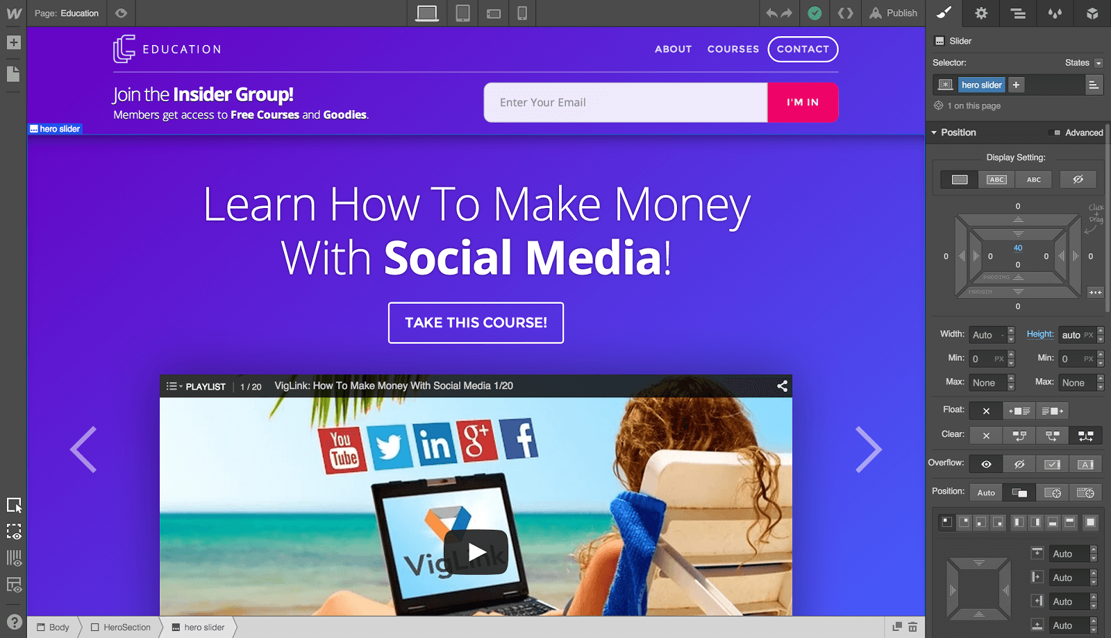
The first thing to understand about these new tools is that they don't exclusively cater toward designers who are too lazy to learn how to code. Webflow, as one example, generates exceptionally clean W3C compliant HTML5 and CSS3 code, making sites cross-browser compatible and responsive out of the box. The code is based off of Bootstrap, and it's easier to work with than the code I usually write by hand! You can consider Webflow a visual Bootstrap designer.
Further, both Webflow and Froont don't lock us into their platforms; we can export sites out of their environments to host them elsewhere — perhaps to further develop them within our IDE's. Basically, these tools function as time-saving starting points. They do all the heavy-lifting.
They're the perfect tools for professional developers under tight deadlines with clients. And, for our selfish purposes, they're equally perfect for helping us bang out all our side project ideas.
A learning curve exists with these tools, but it's minimal and ultimately rewarding. You're looking at spending about an hour to get a solid grasp on any one of these tools.
They're Doing More than Just Saving You Time
An exciting benefit of the competition in the sitebuilder market is that they're constantly setting new standards for web development workflows: instant one-click hosting on AWS, automated visual backups for quick iterations, access to web fonts from Typekit and Google, automatic responsiveness on mobile devices, and a lot more.
Another benefit of the way the competition has evolved is that they all newly offer free plans now. (Yay for us!)
Here's how our three professional sitebuilders stack up against one another. Skip to the next section if you want a quick overview of each one.
| Webflow | Froont | Weebly | |
|---|---|---|---|
| Free | ✓ | ✓ | ✓ |
| Responsive Sites | ✓ | ✓ | ✓ |
| Versioning | ✓ | ✓ | ✗ |
| Code Exporting | ✓ | ✓ | ✗ |
| Custom Code | ✓ | ✓ | ✓ |
| Contact Forms | ✓ | ✓ | ✓ |
| Media Widgets | ✓ | ✗ | ✓ |
| Hosting | $4.99/mo | $9/mo | $4/mo |
| Free Projects | 20 | 10 | Not Specified |
| Ad Free | ✓ | ✓ | Footer Banner |
- Responsive Sites: Responsiveness has become a standard, not a necessity. These tools embrace this. Each one delivers on this capability out of the box without requiring you to perform extensive media query tweaking to get exactly the look you want on all devices.
- Multiple Versions: The ability to create multiple versions and restore points. Being able to revert back to an older version of a site is a workflow booster for those who like to find the perfect design through experimentation, and for those who work in teams that iterate quickly.
- Code Exporting: An often overlooked capability of these new sitebuilders is the ability to export your sites so that you can further hone them with custom code inside your IDE, or host them off-platform.
- Custom Code: Moving away from code and designing visually has its benefits, but for more technical integrations, a simple drag and drop workflow just won't cut it. That's when you need to be able to inject your own custom code. These tools don't prevent you from doing so.
- Contact Forms: A standard of conducting business on the web is being able to reach out to customers via email. That's why all the modern sitebuilders now provide native Contact Forms widgets that can be dragged and dropped into place on your site, without any custom code required by a developer. Best of all, you can fully modify the design of these widgets so they don't look like exactly that: ugly, stock widgets. Say goodbye to being locked into templates.
- Widgets: Components like Tabs, Sliders, Navbars, and Lightboxes can now be accessed as pre-built elements. All you do is select the media you want to showcase then quickly redesign the widget to fit the rest of your UI.
- Hosting: Subdomains are provided for free. But, once your site is ready to be published, you will most likely want to avoid forced branding. Fortunately, these sitebuilders all provide super-fast hosting (usually built off of Amazon AWS) -- eliminating the need for third-party hosting setups when you don't have the energy or necessity to set something custom up.
- Free Projects: All free plans come with a variation of perks. The number of free projects here corresponds to the number of individual websites that you're allowed to create on their free plan.
Overview: Webflow
Webflow is my go-to sitebuilder for developing sites and apps, which is why I'm listing it first. It makes designers feel empowered by not handicapping their ability to design to pixel-perfect precision. It claims it offers the power of Photoshop, and I'd say it actually delivers on that.
It's also a big workflow boost for developers: In taking the time to learn Webflow, you're taking the time to learn real web development best practices. Webflow's visual editor doesn't abstract away HTML elements or CSS properties; it simply provide quick access to manipulating them. Webflow doesn't treat you like a dummy; it exposes the power of code in a visual manner.
If I want to turn my Webflow site into a full-featured app after I'm done designing, I can export the site off the Webflow platform to finalize its functionality within my IDE. If instead I were putting together a site that didn't require custom functionality (say, a multimedia gallery), and all my functionality goals are fulfilled by Webflow's pre-existing media widgets, then I don't even have to export the site at all. I can keep it on Webflow and point a custom domain to my new Webflow site.
Overview: Froont
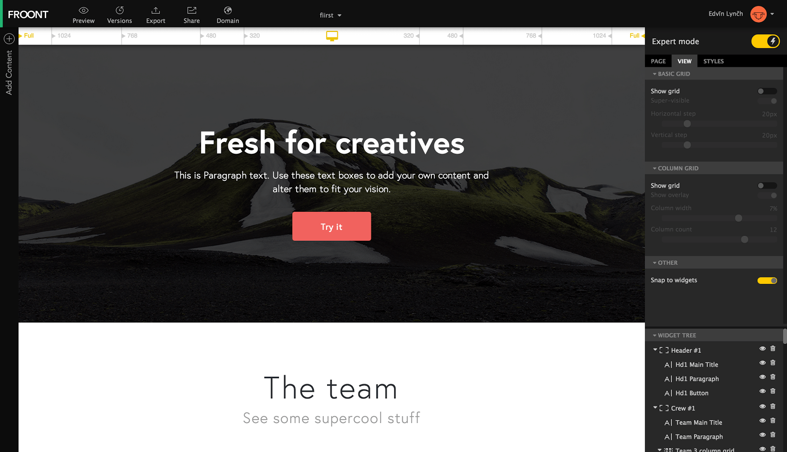
Most of what I described for Webflow holds true for Froont as well, so I won't repeat the benefits here. It's the newest contender for inclusion in my toolbox: A nicely-featured drag and drop sitebuilder that gives me the power I need to put together a full UI without the hassle of constant CSS tweaking.
The code it produces isn't exactly up to par with Webflow's, nor is its designer equally as flexible, so I consider this a backup alternative if Webflow doesn't rub you the right way.
Regardless, I strongly recommend creating accounts on both services and judging for yourself which seems better suited to the way you develop. Froont is truly a strong contender.
Overview: Weebly
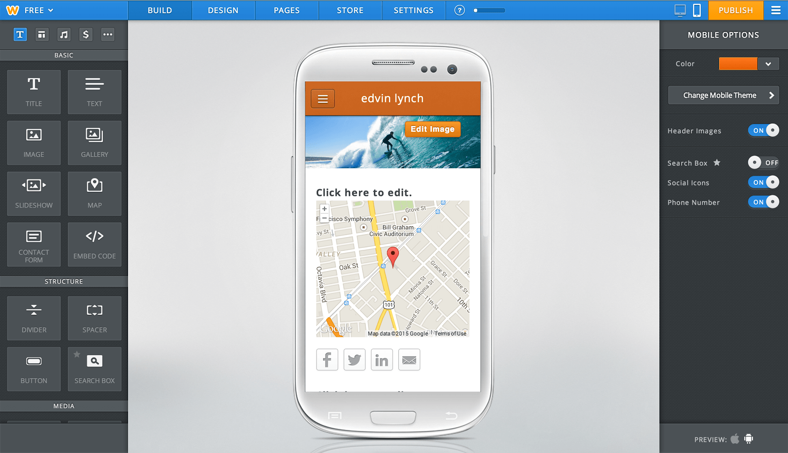
For those of you looking for an even simpler approach to web development, but don't want to be locked into the restrictions of Squarespace, Weebly is the most user-friendly drag and drop sitebuilder out there. With the Weebly app on my iPad, I can easily build, manage, and edit my storefronts and blogs. It's a fully-featured ecosystem that's tied together phenomenally well.
It's not the best fit for professional designers looking to design sleek, modern sites to the exact specifications of clients, but it is the best fit for those who want the broad plugin ecosystem of WordPress and need access to pre-made eCommerce, blog, and CMS solutions. In short, Weebly is an amazing one-stop shop solution.
If, however, you're a professional freelancer or agency, stick with the design power and exporting capabilities provided by Webflow and Froont. Design agencies rely on these tools for a reason: They let you design beautiful and responsive sites entirely from scratch.
Making it easy to be more than just a designer
It's foolish to see the new crop of professional sitebuilders as gimmicks -- or as threats to our traditional workflows. In reality, they are richly-featured tools that let us efficiently achieve base designs that we are fully in charge of. In 2015, we're no longer locked into proprietary platforms (e.g. WordPress) or horribly messy code (e.g. Dreamweaver). We've come a long way.
At the end of the day, these tools help us get more work done quicker so that we can spend time focusing on the creative aspects we love, which is probably why most of us get into development in the first place.



What is media wigets?
fwiw. I picked up a job where the client showed me a concept home page made in Adobe Muse. It had a 4.5 MB weight including images. I am nearly done recreating the same page and it’s weight is something under 700K.
Yeah, Adobe Muse is a mess.
Good post but I have to correct you, wordpress is not proprietary software?!?! “In 2015, we’re no longer locked into proprietary platforms (e.g. WordPress)”.
It’s freely downloadable and Open Code / Open Source.
I think your mistaken with their blog hosting service.
Hello Charles! Very informative article! I’m not a big fan of website builders, I prefer using WordPress for all my projects, however if we are talking about a simple project with few pages and a contact page I use Weebly. It is simple, easy to use and mobile ready. Love it!
Great list, Charles, but have you checked out Duda? They have a comprehensive suite of tools that definitely rivals the three preferred site builders you listed and some additional customization features like a website personalization tool that’s built into the platform and doesn’t require any kind of coding. Definitely worth a look.
Weebly wobbly
These are some nice looking tools, however as soon as you need to make use of actual code (e.g. PHP/ASP/JSP/Python/Ruby/etc.) you will still need to take what it generates and rip it apart into the fragments and templates you need.
I’m not saying this is a bad thing, its just the difference between a “Business Card Marketing” website or blog and an actual custom website/application. :-)
Thanks for this excellent review, I found it tremendously useful and to the point.
Hey there – I think Froont and Webflow are both great. I think our company Cubender is maybe worth a mention too. Cheers, Andrew.
Just tried Webflow, only to discover that it only works with Chrome or Safari.
Have to say that if Webflow’s own site doesn’t work with Firefox or IE, I’m inclined not to trust that the resulting product will work reliably in those browsers.
Sites made with Webflow are perfeclty compliant with Firefox and IE.
The builder has been optimized for Webkit. But what comes out of it is cross-compatible. In a way that’s mind blowing (it even includes Flex, if you’re familiar with this new responsive technology).
My interest was completely destroyed when I read Webflow uses Bootstrap as the CSS base.
Anything that’s Bootstrap related is not professional web development.
One thing you should mention about Weebly. As you note in the matrix, it has no versioning feature.
But worse than that, is has no undo! I accidentally deleted a text box, and too bad! I set my page to have no header, and it was awful. But again, no way to get it back.
I really liked Weebly until I bumped into this. How can a design site have no undo?? I paid for 2 years, now I just have to abandon it.
Easily WebFlow is the most flexible site builder available today.. I’m amazed that more people don’t know about it or use it.. Its simply amazing – when I found it, it blew my mind. I’ve been using it ever since, and have never looked back.. Unfortunately though, to export the code is extremely expensive. All of their plans are extremely costly. But you can design a site for free, and then simply pay $45 for 1 month worth of ability to export when needed.
I’m surprised at how difficult it is to make a website and get it online. Getting wordpress to do what you want is like fighting a gorilla with a pencil. Surely it should be as simple as building the graphical elements and dropping things on top like facebook like buttons or comment reply buttons. The relationship between javascript/html/css and 2D graphics obviously isn’t a very harmonious one otherwise building things exactly how you want them should be easy.
DivShot was a pretty great visual HTML layout editor, but Google bought them and killed the product.