Fix Button Borders in WebKit Mobile
One of the focuses of the blog redesign I've been working on is mobile support. This current blog design is passable at best when it comes to mobile display, and with mobile sales booming, I need to make sure my site is optimized for these devices. When checking my blog's comment form on the iPad, I saw this ugly border around the "Post Comment" button:

What a disgrace of a button! The light inset border is not at all what was intended. Luckily a quick CSS snippet removes the side effect:
-webkit-appearance: none;
And voila, button fixed:

Resetting the -webkit-appearance property removes the ugly border and makes my mobile buttons look exactly as my desktop WebKit buttons. Mobile development doesn't need to mean we have less control over display!
![Page Visibility API]()
One event that's always been lacking within the document is a signal for when the user is looking at a given tab, or another tab. When does the user switch off our site to look at something else? When do they come back?
![LightFace: Facebook Lightbox for MooTools]()
One of the web components I've always loved has been Facebook's modal dialog. This "lightbox" isn't like others: no dark overlay, no obnoxious animating to size, and it doesn't try to do "too much." With Facebook's dialog in mind, I've created LightFace: a Facebook lightbox...
![Using MooTools to Instruct Google Analytics to Track Outbound Links]()
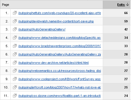
Google Analytics provides a wealth of information about who's coming to your website. One of the most important statistics the service provides is the referrer statistic -- you've gotta know who's sending people to your website, right? What about where you send others though?
![Event Delegation with MooTools]()
Events play a huge role in JavaScript. I can't name one website I've created in the past two years that hasn't used JavaScript event handling on some level. Ask yourself: how often do I inject elements into the DOM and not add an...


NIce! Thanks man
What about
-webkit-appearance: button;?