Why Uncode’s Adaptive Grid System Is a Game Changer
Having to work with a WordPress theme that does not allow you complete freedom of layout design is enough to keep you awake at nights. Templates are of some help, in that they may allow you to deliver a fully-functional, clean-looking website, but there’s a better way.
Have you ever considered working with a "concept" as a starting point?
The wonderful thing about a concept is you it allows you to modify, remix, and recreate throughout the design process to your heart’s content. Uncode allows you to do exactly that.
Uncode not only has delightful visual concepts to work with, it has some pretty amazing features as well; features you’re sure to fall in love with.
More than 15,000 web designers can attest to that.
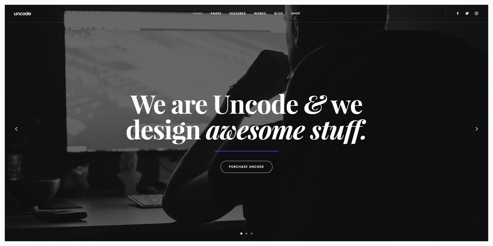
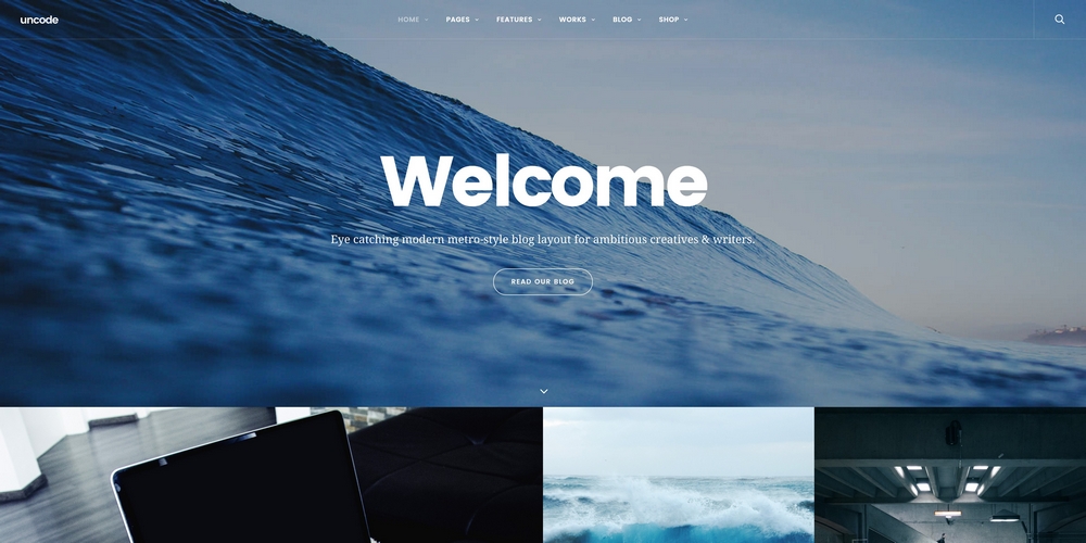
Check out Uncode’s Creative Studio concept.
Uncode’s Impressive Advanced Adaptive Grid System
One Uncode feature you’re certain to fall in love with is its unique Adaptive Grid System. Its options allow you to create every possible layout; and a few impossible ones.
The system’s options include:
- fluid or boxed main layout,
- fully responsive layout,
- full width options,
- out of grid options,
- horizontal and vertical alignments,
- gaps, padding, spacing, and margin options,
- smooth parallax,
- and more.
It’s a game changer:
- You can organize information however you choose.
- The design process centers around your creative vision, and your decisions.
- Your final product will look vastly different from your starting point, and from other Uncode-built websites.
- You’re no longer confronted with the hard choice of finding the right WP theme for the job. Uncode is a super-flexible tool that you can use to build any type of website, for any type of business.
Seven Awesome Websites from Uncode’s Showcase
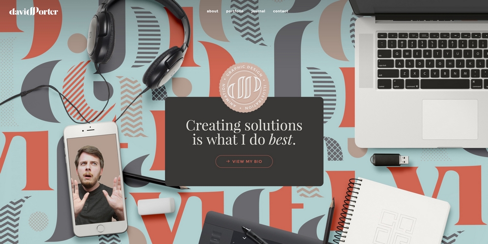
The website belongs to a professional designer, illustrator and animator from Maryland. The homepage is very well structured, with subtle effects that make the overall experience engaging. Under the header, there are the most important projects in a short showcase, a section with the services offered and a section dedicated to blog posts.
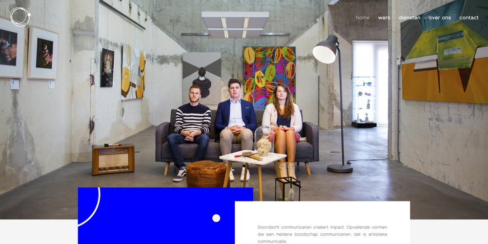
Eye candy meets creative agency. A Netherlands based creative studio named Brain managed to work wonders with Uncode. The resulting website is bright, sharp, playful and down to earth. There’s also a smart use of colors, gifs and typography, leading to a charming experience.
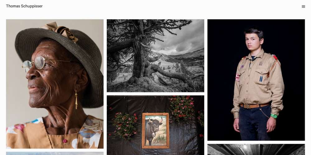
It’s said that good design should be invisible. This photographer’s portfolio bears that out. Each homepage image links to a page that showcases the project it belongs to. This is a good example of the effect of smart organization combined with design simplicity.
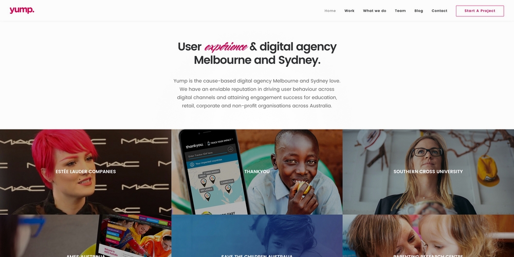
Uncode has quickly become the theme of choice for creatives all over the world. In Australia, the guys from Yump, a user experience and digital agency from Melbourne and Sydney, used Uncode for their versatile, straight forward presentation website. Subtle effects, a hip color line chosen, and a beautifully efficient typography, these are all part of Yump recipe of success in their online presentation.
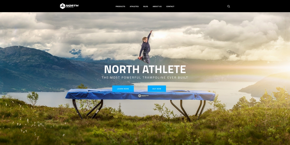
With Uncode, you can build any type of website, for any business; even a trampoline business. Images and video on this homepage tell the brand’s story. Uncode’s elegant visual capabilities support the message in a way that’s difficult to duplicate – except in other Uncode-built websites.
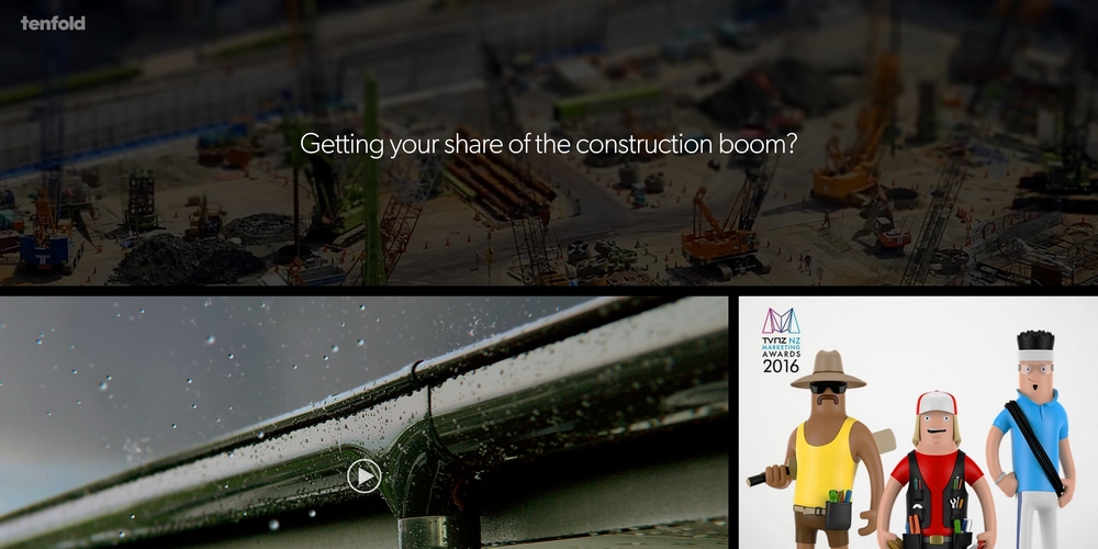
This amazing theme is used also by niche agencies. Take Tenfold for example – a creative agency that works for clients in the construction sector. The direct design line, focused on results and the actual work, that uses building blocks card like, is perfect for the suited audience. And Uncode managed, once again, to show its versatility.
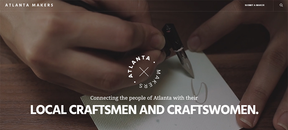
Like other examples of creative people or projects using Uncode, this Atlanta initiative is designed to bring the city’s artisans and craftsmen closer together. Based on an Uncode concept utilizing a video header, the homepage tells the story the city wants to be told.
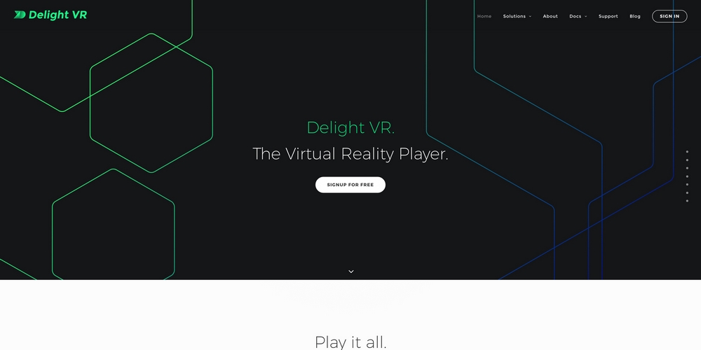
Creative tech is also a domain in which Uncode can perform in an amazing manner. Take this Virtual reality player, named Deligh VR – their website juggles with tech graphical elements, subtle effects (parallax, for example) and a minimalist look to get the job done. The result? An impressive presentation website for a sweet piece of tech.
What Makes Uncode Different?
For starters, Uncode is the first theme to prove that when you design a website with WordPress, you needn’t be confronted with strict rules or limitations. If you can think of it, you can build it.
Uncode offers tremendous flexibility. It enables you to create an unlimited number of websites, each one different from the next; even if you were to use the same starting point for each one. There are many different concepts of course; giving you that many choices as to what your starting point will be.
Here’s a taste of what comes in this unique theme:
- The Adaptive Grid System, the most advanced grid system of any WP theme; with all the options, elements, and juicy combinations you could think of.
- The most advanced thumbnails Masonry/Isotope and Carousel grid layouts you’ll find anywhere. You can use them in portfolios, for blog posts, for online stores, web pages, and – whatever.
- Hierarchical Theme Options, a cascade options system that you can define as a single type, or at the page level.
- The capability to create a color or typographic set that is available whenever a need for it arises.
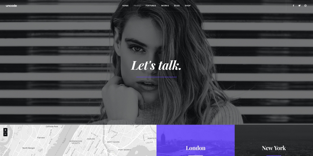
Discover this beautiful contact page here.
- A native header solution that you can adjust to match your creative vision.
- An Adaptive Image system. Instead of having to worry about visitors’ screen sizes, the system detects the screen size and makes the appropriate changes – while maintaining optimum performance.
The Autumn Theme Update Brings Even More Exciting Features
The following major updates were incorporated into Uncode’s Autumn release.
Related Posts
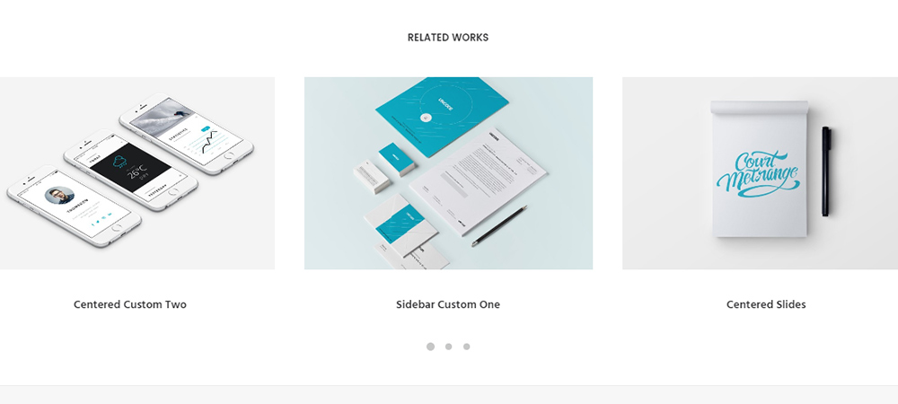
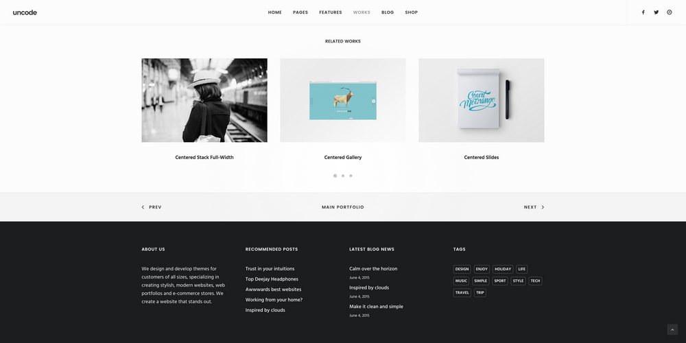
Using the Related Posts on the Portfolio Agency concept.
Displaying related posts can improve your SEO rankings. Related posts increase page views, and tend to keep visitors on your site or within your domain for a longer time. As a result, you should see a reduction in the bounce rate. The best way to display related posts is between the content and comments sections of a page.
Sticky and Hide Menu on Mobile Devices
The idea of the sticky menu came from within the Uncode community. A sticky or fixed menu remains fixed while scrolling in a mobile view. The mobile user has the option of displaying the menu or hiding it. This option presents the web designer with some attractive options that will only increase as small screens get higher resolution.
New Menu Layouts
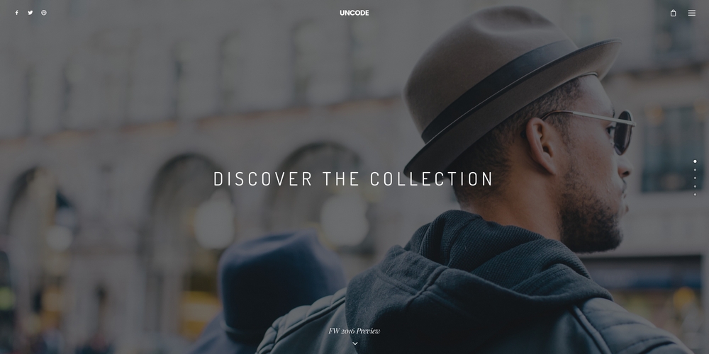
A beautiful overlay centered menu, suited with the overall design of the Shop Landing concept
The overlay centered menu is one of two menu option included in the Autumn update. This brings the total number of menu layouts to nine.
The Overlay Centered Menu – This off-canvas menu slides in from outside the viewport, pushing the page sideways. The menu items are centered and are vertically aligned.
The Center Split Menu – This menu displays the logo in the center of the screen. The menu items are positioned to the left and right of the logo.
To gain an even better understanding of the Adaptive Grid system, the visual concepts collection, and more, check out Uncode’s visual concept and showcase.

