Redacted Font
Back when I created client websites, one of the many things that frustrated me was the initial design handoff. It would always go like this:
- Work hard to incorporate client's ideas, dream up awesome design.
- Create said design, using Lorem Ipsum text
- Send initial design concept to the client with detailed explanation of why each piece should look the way it does
- Receive an email back with no comments except "I can't read the text" or "Why is all the text Italian" or "This makes no sense"
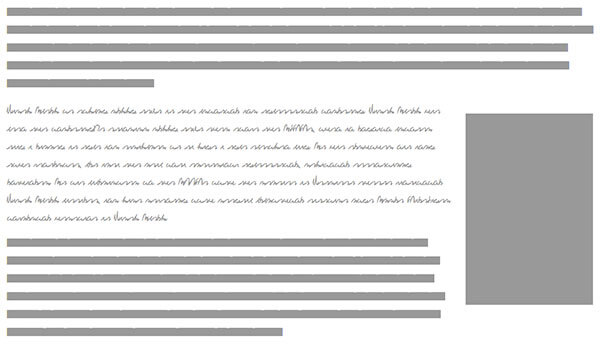
Always a wasted interaction that got in the way of making progress on the project. If only Redacted Font had been created back then. Redacted Font obscures text into straight blocks so the text is illegible but the viewer gets the idea of where text will be without caring what the text actually is. Here's an example:
So how does Redacted Font work? Essentially this project is just a bunch of font resources you can pull into your project. You will add these fonts to your stylesheet like so:
@font-face {
	font-family: "Redacted";
	src: url("Redacted-Font/fonts/web/redacted-regular.eot");
	src: url("Redacted-Font/fonts/web/redacted-regular.woff") format("woff"),
	     url("Redacted-Font/fonts/web/redacted-regular.otf") format("opentype"),
	     url("Redacted-Font/fonts/web/redacted-regular.svg#filename") format("svg");
}
With the font available, you can use it to make text within the page look redacted:
.prototype {
	font-family: "Redacted";
	color: #999;
}

.prototype-script {
	font-family: "Redacted Script";
	color: #999;
}
Redacted Font comes with Regular, Script, and Bold Script variants and works at all sizes.
The amount of face-palming Redacted Font would have saved me back then is incalculable. Redacted Font lets you create prototypes that represent real space without the hassle of real text.


Nice! It removes a distraction from the client so we can focus on the matter at hand. I am going to add this to my framework. No more being caught with Samuel L Ipsum on a mock-up.
Haha, I can relate to that all too well. Mr. Jackson has given me more than a few awkward moments.
But it doesn’t work on the hosting. Why? missed configuration?
I’m foreseeing the client complaining: “Why can’t I read the text? That font is terrible!” or “Where’s my text and what are those strips?”
Great idea. Can’t wait to try Redacted font.
why bother importing a font? You can do the same thing with unicode
The fun thing is that Italians say “Why is all the text in English” :)
Thank for sharing
Brilliant!
@maxart The font is “scribbly” enough for it to be obvious that it’s just filler text. We hope.
NICE!! you wouldn’t believe the amount of times a Client has said “I like the design, but not sure about the Italian text starting with “Lorem”, can we make it English please!”
This is one handy font. BTW – I discovered an interesting thing about it when I was working in Illustrator:
if you go to Type and click Create Outlines the solid lines will change into blocks that are the size of the words in the line….very nice if you want to see how word spacing looks…very nice indeed!
I used this for body copy on a production website and let’s just say the readers HATED it.
Um, I don’t think this is a very good idea, since typography is such a big part of any design. You just have to explain to the clients that the text is placeholder text. You can’t really judge a design if you can’t see the typography.
I agree with Daniel. Typography is part of the design (always was, but especially these days that we have all these web font choices) and most clients will be distracted by the blocks and complain about them.