Using pointer-events with Media Queries
We all know that there are a number of ways we can modify layout based on CSS media queries -- hell, we can even animate properties between media queries. One bit of outside the box thinking with media queries is deals with pointer-events. Using the pointer-events property, we can also enable and disable some functionality with CSS based on media query state!
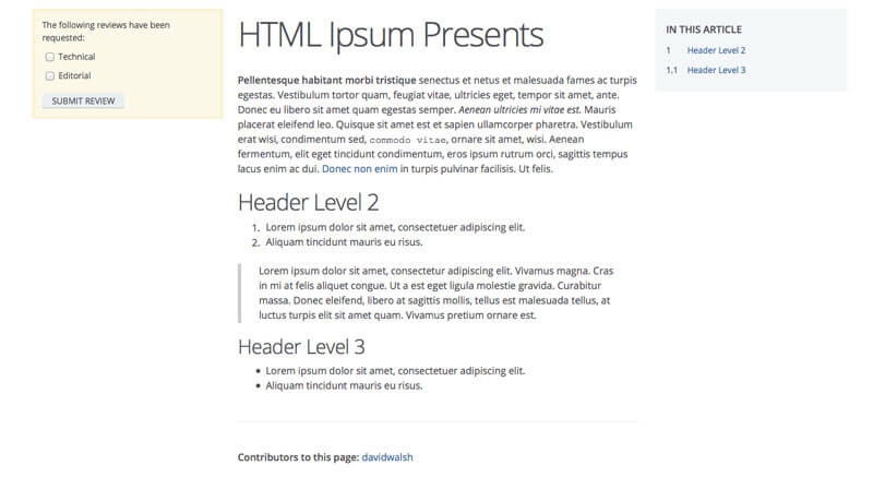
The scenario is one that's present in the current implementation of the MDN redesign. On the left you see article content, on the right you see a table of contents:

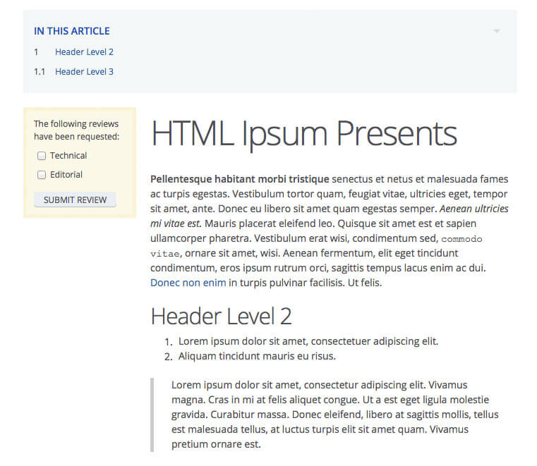
When pushed into the tablet media query, the table of contents should move above the content:

When on desktop, the table of contents should not be toggleable when the title is clicked. On tablet or other mobile device, however, the table of contents should toggle (slide up) when clicked to free up critical space, so as to avoid (possibly) loads of scrolling. I didn't want to use JavaScript to enable/disable the toggler, because...well...that would be inefficient. Instead I paired the pointer-events property with the tablet media query:
/* disable by default */
#toc .heading {
	pointer-events: none;
}
#toc i {
	display: none;
}

/* enable for tablet! */
@media only screen and (max-width: 760px) {
	#toc .heading {
		pointer-events: auto;
	}
	#toc i {
		display: block;
	}
}
I absolutely adore pointer-events because it even prevents click events from firing, thus the JavaScript I use to trigger the slide up/down doesn't occur. While I wouldn't say what I've done is overly clever, I would like to say that you should think about modifying more than just layout within different media queries. Oh, and also, pointer-events is awesome!


I like the theory in this! ,
but I can’t see myself being able to be so gung-ho about IE11+ CSS properties in
my professional life, haha… but it did spark a thought for me… a way of doing
this kind of thing without writing “if/else” into every event…
(function(){

  var tablet = 800, $win = $(window);

  $win.on("resize.binds", function() {
    if( $win.width() > tablet ) { responsiveUnbinds(); } else { responsiveBinds(); }
  });

  function responsiveUnbinds() {
    $('.el').off(".responsive");
  }

  function responsiveBinds() {
    $('.el').on("click.responsive", function() { /* ... */ });
    // loads of fun events that should only work on > tablet
  }

  $win.trigger("resize.binds");

})();
I’m sure you could optimize that even more! but it should avoid all the hassle
of events firing and then logic’ing
Seems to me like you’re using CSS for functionality instead of style. Of course this has been growing more and more (transitions and animation), but something like this seems shouldn’t be that hard to do without it. Interesting usage though.
Haha, i found pointer events also interesting until i figured out IE9 doesnt support it. And in real live you still have to support this browser unfortunately. It’s already hard to explain even some bigger companies that IE8 times should really be finally over now. And I also think twice before i try to implement stuff like this via javascript…