3 UX Lessons from Pinterest
Pinterest has exploded in recent years from obscure project to global phenomenon. Why? And how can Pinterest's user experience inform developers and designers of all sorts? Let's learn from some of Pinterest's bleeding edge design decisions.
Search vs. Browsing: How Do You Help Your Users Discover Content?
Pinterest is about discovery. It makes it so easy to find beautiful items and ideas. But how does a user experience balance user-led behavior (search) or an application-led behavior (browsing)?
It is a design challenge to balance accommodating both behaviors while still establishing some information hierarchy, so that users don't get confused. In Jakob Nielsen's heuristics, this is the balance between "Flexibility and Efficiency of Use" and "Aesthetic and Minimalist Design".
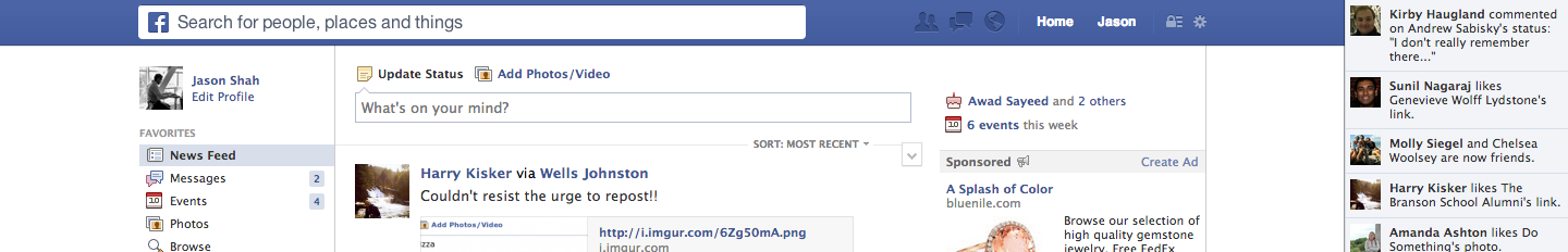
You could prominently slap the search bar across the top of the navigation above the main feed for browsing the way Facebook is testing here.
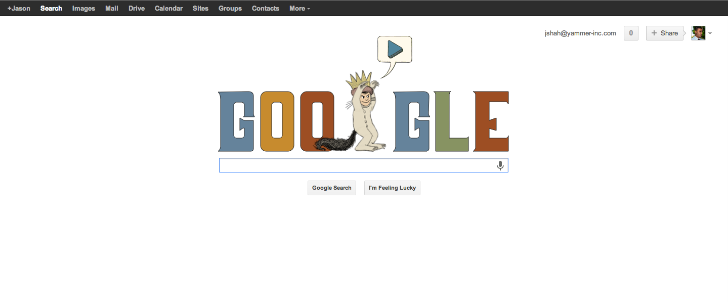
Or you could make a search-only experience the way Google has, with browsing reserved for the results section only. There is no default browsable content in Google Search because it is an intent-driven product in which you often know what you are looking for ahead of time.
But neither of these are ideal for Pinterest. Facebook likely weights search more heavily than Pinterest, given the rollout of graph search and the relatively larger and more complex data that Facebook users would be searching. Moreover, as mentioned above, there is user intent to harvest: with Facebook and Google, it's much more likely that you want to search for a person, topic, or other very specific object.
On the other hand, Pinterest heavily demotes search across platforms. For starters, it's easy to click on pretty pictures than figuring out what to search for and typing it in -- character by character -- into a search field you would have to first find, click into, and hit enter for...once your query was typed.
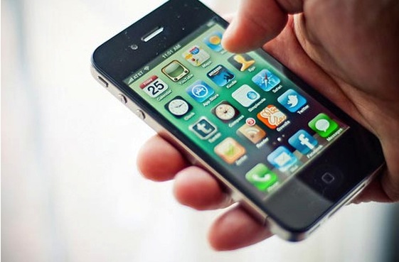
But on mobile especially, Pinterest recognizes the user context. Search is painful when you're on the bus, walking down the street glued to your phone, or in a crowded elevator. Your input accuracy, and consequently user experience, correlates positively with an input's ease of use. In other words, tapping on pictures is a lot easier than tapping 5-20 characters that each occupy less than a square centimeter on a just barely usable keyboard when you're in motion.
Pinterest on Desktop Web
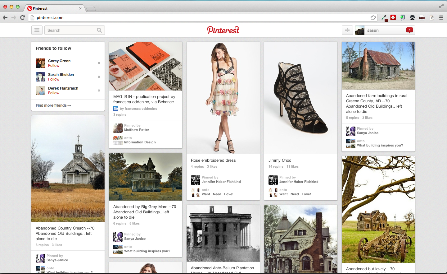
Here you can barely find search in the top left. It doesn't stand out because there is no color contrast. The images that are front and center capture attention. But it's there if you need it.
But on a mobile website, Pinterest product designers have even less screen real estate. Consider a 4.87" x 2.31" screen (iPhone 5) vs. 12.78" x 8.94" (13" Macbook Pro). That's approximately a 10x difference in surface area (11 sq. inches on mobile phones vs. 114 sq. inches on laptops).
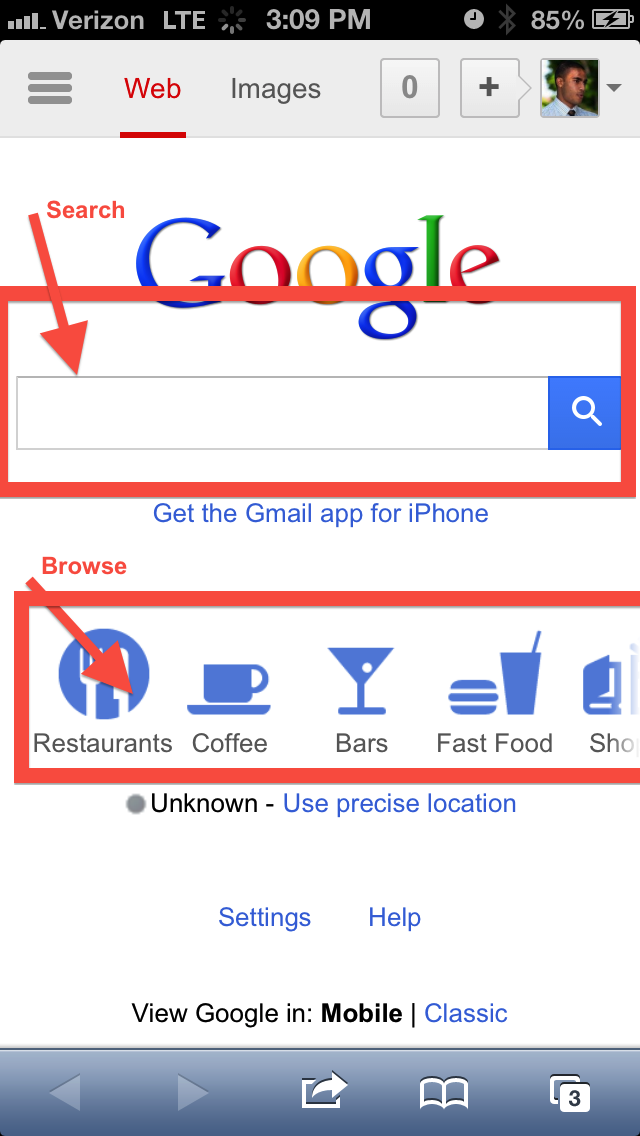
Pinterest on Mobile Web (iPhone)
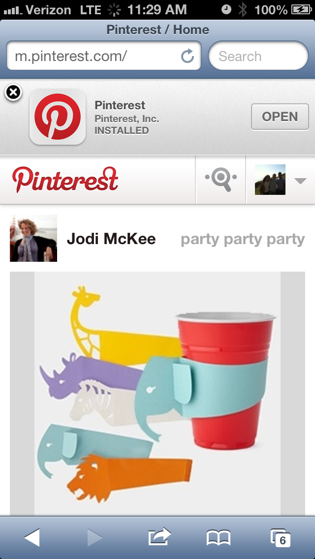
That's when you really see what their priorities are. Search is now hidden behind an icon, unlike Google.com on mobile (which is rarely used anyway, given that it's often built into the browser). But for Google, Search is the primary use case, so even with the limited real estate, exposing the search field by default is an immutable priority.
Google.com on an iPhone 5
Pinterest applies this same browse before search approach to its native mobile app.
Native Pinterest Mobile App (iPhone)
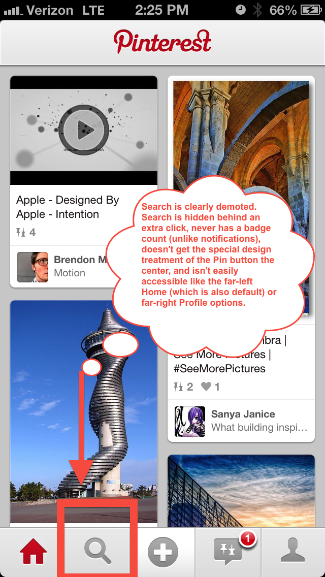
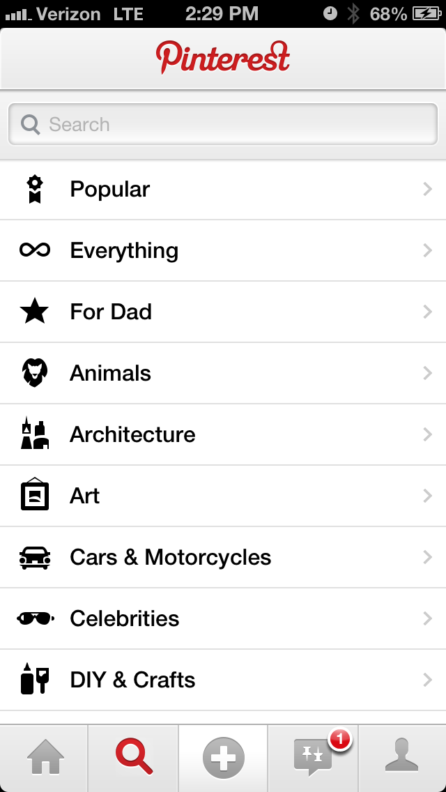
Search admittedly is just one click away. But the interface definitely demotes search through shadows, gradients, overlay objects (i.e. notifications), and deliberate ordering. Notably, even when you do choose to search for something, Pinterest really helps you avoid typing in favor for just tapping a category. Aligned with Hick's Law, Pinterest wants to reduce user's time-to-decision.
Which experience is the right one for people who use your app? Is the precision that search affords users more important than the effortless experience that browsing enables? Web developers and mobile app designers need to think hard about product priorities and user context when designing applications given how new screen sizes force prioritization like never before.
Go Where Your Users Go: Position Actions in Locations Users Already Gravitate Towards
Using HeatData, we found our biased, small group of users tend to scroll on the right side of the screen at an overwhelming rate on m.pinterest.com.
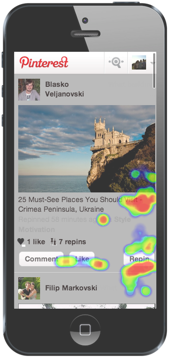
It's just a natural side of the screen -- not the center and not the left side -- for users to touch, assuming many users are right handed.
Credit: iaptouch.com
Notice they have put what I believe to be their most valuable user action "Repin" - not Comment, not Like, in that position. Repin is valuable because it adds content to the Pinner's board, generating more content and creating a ripple effect among the Pinner's followers -- unlike a one-way Like, and Repin is lightweight (unlike Comment, which requires the cognitive overload of thinking of a comment). Repins generate engagement for both users (in addition to the Pinner's following), and have become socially acceptable, whereas comments, I subjectively believe, require some form of greater intimacy between the Current Pinner and Original Pinner.
When designing your mobile interfaces, think about where your users feel the least physical pain in interacting. This draws from Fitts's Law, which "predicts that the time required to rapidly move to a target area is a function of the distance to the target and the size of the target". Based on the HeatData we collected and the observed size of the Repin button, Pinterest understands this law very well and has implemented a mobile design to maximize desirable user action.
Reduce The Amount of Time Needed for Rich Interaction
Products are driven by content - whether the product is a social network like Facebook (user stories and photos), a media platform like YouTube (user videos), or an enterprise tool like Salesforce CRM (sales records). Content. But how do you make your content interesting, especially in a world in which it seems like ADHD is on the rise alongside increased information technology in our lives?
Help people. It's simple. They click a button? They had intent. Facilitate that intent. Notice how Pinterest does it. Preselected Board. Pre-filled text using the object's meta-data.
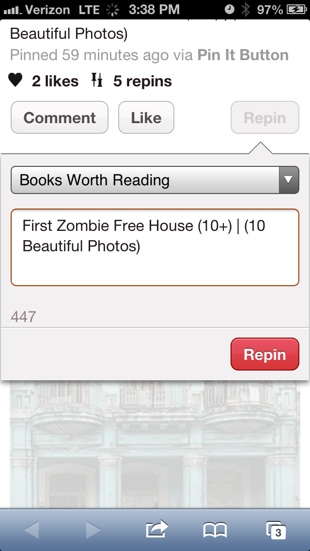
"Books Worth Reading" could have been instead "Choose a Board", which would have forced yet another decision on me. "First Zombie Free House (10+) | (10 Beautiful Photos)" could have been an empty text field. That's not engaging and it puts a burden on me to make yet another decision. But what they have done here is make it so I am just one more click away from Repinning, easy. They could have chosen to not have this overlay show, and just Repin immediately, but that likely leads to a less engaging experience in the long term. I would not have been able to organize the Pin into a Board, nor would I have associated any specific comments or metadata the way that this overlay allows me to do.
Summary: Prioritize Wisely, Optimize Based on Existing Behavior, and Eliminate Friction
Through the use of basic user interaction principles and custom HeatData, we made smarter product decisions. Pinterest has balanced consistency with customization across platforms in a way that matches the beauty inherent in the very products that they feature.
How do you achieve this in your own web and mobile applications?
Try HeatData: One Free Month
Want to see HeatData like we got for Pinterest? For Script and Style & David Walsh Blog readers, we're offering a free month of any HeatData plan. Just use promo code walsh in the next two weeks. Email jason@heatdata.com if you have questions!


About Jason Shah
Jason Shah is the creator of HeatData, an analytics tool for tracking and optimizing what people do on mobile websites. He blogs about user experience and personal growth regularly at blog.jasonshah.org and you can follow him @jasonyogeshshah


Never really believed into Pinterest for three reasons:
1/ Poor navigation (no next – previous button, really ? scroll down, click an image, then need to click back and you are at top of page so you scroll down again, really ?)
2/ Credit/Copyright/Source issue
3/ No backup feature; really why pinning if I can’t backup my pins ? Luckily I use IFTTT to backup all my pins in Google Drive.
but here they are !! and doing well !! and audience is broad (not only girl as in early years)
I’ve found pinterest to be difficult site to actually find great design. Sure you can type in design but the design style you’re looking for from the start is difficult to find. I only find Pinterst interesting as a central repository to house the designs I find online that I believe are great not the other way around. Thanks for the article!