Image Optimization Strategies Compared
We all know the stats. Slower website performance is strongly linked to higher abandon rates and lower conversions. What you may not know is that the main culprit is bloated web page payloads, bringing down our otherwise performant web pages via images.
That being said, images also drive conversions, social sharing, and overall visitor engagement; which is why their total usage continues to grow, regardless of the consequences.
Perhaps the biggest contributor to bloat is treating images like they are static content. The problem is compounded in a mobile-first future where a single web page may be viewed on a growing variety of screens, devices, OSes, and browsers.
The solution is to start implementing image optimization as part of your website development and maintenance. And, that begins by picking the optimal strategy for you.
However, image optimization can result in a major drag on your design and development process as well as add significant long-term maintenance. Not to mention its impact on resource usage and build times. There are many techniques you can use to optimize your images. Some are not easy to achieve manually. We will review the effectiveness of four strategies, increasing in their level of automation and dynamic optimization to specific devices.
As a benchmark, we're applying Responsive Image Syntax manually to the site so it responds to a few breakpoints with no specific image optimization strategy applied. Next, we look at Build-Time Optimization where an image compression tool assists in developing image variants during the building of the site. The third strategy is Run-Time Optimization, where an automated tool or online service applies generic optimization to an image or may take information from the browser and optimize accordingly. The final strategy is to include device and browser information (Device-Aware Optimization) to generate and deliver optimized images.
Quick Summary
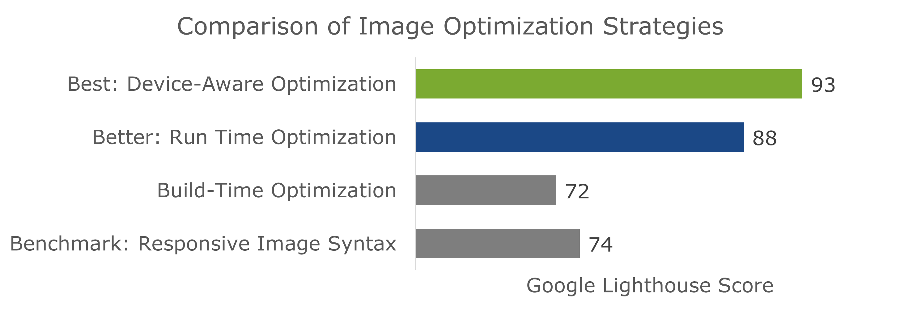
Going with a device-aware image optimization strategy will get you the best performance results. In this article, we will dive into the pros and cons of implementing these different strategies as part of your web app workflow.
Benchmark: Responsive Image Syntax
The end goal of image optimization is to increase your website's performance by having faster loading times. So, I ran a Google PageSpeed Insight audit on a page using each of the below strategies. Because it better highlights the performance of individual strategies, and because the future is trending towards mobile-first, we'll be running audits on mobile pages.
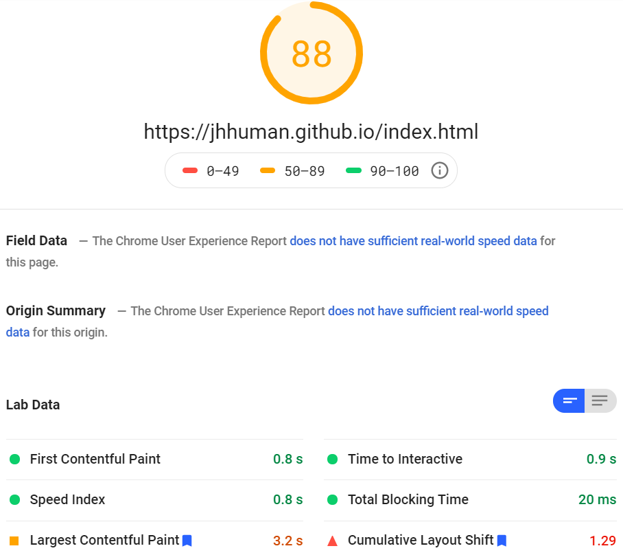
As a benchmark, I ran some tests on a page with no specific image optimization strategy other than using pretty standard responsive images syntax.
Responsive syntax works by providing browsers with a selection of the same image in different sizes, and then letting it pick the best one for the current viewport size.
To this effect, developers usually use several breakpoints to provide images for different viewport sizes. For example, mobile phone, tablet, and desktop displays.
The elephant in the room is that there are already thousands of different possible viewports out there in terms of dimension and size. And that sample size is growing by the day.
The obvious solution seems to be to add more breakpoints! However, this takes up more development time, leads to code bloat, and just looks messy. To illustrate, here is an example of the default responsive syntax with only four break points in the srcset:
<img srcset="image-1920.jpg 1920w,
  image-1280.jpg 1280w, image-640.jpg 640w, image-480.jpg 480w" sizes="(min-width: 36em) 50vw,100vw" src="image-320.jpg" alt="Responsive image syntax" />
Now, imagine this for every single image...
Importantly, each specified image variant needs to physically exist, taking up time to create as well as extra storage space.
You can also implement similar responsiveness using CSS media queries. Using the newer <picture> and <source> elements, it's possible to implement some art direction. However, both approaches don't solve the inherent issue with scalability.
The biggest nail in the coffin for relying solely on responsive syntax is that it doesn't feature run-time intelligence on context awareness. Every time you implement it, you're just making a best guess on which breakpoints to choose and which image sizes to serve. Also, there is no guarantee that the sizes and breakpoints of today will make sense tomorrow.. .
Pros:
- Don't have to pay for or subscribe to additional software/services
- Relatively easy and well-documented standard to implement
Cons:
- Additional storage requirements due to image variants
- Code bloat and introduction of more complexity
- Time and effort required to create variants and implement responsiveness
- Browser support as well as browser-specific implementations are a concern
- Doesn't adapt to different contexts, it simply selects the best match from available sizes and formats.
- Will still need a separate CDN if looking to further increase delivery speeds
- Ongoing maintenance to adapt to new devices, image formats, markets, practices
Speed Results:
Now, let's take a look at the performance results using the same image content, but with responsive syntax:
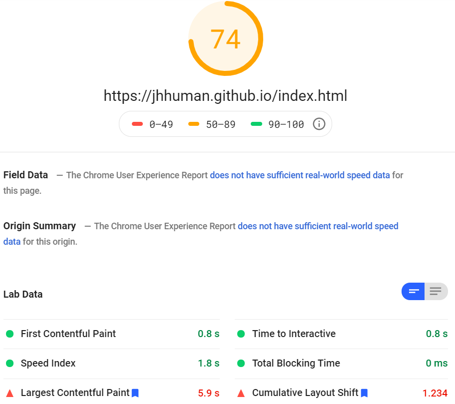
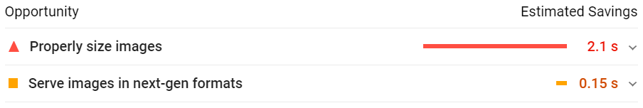
The benchmark didn't address efficient image formats or compression and could still improve when it came to optimal resizing:
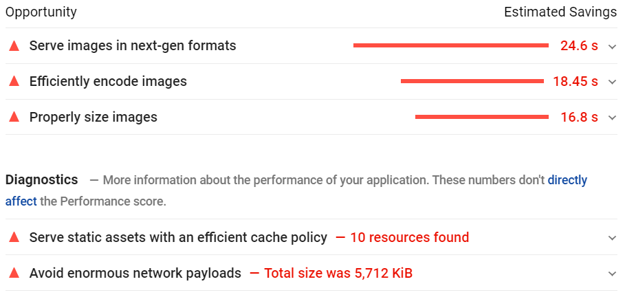
Now, let's see which of these opportunities each strategy addresses, and how they measure up.
Build-time Optimization
One way you can lighten the load of having to create variants is by using image editing or compression software. Kraken, compressor.io, mozjpeg, and squoosh are just some examples of these tools.
All you do is upload your images to the platform and the server processes and optimizes the images. You can then download the optimized images and use them in your project. Usually, you can set automatic or manual optimization settings. Controls typically include lossy or lossless compression, resizing, quality downscaling, etc. You might even be able to bulk request multiple sizes for all image files to use in responsive syntax.
Or, you can go all in and use task managers like Grunt or Gulp to optimize images by running jobs at build-time. One of the most functional and popular choices is using the JavaScript package, imagemin.
It can be installed as an npm package or used via the CLI. It's a modular solution with different plugins for compressing different image formats, like mozjpeg for JPEG or pngquant for PNG compression. In terms of the available image optimization controls, they are very similar to those of SaaS compression tools.
This is the most development-heavy strategy of the bunch. Even though you can bulk-process images with pretty extensive controls, you will also need to update your code from time-to-time to adjust to new developments in image formats or website design.
Pros:
- Image optimization happens on another server and doesn't impact your own build times
- Image processing is usually lightning fast, assuming you have a manageable number of images
- Can be integrated directly into your development and deployment workflows
- Some easy-to-use controls to adjust the image optimization settings
- Plenty of free tools or with relatively generous free plans
Cons:
- You need to use responsive syntax for image variants (with most of the same cons)
- There is still no run-time or context-aware optimization
- You still need an additional CDN for faster image delivery (although you will save on CDN usage)
- Significant upfront investment in developer time and effort if you want to take advantage of API and integration capabilities
- Need to reprocess all your images every time you want to create new variants
- Image variants need to physically exist and be stored somewhere
Speed Results:
Let's check out the results of using build-time optimization with responsive syntax:

While better than no strategy, the scores remained virtually unchanged from just implementing responsive syntax with no specific optimization strategy, sometimes even scoring worse. Properly resizing images as well as using next-gen formats were still concerns flagged by Google.
However, the good news is that the total image payload dropped to 1.4 MB which is about 80% less than no strategy and 50% less than pure responsive syntax.
Run-time Optimization
Whenever a device accesses a website page, the server performs an analysis of the request header it receives from the browser. This HTTP message contains certain information about the accessing context and preferred formats.
For example, the accept header on a Chrome browser looks like this:
image/avif,image/webp,image/apng,image/*,*/*;q=0.8
With the recently added client hints, even more fine-tuned content negotiation was made possible with the additional headers, such as the DPR and Viewport-Width.
Using this data, run-time optimizers can make certain decisions on how to compress and format images. However, you will still need to implement some kind of manual breakpoint-based logic for responsive resizing.
Some of the more popular SaaS options are Cloudinary and imgix. These platforms usually have an automatic optimization opt-in where the image server/proxy will decide how best to optimize the content. Or, you can specify transformations yourself with the API (usually, using simple URL parameters).
As part of the service, you'll also typically benefit from a CDN specifically for accelerating image content delivery. And, in the case of Cloudinary, it may come with DAM (digital asset management) capabilities as well.
Before you get too excited, there is no direct device detection. For example, while the HTTP headers, including a potential user agent client hint in the future, might tell you your content is being accessed from the Chrome browser on an Android device, it won't be able to tell you whether it's a Samsung Galaxy S20 or a One+ 8 Pro. You'll see why that leaves plenty of opportunities untouched below.
Images are also stored on the platform's servers, and not on your own resources. However, you usually have a fixed monthly quota of storage space with variants counting towards that quota.
Pros:
- Very little effort required to optimize images as part of your workflow
- Most likely includes an CDN service to accelerate delivery
- May come with other capabilities, such as a DAM or advanced image editing
- Automatic or manual image optimization via URL-based directives
- Takes over storage of image variants, freeing up local/cloud-based storage
- Almost no ongoing maintenance or readjustment needed
- Larger payload reductions than responsive syntax or image compression tools
Cons:
- Usually requires a pricey monthly subscription because you are paying for more than just image optimization
- Must update image tags to serve images from image service
- Responsive syntax still required for automatic resizing
- Potentially slower on first requests because the service would have to fetch the image from the origin and then optimize it on a complete cache miss.
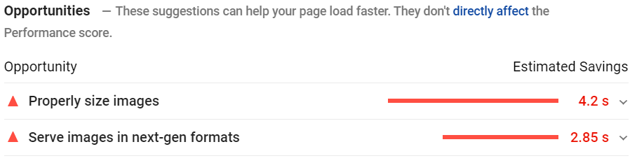
Speed Results:
Here are our run-time optimization results using Cloudinary with responsive syntax:
So, things are looking much better with the inclusion of automatic on-the-fly compression and formatting. However, we could still do with some finer image resizing:
Our total payload also significantly reduced to 897 kB, or by around 88%.
Device-Aware Optimization
Like the previous run-time tools, this approach consists of an image server that uses request headers to implement automated content negotiation for dynamic, context-aware optimization. For example, the browser may announce support for AVIF through the Accept HTTP request header. Then the image service would consider serving an AVIF image. However, it goes one step further.
One specific example is ImageEngine which uses WURFL device detection to glean all kinds of information from the accessing context. On top of the browser and OS, it can hone in on the exact make and model as well as in-depth characteristics of the screen, such as resolution, PPI, and more. It also features support for client hints including the save-data header, something not all run-time tools have.
This allows the image-serving engine to come up with much more fine-tuned image variants with optimal payload-to-quality ratios for any given scenario.
These image engines also serve images via a global image CDN to speed up delivery and improve cache-hit ratios. ImageEngine, specifically, has over 20 global PoPs with device-detection capabilities built into each of these edge servers.
This approach has a massive advantage in mobile-dominant internet markets. Because there are so many different types of devices with different underlying technologies and screen properties, you can get a lot more mileage out of a device-aware CDN than just a run-of-the-mill run-time tool.
However, these are usually much more specialized services that focus on squeezing every drop of juice out of your image optimization efforts. For that reason, they usually don't come with auxiliary capabilities, such as digital asset management.
This strategy also has virtually no development footprint. Once you've updated your img tag src attributes to serve images from your optimization server, there's nothing left to do. On an ongoing basis, the provider will update image optimization strategies for optimal results according to new trends (e.g. the new AVIF file format).
Pros:
- Minimal developer effort needed to implement or maintain
- Can effectively set-it-and-forget-it when using automatic optimization settings
- Automatic or manual image optimization via URL-based directives
- Largest possible image payload savings while maintaining maximum aesthetic quality
- Incredibly easy to implement and the solution can be live in a matter of minutes
- Usually offers the best value bandwidth-to-price offering
- No code bloat, no responsive syntax, and no breakpoints
Cons:
- Must update image tags to serve images from image service. However this is a simple one time effort.
- Requires a monthly subscription
- Potentially slower on first requests because the service would have to fetch the image from the origin and then optimize it on a complete cache miss.
Speed Results:
OK, so here is the final set of results, using device-aware run-time optimization.
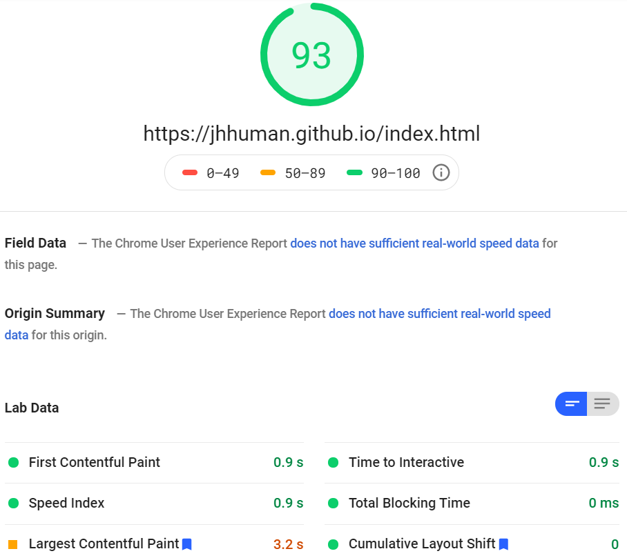
There were no more opportunities flagged by Google PageSpeed Insights, which is why a screengrab wasn't included here. Most metrics improved drastically. We also automatically use next-gen formats, including AVIF, with optimal compression according to the accessing context. Furthermore, images are automatically resized and scaled for various screen sizes.
In total, our image payloads were reduced by around 95%:
Conclusion
As you can see, all strategies have their pros and cons. There's no question that run-time (and especially) device-aware image optimization services have the edge because they rely on some real-time intelligence and sophisticated engines to optimally serve images.
These services will help you keep your development workflow lean with minimal upfront and ongoing investment to generate, maintain, and store image variants. Not to mention keeping your code clean thanks to avoiding messy and unscalable responsive syntax. It's also the more futureproof route as your image-serving engines will automatically adjust to optimally serve images according to new trends and markets.
There's also no need to worry about losing control over how your images are transformed, as you can usually apply certain transformations using APIs or simple URL parameters.
That being said, you will need a budget for them, although suitable plans for individuals and SMBs don't typically break the bank.

