Divi 2.4 – Tons of New Features. More Control than Ever Before
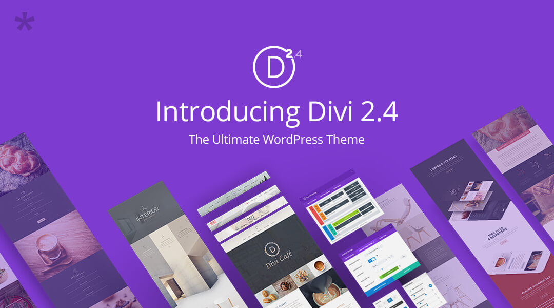
The magnitude of the Divi version 2.4 release may seem a bit of unusual for a theme that already has so much to offer. Nevertheless, portions of this theme, Elegant Themes' flagship theme, have either undergone significant improvement, or have been totally revamped. As a result, Divi is on the threshold of becoming even more popular than ever. Whether you choose to examine the pre-made layouts, the Modules section, the Customizer, the Library, or other key features, you will find improvements galore. The Divi page builder interface for example has always been user friendly - now it is even more so.
An Overview of a Monster Upgrade
Not all that long ago, Elegant Themes began publishing sneak peeks at what they had in mind for Divi's upgrade to version 2.4. These "teases" were impressive, but whether the theme's authors could deliver, remained to be seen. Divi 2.4 is here, and what was promised is now a reality.
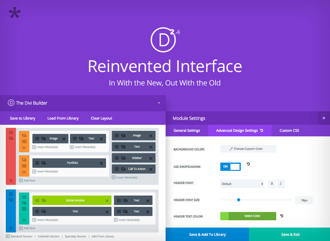
When you rework an extremely user friendly interface, in this case the Divi Builder Interface, and you go about it right, the end result is an ultra-friendly user interface, which seems to be the case here.
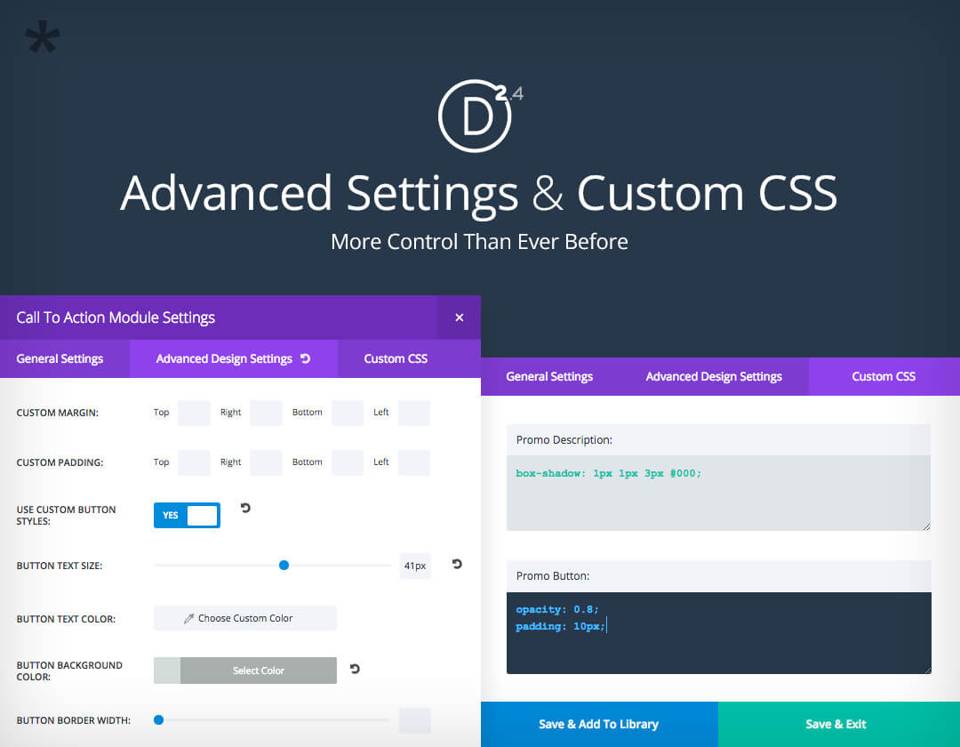
Divi's building block or module settings have always been noted for giving website developers a significant amount of flexibility in their design work. The advanced module settings, together with the ability to customize with CSS, takes this flexibility to the extreme.
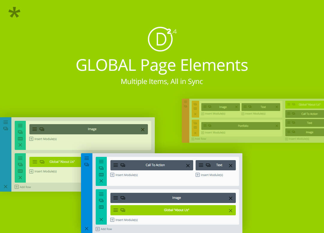
The very term globalization adds a new dimension to whatever it is applied to, whether it is a business, or in this case a website page element. When you change one element, the same elements residing elsewhere, are changed as well. This in itself can be a huge design and development time saver.
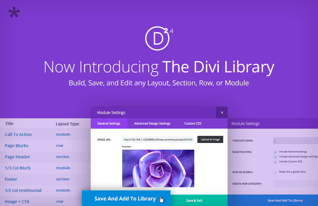
The Saved Layouts function, which did pretty much as its name implies, and not much more, has been transformed into the new Divi Library. More about this later, but both layouts and design elements can be stored, and even edited while residing in the library.
No less important is the introduction of the fluid grid. Like several other 2.4 upgrades, this new feature removes certain key design limitations, making Divi more productive than ever.
These, and few other features will be looked at in more detail. As you browse through all of the changes and additions, you will be hard pressed to find any other WordPress theme that has performed such a complete overhaul on an already widely popular premium theme.
What Divi 2.4 Brings to the Table - in Detail
The following accounts of Divi's major changes are not listed in any order of importance. Each and every one of them provides significant benefits to the user in one way or another. But a discussion of the Advance Module Settings gets things off to a good start, due to its huge impact on Divi's design flexibility feature.
Advanced Settings and Custom CSS
Greater flexibility with more control than ever: that's what has happened with respect to Divi's module or building block settings. Divi featured a large number of different modules to start with, each of which could easily be customized through the use of various settings. 100s of new and advanced design settings, which have been applied to every single module, plus the ability us enter CSS directly into a module or building block, gives the developer almost unlimited design flexibility.
The Library
A new modern library can always be an exciting place to visit, and this holds true for a WordPress theme's library as well. The old Divi library, which wasn't even called a library, was simply a repository for layouts. It was a necessary feature, but not a particularly exciting one. The new library, not only stores saved layouts, it can store sections, rows, modules and other elements as well. New sections, rows, or modules can even be created within the library, and layouts can also be edited within the library. Any library element can be accessed from the page builder, which indicates the Divi Library has been fully integrated with the page building process; definitely a major enhancement.
Globalization 101
Having discussed the exciting features the new Divi Library brings to the forefront, it is only appropriate to discuss globalization, in this instance the globalization of library elements, which may prove to be one of the major time savers featured in the 2.4 upgrade. Any instance of a section, row, or module that has been saved in the library, can be added to any number of layouts or pages at any time. If one of these elements is updated, all will be automatically updated. This process can be accomplished within the page builder itself or within the library.
The Divi Page Builder Interface
It must have been difficult to take a user interface which had a reputation for user friendliness and totally reinvent it, but that's what the folks at Elegant Themes chose to do. The result is an interface which is still just as easy to use, and perhaps a bit easier, but also offers the theme user quicker and easier access to this theme's many features, settings, and options. The result is an ingenious combination of easier to use, and more is better.
The Divi Page and Post Builder
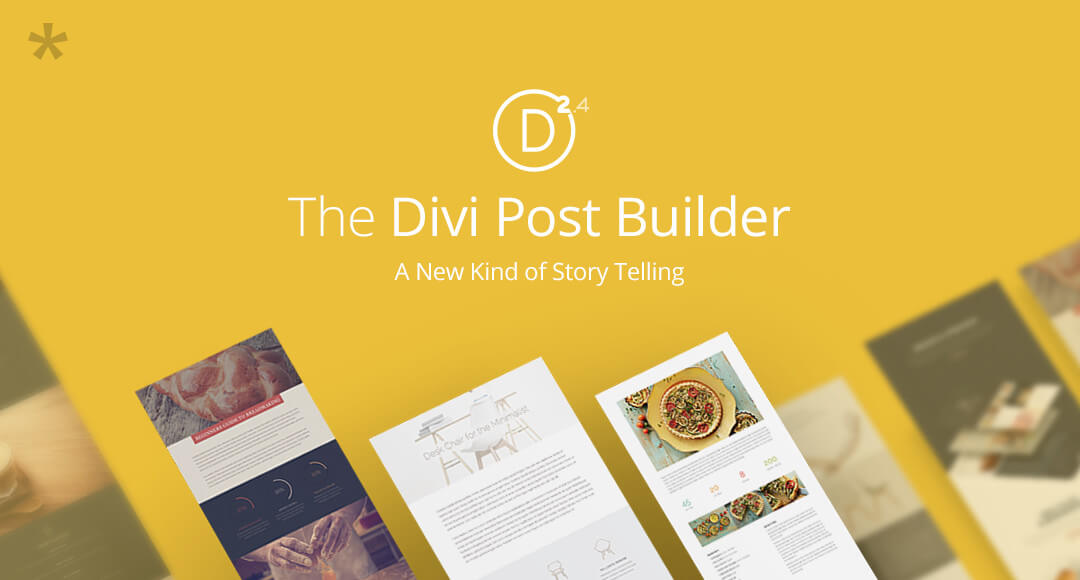
The Divi page builder could already be used to create posts, although the approach was to some degree cumbersome and not without its limitations. The 2.4 introduction of a special post title module makes creating a post a snap. This module places the post title, meta descriptions, and feature image blocks exactly where they are designed to be in a page builder layout. The designer is also given a choice of full-width or sidebar presentations.
The Improved Customizer Offers Increased Versatility
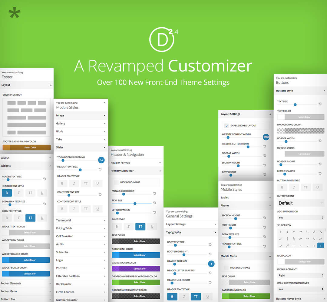
Divi's Customizer, which was already impressive, has not simply been improved upon. Like several other key features in this theme, it has been totally revamped. A number of features, such as theme settings, footers, display styles and module settings (mentioned elsewhere), have had certain past limitations removed, and additional options made available. Text styles, content widths, sidebar widths, tablet and phone displays, just to name a few, can now be controlled with precision as opposed to being chosen from a list of options. The result is a huge gain in versatility, and design flexibility as well.
Other upgrade features worthy of mention include the incorporation of custom spacing controls, where spacing's, paddings, and margins can now be highly customized, with limitations on content and sidebar widths having essentially been removed. The new Fullscreen Header Module fills the display, no matter what the platform, and comes with 24 unique layouts. Divi 2.4 also comes with new navigation options, new row options, and an impressive fluid grid feature. In summary, a designers creations can now be more versatile and adaptable than ever.
Should You Invest in 2.4?
The pros definitely outweigh the cons with this new upgrade. Negatives are difficult to come by. The only lacking feature might be that of a steep learning curve, but that is hardly a negative. Novice users might feel intimidated using Divi for the first time, but any information overload experience they have should be mitigated by the theme's quality user documentation. If you are already a Divi license holder, you may have the upgrade by now, but if you are new to WordPress themes, or if you have been using other themes up to now, Divi 2.4 is highly recommended.

About Kate Dagli
Kate enjoys writing roundups for web dev and technology websites. She is currently a staff member of the-webdesigner.co.


Seems to close the 20+ years old gap between print- and web-design, doesn’t it?!
One concern and question raised in my mind: I have read in a blog comment about a max. count of 4 columns per row!?!? Which sounds like a strange, crucial limitation. If this is true, it does not fit into Divi’s feature set. I mean, we use CSS-grids for some years now, and they always had 12+ columns. Any clues?