Automate Your Images with Cloudinary
If you work with images on the web, you've spent more than a few hours doing some of the following:
- Cropping and sizing an image just right to fit a layout. And then doing it again when the layout changes. And then again, and again, and again.
- Drawing upon years of experience and deep
superstitionsknowledge to selectheresy-best-practice-based image compression settings. - Trial-and-error-ing your way through selecting an optimal
number between 1 and 100image "Quality".
These chores are as old as the img element. But the web is a dynamic and ever-changing arena! Recent developments in responsive design are adding some wrinkles to our workflows:
- Generating large, medium, and small versions of every image on a site.
- Realizing that they actually, having a few sizes *between* those sizes would be great, too.
- Falling in love with the possibilities of art direction (while understanding that employing it requires even more more manual work and yet further resources-per-image).
- Wondering what a WebP is and how you would even go about making, (never mind deploying) one.
- Becoming overwhelmed with complexity and tedium.
Our practice is outpacing our toolset. Cloudinary is building a better set of tools. The benefits of being able to do all of the above dynamically using a simple set of (visible! version-controlled!) URL parameters are enormous. And today, Cloudinary has added something else to the mix: smarts and automation. Here's the pitch: using Cloudinary, you can generate one, canonical image. Cloudinary, then, is smart about your image's unique content and your users' varied contexts, and handles all of the details of tailoring content to fit context, supplying each user with an optimal resource and automating away the painful parts of putting images on the web.
How? Let's kick the tires on some of the new features.
Automatic format selection
We'll start simple. What's the first thing you have to do when saving an image for the web? Pick a format. Previously, Cloudinary could re-encode images on the fly based on the file extension given in the URL. So I could change this:
https://demo-res.cloudinary.com/image/upload/sample.jpg
To this:
https://demo-res.cloudinary.com/image/upload/sample.png

And convert a JPEG to a PNG with minimal effort. *Now*, I don't have to think about formats at all. This URL...
https://demo-res.cloudinary.com/image/upload/f_auto/sample.jpg

...delivers different formats to different devices, depending on both:
- The content of the image. Will it compress better as a PNG or, say, a JPEG?
- The user's specific context. Cutting-edge formats like Jpeg-XR and WebP aren't yet supported everywhere. We only want to send them to devices which can render them, and fall back to universally-supported formats on devices that can't.
Ok, now that we have a format, we need to pick a "quality".
Automatic quality/compression settings
Ah, image "quality". An integer between 1 and 100 that maps arbitrarily (and opaquely!) to dozens of low-level encoding settings; an input whose output varies wildly across formats, tools, and even types-of-images. There's no way to predict how an image with a "quality" of 75 will look (or how well it will compress) without intimate knowledge of the target format, encoding tool, and how that tool/format combo handles images "like" the one in question.
What's a web developer to do? Pick numbers through trial-and-error if they have time, and set-it-and-forget-it if they don't.
Cloudinary's new q_auto parameter taps into algorithms that analyze the particular characteristics of your image and understand how it will or won't compress in order to hit the sweet spot between small files and crisp images, automatically.
Compare this (117 KB image):
https://demo-res.cloudinary.com/image/upload/sample.jpg
to this (79KB):
https://demo-res.cloudinary.com/image/upload/q_auto/sample.jpg

The q_auto parameter cut file size by over 30%, with little-to-no visible effect.
(And if you ever find yourself wanting to tweak the default, you can via a simple, predictable scale)
Automatic smart cropping
Cropping an images to fit a layout – within a dynamic art-directed responsive design, or otherwise – is a hard problem to tackle at scale. It's simple enough to, say, automatically crop in on the center of an image, but algorithmically generating a crop that looks good and preserves the images' most important elements is challenging; most designers, at any rate, resign themselves to doing it themselves, manually.
Cloudinary provides a setting called "gravity" which allows developers to anchor their crops around a specific coordinate. Starting today, you can set the gravity of your crops to "auto" – and smartly crop your images, automatically.
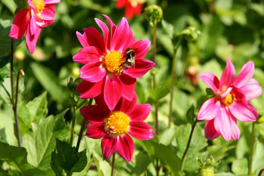
So, instead of getting this headless bee:
https://demo-res.cloudinary.com/image/upload/c_fill,ar_4:1/sample.jpg

We get this centered one:
https://demo-res.cloudinary.com/image/upload/c_fill,ar_4:1,g_auto/sample.jpg

Much better!
Automatic sizing for responsive design
Lastly, I want to talk about a feature that is helping to push the web forward, even though it may not quite be ready for production prime time.
We've seen how to set an image's delivered format, compression settings, and focal-point-for-crops to auto using the f_auto, q_auto, and g_auto parameters. What if you could set the size of the image to "auto" as well? You can! w_auto is here, and it serves up perfectly-sized resources for variable-width images in responsive designs, from a single URL.
Now, the bad news: the w_auto feature is built on a cutting-edge feature called Client Hints. Enabling Client Hints requires sending a special HTTP header, and to get the most out of Client Hints, you also need to add the sizes attribute to your images. Worst of all, Client Hints are only supported in Chrome at the moment; we're hoping Cloudinary's support pushes other vendors to pick up the pace on their implementations.
But! If you send the right HTTP headers and are using a supporting browser, variable-width responsive images with Cloudinary are as simple as:
<img
sizes="100vw"
src="https://demo-res.cloudinary.com/image/upload/w_auto/sample.jpg"
alt="1, 2, 3!" />
The future! Won't it be nice? You can try it (and everything else discussed here) today by signing up for a free Cloudinary account.

