CSS animation-fill-mode
We're always super excited to get into CSS animations because, quite frankly, they're incredibly awesome. One overlooked animation property, however, is the animation-fill-mode property. This CSS property sets the state of the end animation when the animation is not running. Here's a quick example:
@keyframes fadeIn{
	0% { opacity: 0 }
	100% { opacity: 1 }
}

.fadeIn {
	animation-name: fadeIn;
	animation-duration: 1s;
	animation-fill-mode: forwards;
}
In the case of my fadeIn animation, I want the element to stay at an opacity of 1 when the animation is complete. If I don't set the value to forwards, the element would go back to an opacity of 0 after the animation runs. In most cases, you'll likely want the the value of animation-fill-mode to be forwards, so don't forget to add it!
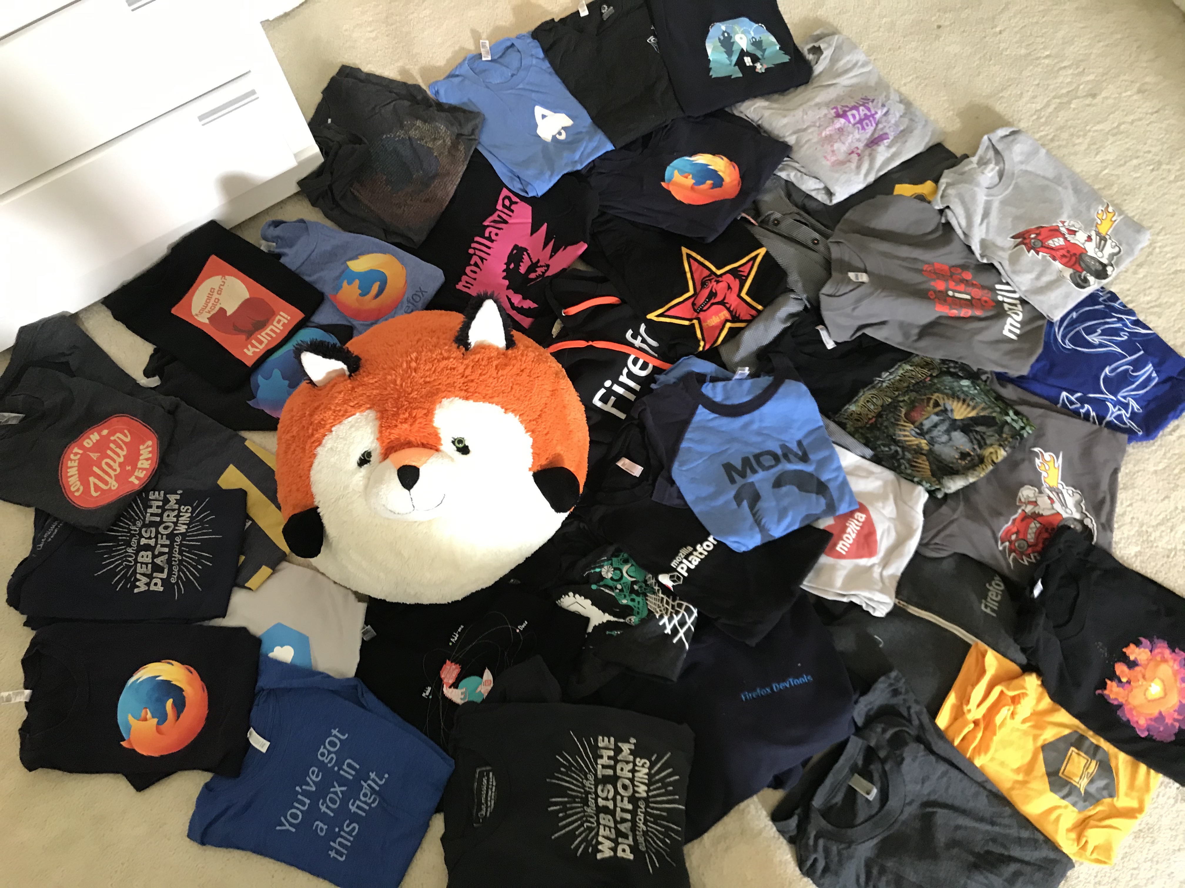
![39 Shirts – Leaving Mozilla]()
In 2001 I had just graduated from a small town high school and headed off to a small town college. I found myself in the quaint computer lab where the substandard computers featured two browsers: Internet Explorer and Mozilla. It was this lab where I fell...
![Create Namespaced Classes with MooTools]()
MooTools has always gotten a bit of grief for not inherently using and standardizing namespaced-based JavaScript classes like the Dojo Toolkit does. Many developers create their classes as globals which is generally frowned up. I mostly disagree with that stance, but each to their own. In any event...
![Use Elements as Background Images with -moz-element]()
We all know that each browser vendor takes the liberty of implementing their own CSS and JavaScript features, and I'm thankful for that. Mozilla and WebKit have come out with some interesting proprietary CSS properties, and since we all know that cementing standards...
![CSS Tooltips]()
We all know that you can make shapes with CSS and a single HTML element, as I've covered in my CSS Triangles and CSS Circles posts. Triangles and circles are fairly simply though, so as CSS advances, we need to stretch the boundaries...


Indeed, animation-fill-mode defaults to “none”, which means no animation style is applied when the animation starts or ends. You could expect “forwards” to be the default one, but… nope.
The other values are “backwards” and “both”. Cue to MDN page:
https://developer.mozilla.org/en-US/docs/Web/CSS/animation-fill-mode
> You could expect “forwards” to be the default one, but… nope.
This is why Max: http://www.w3.org/TR/css3-animations/
> The keyframes specify the behavior of one cycle of the animation… If a 0% or “from” keyframe is not specified, then the user agent constructs a 0% keyframe using the computed values of the properties being animated. If a 100% or “to” keyframe is not specified, then the user agent constructs a 100% keyframe using the computed values of the properties being animated.
> …by default an animation does not affect property values after the animation ends. The ‘animation-fill-mode’ property can override this behavior.
So, it is assumed that the non-animated state is the ‘default’ resting state for the animation.
This definitely helped me out a few times. I also like the “animation-direction” property, it can lead to interesting effects: http://cdpn.io/Kdslg