Adaptive Images
The landscape of web continues to change as we get more and more devices that we need to support. One concern when creating websites that should accommodate all screen sizes is image size. The acceptable size for an image is not the same across devices, so we usually end up compromising image size and quality on all devices; not the optimal solution, of course. Enter a solution called Adaptive Images, a PHP / .htaccess based solution for detecting screen size and delivering optimally sized images for the user's device.
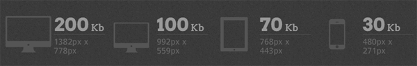
Adaptive images provides an outstanding set of instructions for customizing the images generated by PHP's GD library, so you aren't stuck with rubbish images. Do yourself a favor and check out Adaptive Images -- it could be the perfect solution for your website imagery needs.
![9 Mind-Blowing Canvas Demos]()
The <canvas> element has been a revelation for the visual experts among our ranks. Canvas provides the means for incredible and efficient animations with the added bonus of no Flash; these developers can flash their awesome JavaScript skills instead. Here are nine unbelievable canvas demos that...
![CSS Animations Between Media Queries]()
CSS animations are right up there with sliced bread. CSS animations are efficient because they can be hardware accelerated, they require no JavaScript overhead, and they are composed of very little CSS code. Quite often we add CSS transforms to elements via CSS during...
![Advanced CSS Tables II – Using Mootools JavaScript For Alternate Row Colors]()
![Implement the Google AJAX Search API]()
Let's be honest...WordPress' search functionality isn't great. Let's be more honest...no search functionality is better than Google's. Luckily for us, Google provides an awesome method by which we can use their search for our own site: the Google AJAX Search API.


This is the next BIG thing … I believe!
Will this method work with Joomla CMS sites?
It should — you’ll need to do your research about .htaccess though to make sure you don’t break Joomla.
One thing I noticed with this… it says the page loads a tiny bit of JavaScript first and creates a cookie with window size. That cookie is not going to be able to be read until the second page load. So this idea won’t work for the first time a visitor sees your site. Am I wrong?
You’re wrong ;)
If you include the script from an external file you’re right – because the time taken to fetch the external file is more than it takes to continue loading the HTML. But, if you have the code in the head (it’s only one line, and is more efficient embedded anyway), then the cookie actually gets set immediately, before the rest of the HTML has finished being loaded.
Try it – go visit http://adaptive-images.com on a large screen. If you see large images it worked, because if there isn’t a cookie set it delivers the mobile resolution, which are much smaller.
Here an alternative solution for adaptive images: http://litesite.org/holygrail/stage2/