jQuery Wookmark
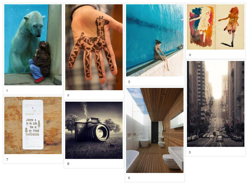
The first thing that hits you when you visit Pinterest is "Whoa, the columns are the same width and the photos are cut to fit just the way they should." Basic web users probably think nothing of it but as a developer, I can appreciate the effort that went into creating that design, both on the server and client sides. That's why I've fallen in love with Wookmark, a jQuery plugin to create the same consistent layout effect with imagery.
Let me show you how to use Wookmark.
The amount to work the developer has to do can be completed in just a few minutes. Start by including the images in any format; this example uses a list:
<ul id="tiles">
	<li><img src="images/image_1.jpg" width="200" height="283"><p>1</p></li>
	<li><img src="images/image_2.jpg" width="200" height="300"><p>2</p></li>
	<li><img src="images/image_3.jpg" width="200" height="252"><p>3</p></li>
	<li><img src="images/image_4.jpg" width="200" height="158"><p>4</p></li>
	<li><img src="images/image_5.jpg" width="200" height="300"><p>5</p></li>
	<li><img src="images/image_6.jpg" width="200" height="297"><p>6</p></li>
	<li><img src="images/image_7.jpg" width="200" height="200"><p>7</p></li>
	<li><img src="images/image_8.jpg" width="200" height="200"><p>8</p></li>
	<li><img src="images/image_9.jpg" width="200" height="398"><p>9</p></li>
	<li><img src="images/image_10.jpg" width="200" height="267"><p>10</p></li>
	<li><img src="images/image_1.jpg" width="200" height="283"><p>11</p></li>
	<li><img src="images/image_2.jpg" width="200" height="300"><p>12</p></li>
	<li><img src="images/image_3.jpg" width="200" height="252"><p>13</p></li>
	<!-- ... -->
</ul>
Images should optimally be preprocessed on the server side to the same width, however, you can still force widths if desired. With the images in place, you can use the jQuery plugin to do the dirty work:
$(document).ready(new function() {
	// Call the layout function.
	$('#tiles li').wookmark({
		autoResize: true, // This will auto-update the layout when the browser window is resized.
		container: $('#tiles'), // Optional, used for some extra CSS styling
		offset: 2, // Optional, the distance between grid items
		itemWidth: 210 // Optional, the width of a grid item
	});
});
Wookmark also includes a few additional options to customize the look of columns and can resize the column widths to a window resize -- excellent!
Wookmark is a plugin that does one thing exceptionally well. If you'd like to create an elegant, uniform photo galleyy, give Wookmark a try and I think you will be impressed!


Great plugin.
I didn’t know it. Thanks for sharing.
Isn’t this very similar to the old & great Jquery Masonry?
How does this differ from the Masonry Plugin?
Looks nice. I will try it.
Merci
Perfect , just what i been looking to applay on some of my desing, thank you D.
Is there any decent mootools equivalent ?
Wookmark is not smart enough when dealing with image loading, try Masonry, it comes with
imagesLoaded(), it helps u a lot:)Not true:
(function ($){ $('#grid').imagesLoaded(function() { var options = { align: 'center', autoResize: true, comparator: null, container: $('.mainwrap'), itemWidth: 348 }; var $handler = $('#grid li'); $handler.wookmark(options); }); })(jQuery);This is the first thing came in my mind when i saw pinterest.. but now i came to know it’s a plugin.
i love this type of UI, specially horizontal sliding. Windows 8… Awwww m crazy for that, n thinking to apply that in my new blogging site !!!
Nice plugin, but – i see the autoresize here, but it didn’t works at the demo page
Thanks very much for that post.
I was searching for the same for long and ended up in ipin wordpress plugin. But now i can do my website on my own php code :-)
Thanks David
Wookmark works fine with imagesLoaded and also with more content as images only.
Have a look at our Blog. My initialization looks like this:
var container = $('.content'); container.imagesLoaded(function() { // Prepare layout options. var options = { align: 'left', // no horizontal centered layout autoResize: true, // This will auto-update the layout when the browser window is resized. container: $('view-content', container), // Optional, used for some extra CSS styling offset: 20, // Optional, the distance between grid items // itemWidth: 211 // Optional, the width of a grid item }; // Get a reference to your grid items. var handler = $('.view-content > li', container); // Call the layout function. handler.wookmark(options); });Sorry David, your Code Editor works not so good. Can you clean up my posts, please.
Hi David nice post, FYI your demo link at the top is pointing to the webkit filters article though.
This plugin is great easy to implement and very functional thank you!
Hi David
Another cool post man! Not many people know about this plugin.
I’m sharing all options for the woomark plugin as configurable bits with a live preview
http://bitconfig.com/woomark/bitconfig_woomark.html
Thanks David
– Patrick
Its a good script..but only works with images and if u specifie h and w of the image..othervise items goes on each other and doesnt work..
Hi, I am facing the following problem and I need your help I suggestions. I am redesigning a travel portal site using umbraco and I am using wookmark in front page to load images from articles. The problem is that the articles are more than 1000 so I need a lazy load for every 60 articles. On wookmark examples there is an example with lazy load but the example is using jquery and copy the first 10 items from the example list. Here starts my problem. The list of articles exists in the razor page. How to append more li items in wookmark ul from within jquery with values from the list of the articles which is a razor variable? I will appreciate your help.
Does Wookmark plugin have an option to handler the url for a filtered result, such as adding an anchor to the url? I’ve building a website and the main menu contains the wookmark filters, so, the menu will be included into all pages. My problem is: when the user is on another page, how can I “make a link” for the previous url which should be return the results filtered by wookmark? Is is possible to add an anchor to the url in order to handler the filters?
Thanks and congratulations for the plugin!
I was searching for the same for long and ended up in ipin wordpress plugin.
Great plugin.
Hello. Great plugin. But i have one problem. I need add new block after wookmark complete.
I have ajax loader to add new image into page. How i can restart wookmark to add new DIV
Hi
I want to make first item bigger than other items. Is this possible?
Thanks in advance.
When I put the local (correct) path to css and js file the page goes gray without showing any of the pictures. When I preview it at github preview here, the page is gray as well.
http://htmlpreview.github.io/?https://github.com/germanysbestkeptsecret/Wookmark-jQuery/blob/master/example-load-images/index.html
Any thoughts?
This is a great grid. Does anyone know if it is possible to sort Ascending and and descending with the sort option?