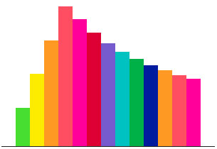
Parallax Sound Waves Animating on Scroll
Scrolling animations are fun. They are fun to create and fun to use. If you are tired of bootstrapping you might find playing with scrolling animations as a nice juicy refreshment in your dry front-end development career. Let's have a look how to create animating sound wave using Skroll.js.
The HTML
Firstly we'll create a container with all our parts.
<div id="soundWave">
    <div class="part p1"></div>
    <div class="part p2"></div>
    <div class="part p3"></div>
    <div class="part p4"></div>
    <div class="part p5"></div>
    <div class="part p6"></div>
    <div class="part p7"></div>
    <div class="part p8"></div>
    <div class="part p9"></div>
    <div class="part p10"></div>
    <div class="part p11"></div>
    <div class="part p12"></div>
    <div class="part p13"></div>
</div>
Each part represents a block in the wave.
The CSS
Add CSS to position our sound wave in the middle of the page and give each part a different background color.
.soundWaves {
border-bottom: 1px #222222 solid;
width: 300px;
height: 200px;
position: fixed;
top: 50%;
left: 50%;
margin: -200px 0 0 -150px;
}
.partsContainer {
position: relative;
width: 240px;
height: 200px;
left: 30px;
}
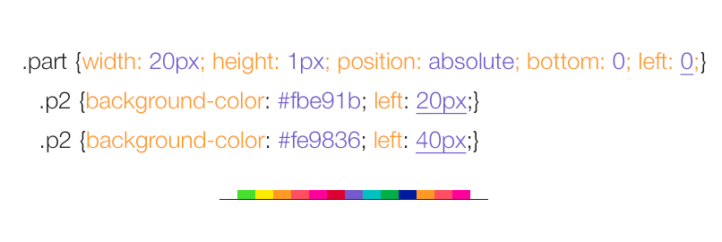
.part {
width: 20px;
height: 1px;
float: left;
}
.p1 {background-color: #4fdc3f;}
.p2 {background-color: #fbe91b;}
.p3 {background-color: #fe9836;}
.p4 {background-color: #fd5064;}
.p5 {background-color: #ff159b;}
.p6 {background-color: #da0638;}
.p7 {background-color: #755eca;}
.p8 {background-color: #0dc2c0;}
.p9 {background-color: #00ae4c;}
.p10 {background-color: #00239b;}
.p11 {background-color: #fe9836;}
.p12 {background-color: #fd5064;}
.p13 {background-color: #ff159b;}
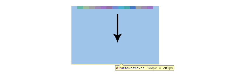
Using float to position our parts won't create a good base for us -- we need to tweak the CSS to align everything with the bottom edge of the parent container. Let's change it from float: left to position: absolute.
.part {
    width: 20px;
    height: 1px;
    position: absolute;
    bottom: 0;
    left: 0;
    transform-origin:50% 100%;
    -ms-transform-origin:50% 100%; /* IE 9 */
    -webkit-transform-origin:50% 100%; /* Chrome, Safari, Opera */
}
.p1 {background-color: #4fdc3f;}
.p2 {background-color: #fbe91b; left: 20px;}
.p3 {background-color: #fe9836; left: 40px}
.p4 {background-color: #fd5064; left: 60px}
.p5 {background-color: #ff159b; left: 80px}
.p6 {background-color: #da0638; left: 100px}
.p7 {background-color: #755eca; left: 120px}
.p8 {background-color: #0dc2c0; left: 140px}
.p9 {background-color: #00ae4c; left: 160px}
.p10 {background-color: #00239b; left: 180px}
.p11 {background-color: #fe9836; left: 200px}
.p12 {background-color: #fd5064; left: 220px}
.p13 {background-color: #ff159b; left: 240px}
We have changed the position of all the parts to position:absolute and bottom: 0, which means that we also need to define left offset, otherwise all parts would be sitting on top of each other.
Now when we have them aligned to the bottom edge, changing their scaleY will make them animate up instead of down.
Notice that we have also included transform-origin: 50% 100%. This moves the point from which the scaleY is calculated to the bottom of the element instead of the default center point.
Step 3 - Init Skrollr and Add Some Jazz
We'll initiate Skrollr below the reference to Skrollr.min.js just before the end of the body.
<script src="js/skrollr.min.js"></script>
<script type="text/javascript">
var s = skrollr.init();
</script>
And add our first data attributes. We'll use absolute values in this demo.
<div class="part p1"
    data-start="transform: scaleY(1)"
    data-1000-start="transform: scaleY(200)"
    data-2000-start="transform: scaleY(1)"
    anchor-target="body"
></div>
By setting these data attributes we are creating an animation keyframes.
data-start contains our initial value, that is similar to our value in the stylesheet.
data-1000-start is the scale of the part when the user scrolls 1000 pixels down the page and data-2000-start is the scale at 2000 pixels scroll top position.
We want to create a wave, which means that we will need to add the same increment to each of the following parts.
<div class="part p2" data-start="transform: scaleY(1)" data-1250-start="transform: scaleY(200)" data-2250-start="transform: scaleY(1)" anchor-target="body"></div>
We are increasing the second and third offset value, which creates the desired wave effect. We are also repeating the same increment for all other 13 parts.
Also notice that we don't need to set the height of out page, Skrollr is smart enough and calculates it for us automatically.
There you have it: a nice simple sound wave created using Skroll.js. Learn more about Skrollr, parallax and scrolling animations in Petr's Parallax Scrolling Master Class, enter our giveaway below.
Giveaway
Enter to WIN a Parallax Scrolling Master Class by Petr Tichy. An online course teaching you how to create a parallax scrolling website from start to finish using Skrollr.js! How do you throw your hat in the ring? In the comments below, post a link to your favorite use of the parallax effect. There are many great ones out there so to win you better bring an A-quality effect!


About Petr Tichy
Petr is a professional front end developer passionate about pixel-perfect code, innovative digital products and state-of-the-art websites.


Awesome parallax effect using skroll.js :) I have seen a good one here http://journey.lifeofpimovie.com/. It is said that parallax effects are used to tell a story. and this page does it well.
Thanks:
Sanjeev
Neat demo. Would be very interested in taking a master class on creating parallax animations! This site is one of my favorites: http://cyclemon.com/
This parallax script looks very nice on desktops, but unfortunately does not work on iOS… In case someone is working on a responsive website and want this to work on tablets or mobiles, need to rethink the approach…
Hi Paulo, there are two options when it comes to parallax scrolling effects and responsive websites. You could turn Skrollr off using something like enquire.js or include #skrollr-body in the HTML markup to keep the animations working on mobiles and tablets.
The approach really depends on many factors like project deadline and the complexity of your layout and animations.
Awesome and nice demo.
Yep parallax is certainly doing the trick, here is some awesome examples
http://www.ciceron.com/2013/12/upon-design-storytelling-parallax/
I had this list of bookmarked websites that use parallex , and i really liked them:
http://www.nintendo.com.au/gamesites/mariokartwii/#home
http://www.diesel.com/timetravel/diesel.php
http://4nparis.com/en
http://ledbow.cz/home
My favorite example has been around for awhile, but it is very well done. The marriage invitation website for Jess & Russ http://jessandruss.us/ is one of my favorite uses of parallax in the net. It tells a warm and complete story and really demonstrates what the medium can accomplish.
I would love to take a skrollr.js class!
Cheers:
Mike
Hey! how are you!
Firstable I have to say that I’m a big fan of parallax, so, I gonna put some examples that blew my mind! (And cause I want to win also! haha)
This is one of my favorites : http://nasaprospect.com/
This is great cause the flat design is awesome! : http://letsyep.com/en/
This is one of the fanciest, simple but great : http://www.discovershadow.com/
This one is so freaking psychedelic : http://www.kilfish.com/v6/#/home
This one is short, but is gorgeous! : http://www.mahedineyahia.fr/ (And he is only 20 years old! ha!)
And this one is pretty cool and unique! : http://andrevv.com/
I hope you like it!
http://activatedrinks.com/
Has always been a favorite of mine. Love the way it starts by having the bottle uncap as you scroll.
This is my fav. parallax website. I wanna make this such website one day, for personal use :)
http://makeyourmoneymatter.org/
Nice, I like demo.