Dijit’s TabContainer Layout: Easy Tabbed Content
One of Dojo's major advantages over other JavaScript toolkits is its Dijit library. Dijit is a UI framework comprised of JavaScript widget classes, CSS files, and HTML templates. One very useful layout class is the TabContainer. TabContainer allows you to quickly create a tabbed content layout with minimal effort. Keep reading to see what you can create in just 10 minutes!
The Basic Dijit HTML
<style type="text/css">
	/* bring in the claro theme */
	@import "http://ajax.googleapis.com/ajax/libs/dojo/1.5/dijit/themes/claro/claro.css";

	/* bring in the widget-specific CSS classes */
	@import "http://ajax.googleapis.com/ajax/libs/dojo/1.5/dijit/themes/claro/layout/ContentPane.css";
	@import "http://ajax.googleapis.com/ajax/libs/dojo/1.5/dijit/themes/claro/layout/TabContainer.css";
</style>
<body class="claro">
The first piece of HTML requires grabbing the required CSS theme files and adding the theme name as a class to the BODY tag. All widgets on the page will use the claro theme unless otherwise specified. Once we have those details out of the way, we can code the HTML structure of TabContainer and ContentPanes:
<!-- will set the eventual dimensions for the tab container -->
<div style="width:600px;height:300px">

	<!-- will host all tabs and their content panes -->
	<div dojoType="dijit.layout.TabContainer" id="tabContainer" style="width:100%;height:100%;">

		<!-- content panes: title is tab name, make this tab selected -->
		<div dojoType="dijit.layout.ContentPane" title="Rod Stewart" selected="true">
			<p>Roderick David "Rod" Stewart, CBE (born 10 January 1945)[1] is a British singer-songwriter...</p>
		</div>

		<!-- content panes: title is tab name, no special features here -->
		<div dojoType="dijit.layout.ContentPane" title="Oasis">
			<p>Oasis were an English rock band that formed in Manchester in 1991...</p>
		</div>

		<!-- content panes: title is tab name, make this tab closable -->
		<div dojoType="dijit.layout.ContentPane" title="ColdPlay" closable="true" onClose="alert('Closing Tab!');">
			<p>Coldplay are an English alternative rock band...</p>
		</div>

		<!-- content panes: title is tab name, load content remotely, preload -->
		<div dojoType="dijit.layout.ContentPane" title="SomeBand" href="some-page.html" preload="true">
			<p>Lorem ipsum...</p>
		</div>

	</div>
</div>
You'll notice the dojoType attribute on a few of the DIVs; that means we're creating our widgets declaratively, not programatically. We'll address what that means in a moment. For now, realize that the dojoType attribute's content is the name of the JavaScript class that it will become. The title attribute text will become the actual tab's content. Adding a selected attribute will make the given tab start as the selected tab, and adding a closable attribute will make the tab closable.
So how does Dojo know to turn these boring DIVs into rich widgets? parseonLoad!
Including Dojo with parseOnLoad; Requiring Dijit Widget Classes
<script src="http://ajax.googleapis.com/ajax/libs/dojo/1.5/dojo/dojo.xd.js" type="text/javascript" djConfig="parseOnLoad:true"></script>
We start by pulling Dojo into the page with a normal SCRIPT tag (AOL CDN, Google CDN, local build). Note that I've added a djConfig attribute with parseOnLoad:true; -- this will instruct Dojo to scour the page looking for Dijit widgets once the required classes have loaded. How do we require the proper classes? By using dojo.require, of course:
<script type="text/javascript">
	/* require necessary classes */
	dojo.require('dijit.layout.TabContainer');
	dojo.require('dijit.layout.ContentPane');
	dojo.require('dijit.form.Button');

	/* when all classes have loaded... */
	dojo.ready(function() {
		/*
			don't need to do anything programmatically!
			parseOnLoad and dojoType does the magic!
		*/
	});
</script>
With the proper classes loaded, Dojo will now find all widgets and inject widgets into the page as necessary.
That's It?!
Yep. The demo I've provided to me roughly 10 minutes to create. I spent more time looking for information on Wikipedia than I did putting together the tab layout. I really love the declarative method of widget creation -- it's less JavaScript write and quicker to code. What you shouldn't lose sight of is that you can also control the Dijit widget programmatically after it's been created.
Dynamically Adding Tabs
To this point our layout is static and was built declaratively. Let's add a Button widget to the page that, when clicked, adds a new tab to the container:
<button dojoType="dijit.form.Button" id="addButton">Add New Tab</button>
<script type="text/javascript">
dijit.connect('addButton')
dijit.byId('tabContainer').addChild(new dijit.layout.ContentPane({ title:'New Tab!', content:'This is new content!', closable:true }));
</script>
I've used onClick to add a click event listener to the button which programmatically adds a new ContentPane to the TabContainer. We start by grabbing the widget with dijit.byId and proceed to add the new ContentPane instance as a child. The object properties passed as parameters should be self explanatory but there's one more bonus -- if you prefer to loaded content from another file via AJAX, all you need to do is provide the file path via the href property. You may also preload the content of that pane by setting the preload property to true:
<button dojoType="dijit.form.Button" id="addButton" onClick="dijit.byId('tabContainer').addChild(new dijit.layout.ContentPane({ title:'New Tab!', content:'This is new content!', closable:true }));">Add New Tab</button>
Doesn't it seem almost too easy?
TabContainer Accommodations
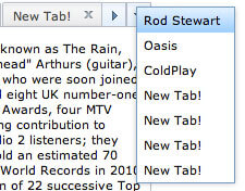
Another awesome part of using Dojo TabContainer is that the class monitors the number of tabs and, if the tabs stretch further than the container's width, will add scrolling left and right controls as well as a table of contents dropdown to easily navigate through the tabs. Additionally, the tab system is completely accessible and keyboard shortcuts work wonderfully!
You may also designate where tabs should display: right-h, left-h, bottom, and top, which is the default. These options are placed within the tabPosition setting:
<div dojoType="dijit.layout.TabContainer" id="tabContainer" style="width:100%;height:100%;" tabPosition="right-h">
Your layout changes simply by providing one parameter!
Possibly the best part about Dijit is just how easy it is to take a static set of HTML markup and make it dynamic, especially when using the dynamic method of widget creation. I encourage you to give Dijit a go by starting with this tutorial. I also encourage you to take a look at Dojo's infamous Theme Tester page. Theme Tester will show you just about every widget within Dijit in one spot.
Have any questions about jumping into Dijit? Ask away!





Dijit works best when used in web apps. I found this breaking after parsing of dojo’s parse on load a lil annoying, but it’s easy to work around with a loader spinner and this code:
dojo.addOnLoad(function() { dojo.query('#urWraperId').style({display:''}); dojo.query('#urLoaderSpinner').style({display:'none'}); });Hey Cesar,
Pete Higgins wrote up a nice blog post on implementing a loading indicator with dojo if you’re interested in taking a peek: http://www.sitepen.com/blog/2008/10/06/implementing-a-web-application-preloading-overlay/
Sean
woow its really cool tabs system Dojo got a nice UI systems?
Dojo has OUTSTANDING UI systems.
Hello David!!!
Great work!!
Do you have this example in jquery framework…? I´m very interested in this solution..
Or, how develope this example on a jquery plattform…?
Regards….and thanks!!!
jQuery UI has a similar tab widget system but it’s not nearly as advanced as Dojo’s.
Ok…thanks for the tip!!
look in while comment :D
awesome tabview, and this is the tab container ck ck ck…
Thanks, David.
I just have one question regarding the claro CSS that is applied when the tabs are on the left (tabPosition=”left-h”). When clearing browser cache via a refresh (Command + Shift + R with Firefox), the border is broken on the left hand side of the content pane? Do you know why? I’ve been tinkering with Firebug, but I’m hoping you’ll have a quick answer :)
I’ve tested this with your example here:
http://davidwalsh.name/dw-content/dojo-tabs.php?position=left
Any suggestions?
Thanks,
Brock
… hmm, my observation isn’t limited to your example, David. I also see the same issue here: http://archive.dojotoolkit.org/nightly/dojotoolkit/dijit/tests/layout/test_TabContainer.html
Any ideas on how to get around this? Does it happen because the layout dijits begin rendering before the CSS is entirely downloaded and processed by the browser?
*bump* :) Any feedback on this CSS flaw, David?
Here is that piece of code,over here I have declaritively given href to calendar.html…..The calendar.html which is also made with dojo works fine when run alone…But when I do it through my other page called admin.html, the page calendar.html is displayed in the content pane but it does not show any of the dojo effects like validation & a calendar widget etc..
I am looking to add tabbed content to emails that we generate, but find that the code the code that works on the web will not transfer into emails. Will your product generate code that will?
Hi all..
how to pass the values dynamically when v add the child tab using tab container..can anyone help me in this..
Thanks in advance…
Hi David,
Nice post — thanks.
Do you have any tips on how to style the tabs themselves, i.e. the clickable bits?
Would be nice to be able to round them and possibly make them full width, i.e. expand to fill the whole horizontal space (if there are three, each takes a third of the whole pane width, etc.)
Best regards
hello, I m using this tab container but there is a problem. I want to change the css property of the stylesheet claro.css. The property p{} is making some problem to another element of the page. How can I do this??
Hi there David,
I’ve been following your blog for a number of years and I think you for your contribution to the net. I have declared a tab container and pragmatically creating tabs dependent on conditions met but, I always get those three long buttons at the top. One pointing down, the other pointing left and finally the last one pointing right. I know I could easily hide these with CSS but would rather not in case I need them later. Also, this does not happen with the declarative example. Any ideas?
The TabContainer class has “useMenu” and “useSlider” properties — if you set them to “false”, I imagine those controls would go away.
Hello, this is really great I have been looking for this kind of example with no luck maybe my search queries to google were not right. Though I have one question. Am developing a data grid and after the information is displayed. I want to provide a link for various information about let’s say an Item, then when clicked I want to add new tab which has data about that item so in my case you add new tab button will be a link in my case and also I want to change the text color of the tab title is active and leave other tabs with the original color. Please help. Thanks
Hello,
Thank you for this excellent resource :-) I am looking for some advice, maybe somebody could help:
The ‘table of contents dropdown’ is a very powerful feature. Is there away I can activate this by adding a separate button to my page? I want to add an icon call ‘Workflow’ which also revels the ‘table of contents dropdown’. Some users currently miss this feature.
Or, could I change the current ‘down arrow’ icon with an alternative which draws the users attention to it???
All help/advice gratefully revived.
Please assume that I am stupid, I am self taught and most things are new to me.
Best regards,
Chris