Create a CSS Cube
CSS cubes really showcase what CSS has become over the years, evolving from simple color and dimension directives to a language capable of creating deep, creative visuals. Add animation and you've got something really neat. Unfortunately each CSS cube tutorial I've read is a bit long and a mixes visual style with the cube basics, so I've decided to write a post which provides just the basic detail needed to create a CSS cube. I'm basing my example off of an outstanding CodePen demo by Mircea Georgescu.
The HTML
The cube element, a wrapper in itself, will actually have a wrapper of its own:
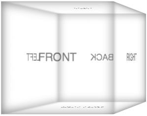
<div class="wrap">
	<div class="cube">
		<div class="front">front</div>
		<div class="back">back</div>
		<div class="top">top</div>
		<div class="bottom">bottom</div>
		<div class="left">left</div>
		<div class="right">right</div>
	</div>
</div>
Each face of the cube will have its own element. As you can imagine, we'll be CSS-ing the hell out of them to put them in the proper position.
The CSS
Let's take this one meaningful bit at a time. The first meaningful element is the entire animation wrapper, which will provide a CSS perspective for the 3D element:
.wrap {
	perspective: 800px;
	perspective-origin: 50% 100px;
}
CSS perspective is a difficult concept to explain but MDN does a great job so I wont duplicate their explanation. To better understand perspective, I recommend modifying the perspective property to see how it effects the demo. Next up is the cube container which will hold all of the different cube faces:
.cube {
	position: relative;
	width: 200px;
	transform-style: preserve-3d;
}
The cube will be 200 pixels wide, with relative positioning so that the absolutely positioned faces will stay within bounds. We'll also use preserve-3d to keep the element 3D and not flat. Before getting to any of the specific face rules, there will be a few general styles that will apply to each face:
.cube div {
	position: absolute;
	width: 200px;
	height: 200px;
}
With the position and dimensions of the faces set, we can get to creating the transformation code for individual faces:
.back {
	transform: translateZ(-100px) rotateY(180deg);
}
.right {
	transform: rotateY(-270deg) translateX(100px);
	transform-origin: top right;
}
.left {
	transform: rotateY(270deg) translateX(-100px);
	transform-origin: center left;
}
.top {
	transform: rotateX(-90deg) translateY(-100px);
	transform-origin: top center;
}
.bottom {
	transform: rotateX(90deg) translateY(100px);
	transform-origin: bottom center;
}
.front {
	transform: translateZ(100px);
}
The rotateY values rotate the faces of the to move the face show the text at the correct angled, while the translateZ setting moves the elements forward and backward within the stack. The translateY setting may be confusing, but note that it represents raising or lowering a face to show 3D effect via the transparent panes. Each face has its own translations settings to place them in the appropriate place, so feel free to modify those values to see why each corresponds to its face.
Horizontal Spinning of the Cube
Of course, what good is a 3D element set without animating it. The answer: none. No good at all. So here are a few steps we need to take to making our precious cube animate horizontally:
@keyframes spin {
	from { transform: rotateY(0); }
	to { transform: rotateY(360deg); }
}

.cube {
	animation: spin 5s infinite linear;
}
Probably easier than you think, yes? The text looks correct due to the facing rotation we implemented originally, and I've used keyframe animation in case we want to add more sexiness in the future.
Vertical Spinning of the Cube
Spinning the cube vertically should simple require changing the animation to Y axis, right? Unfortunately not -- the panes as they are would show text backward in some cases, so we'll need to revise the rotation of a few elements:
@keyframes spin-vertical {
	from { transform: rotateX(0); }
	to { transform: rotateX(-360deg); }
}

.cube-wrap.vertical .cube {
	margin: 0 auto; /* keeps the cube centered */

	transform-origin: 0 100px;
	animation: spin-vertical 5s infinite linear;
}

.cube-wrap.vertical .top {
	transform: rotateX(-270deg) translateY(-100px);
}

.cube-wrap.vertical .back {
	transform: translateZ(-100px) rotateX(180deg);
}

.cube-wrap.vertical .bottom {
	transform: rotateX(-90deg) translateY(100px);
}
... as well as change the animation.
Flattening the Cube
To remove the 3D look of the cube, and simply display one block at a time (without other face hinting), remove the perspective and origin settings from the wrapper:
.wrap {
	/* no more perspective */
	perspective: none;
	perspective-origin: 0 0;
}
Now the only one face will display at any given time.
CSS cubes have been around for a while but I hope this article simplified their composition enough for you to attack your own. And don't get discouraged if you run into issues creating your cube -- I did too! I look forward to seeing what you create!


Just a note, Firefox handles the cube in the same way as Chrome, if you add
pxafter the numerical value, as stated here: https://developer.mozilla.org/en-US/docs/Web/CSS/perspective :perspective: 800px;Excellent — updated and works great!
I love how CSS evolved in the last few years. It’s been progressing faster and faster. :) I wonder where it will be in 5 years^^
How much more complicated would it be to rotate the cube diagonally?
Changing the perspective-origin would allow you to do so!
Thanks for the great tutorial! I used it for a CodePen I was working on. http://codepen.io/cliffpyles/pen/LHlqa
Thanks for the tips and code, this is really useful!
Awesome demo, like you say its great to see how far css has developed and progressed, exciting to see where things are going.
Nice article and demo. Such a shame FF doesn’t anti-aliase as well as Chrome does, but at least it’s not as pants as Opera and IE10 which still aren’t on-board with any of this :-(
Did you know that if you add a transparent outer box-shadow of 2px or more, then Firefox will render anti-aliased.
Hey, look my plugin for automatize this work :)
http://github.com/ivanbanov/polygonJS
“The rotateY values rotate the faces of the to move the face show the text at the correct angled” that text doesn’t read very well.
This is amazing!
Any ideas on how to get it to work on IE 10 ?
IE10 doesn’t work because the method described here requires
transform-style: preserve-3d;to be applied. Basically, in the method above, you create a box by transforming each of 6 faces, wrap those faces in a container, then animate the container (and its contents) in 3D space. IE10 does 3d-transforms, but it will not calculate a 3d-transform within another 3d-transform.To make it work, you can transform and animate each face relative to a central point. Note that each face must also be facing the correct direction for text to render properly.
See the Pen Pharma package in CSS (@jeffballweg).
“>http://codepen.io/jeffballweg/pen/ogxeaB/) by Jeff Ballweg (@jeffballweg).
Very nice tutorial.
I’m just struggling with making the cube in % instead of px
Can it be done?
Thanks – very useful.
Doesn’t seem to work correctly on Chrome 31 though.
Works for me on Mac / Chrome 31.
Interesting post! Unfortunately your Demo link goes to the Firefox animation (fire tail). At least this was true on Feb 10, 2014. Would love to see the Demo to determine if I should read the article in more detail. Thanks…
Displays correctly for me: http://davidwalsh.name/demo/css-cube.php
Seems to work now… thanks…
Would it be possible to make the cube smaller? I have been unable to make everything line up when I try. This is an awesome demo by the way! Thanks for sharing!
Hi, how to build a “block” shape?
I mean the height and the width is different
Check out my 3d cube with rotating sides, it uses mouse and touch events to allow you to move it, while keeping the content of each side rotated the right way.
http://jordizle.com/demo/376/3d-interactive-cube-with-rotating-sides-using-css3-and-javascript/
I have a cube with various rotations, and want to have a more realistic shadow (actually, an ellipse). So I made this code to emulate it, based on your code:
http://jsfiddle.net/ktuw2rbr/
Is made for Chrome only (later I will modify it). The rotation is infinite, and I want to avoid the last anticlokwise jump of my shadow.
Any idea about to solve this problem?
works really well for me in linux firefox and chromium. I was struggling with it because I wanted to use percentages instead of absolute sizes, but percentage sizes don’t work with the rotating cube. However I found if I used VW units I could get the resizing I wanted and have it work with the rotating cube style. Not a solution for everyone I’m sure but still useful for a lot of situations.
Very nice! It was fun to follow these instructions and create some thing really amazing!
Taking CSS coding skills to another level! Really nice piece of code to fiddle with and use it as a basis to create other figures.
Great tutorial… thanks! Just a minor note: syntactically, the transform-origin property expects x-axis (left|center|right), then y-axis (top|center|bottom). I was getting lint errors until I realized your demo has them reversed (i.e. center left). Fortunately, most browsers can interpret these correctly.
http://www.w3schools.com/cssref/css3_pr_transform-origin.asp
This works very nice, i have added the vendor prefixes and cannot get it to run on mobiles.
I just get the initial frame front view, has anyone experienced the same?
How could i fix it, it works on mobile sizes on chrome devTools, but not on real mobile devices.
Thanks for any input
nice work, but it does not work in IE10+, here is a solution: http://www.joer-marzinzick.de
Hi, I am using the same css for my jquery code, however when I touch/swipe the cube to rotate it, it moves fine till the left side, however when you touch the left side to move it to the front it rotates anticlockwise to move back to front showing the back and right slide which I dont want. It should move clockwise back. Can anyone help me with this
How can i convert the whole cube to image?
Hi,
This one I will try out too. I just put one on my site today, bit different code, but now it seems that only in FF the cube pauses a very short while after every square, also on this demo. I haven’t seen that laggy behaviour before, what can that be? In Safari, chrome it is just fine!
In IE10 and 11 only a rotating flat square…hmmmm
Hi Dave!
This example works great except in Safari and Chrome on iPad. I don’t know how to get this working on iPad. Do you have a solution for this?
Here’s a small script that uses these CSS properties to create rotating pages with some Javascript.
https://github.com/Warsaalk/Polytate
I want to make this code dynamic so that it can work with images( I have done the changes to show the images), I want to show lets say 10 images and render them in the cube format, any idea how can I do that?
In case somebody need to change the with quicker (it’s for the horizontal one), done with SCSS:
https://codepen.io/rbalet
actually the cube won’t work without:
.cube div {
    position: absolute;
    width: 200px;
    height: 200px;
    background: rgba(255,255,255,0.1);
    box-shadow: inset 0 0 30px rgba(125,125,125,0.8);
    font-size: 20px;
    text-align: center;
    line-height: 200px;
    color: rgba(0,0,0,0.5);
    font-family: sans-serif;
    text-transform: uppercase;
}