Crafting Twelve-Column Layouts with Flexbox
If there's one thing flexbox excels at, it's twelve-column layouts. In a twelve-column layout, the page is broken into twelve invisible columns. These columns have small amounts of space between them, called gutters. The page is divided into rows, and the containers in the rows take up a certain number of columns.
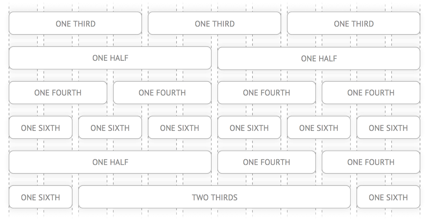
If you start to look for them, you'll see twelve-column layouts everywhere. Take a look at these landing pages from Heroku, ChowNow and Square. Notice how the sections are broken up into halves, thirds and fourths?

In this article, I'll show you how to use flexbox's flex-grow, flex-shrink and flex-basis properties to build twelve-column layouts, without the need for a library!
This article is an excerpt from Unraveling Flexbox, a book and video series on building flexbox layouts for the real world. If you like this post, be to check out the full series and subscribe to the Free Flexbox Starter Course.
Setting Up the Container
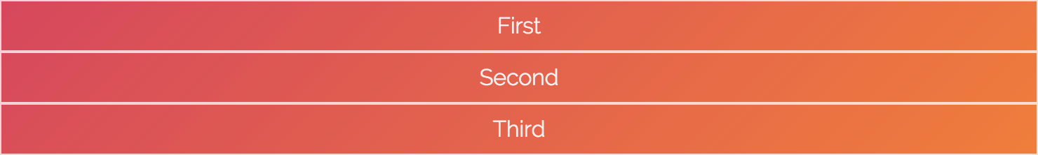
Let's say you want each of the <div> elements in the following HTML to take up a third of the <section>.
<section>
  <div class="column">First</div>
  <div class="column">Second</div>
  <div class="column">Third</div>
</section>
By default, the <section> element takes up 100% of the width of the screen. Start by limiting its width to 740 pixels. While you're at it, also add some space around the columns.
section {
  max-width: 740px;
  margin: 0 auto;
}

.column {
  margin: 10px;
}
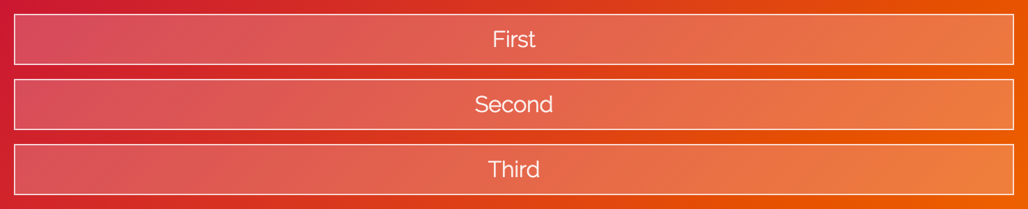
Pop open the code examples and try dragging your browser window until it's smaller than 740 pixels. Notice how the <section> gets smaller as the screen shrinks, but stays fixed when the screen is larger than 740 pixels?
Flexin' It Up
Make the <section> a flex container by setting it's display to flex.
section {
  max-width: 740px;
  margin: 0 auto;
  display: flex;
}

By default, flexbox sets the widths of the columns to the size of their content. You can change this behavior by using the flex-grow and flex-shrink properties.
The flex-grow property tells flexbox how to grow the item to take up additional space, if necessary. flex-shrink tells flexbox how to shrink when necessary. Since we want the columns to behave the same while growing and shrinking, set both of these properties to 1.
.column {
  margin: 10px;
  flex-grow: 1;
  flex-shrink: 1;
}

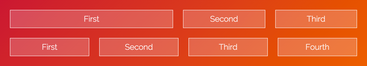
Woohoo! The flexbox container now fills up three columns. The values for flex-grow and flex-shrink are proportional, meaning they change relative to other items in the flex container. Flexbox adds the values for the properties and then divides each column's value by that sum. So each column takes up 1 ÷ (1 + 1 + 1), or ⅓ of the total space.
What happens if one of the columns has a different value?
.column:first-of-type {
  flex-grow: 2;
  flex-shrink: 2;
}

The first column takes up the same amount of space as the other two. That's because the values add up to 4, so the first column is:
2 ÷ (2 + 1 + 1) = ½
The other two are:
1 ÷ (2 + 1 + 1) = ¼
All About That Basis
If you look closely at the last example, you'll notice that the first column doesn't quite cover half of the container. If you add more content to the third column, you can really see the problem.
<section>
  <div class="column">First</div>
  <div class="column">Second</div>
  <div class="column">
    The third column, with more content than
    before!
  </div>
</section>

What's going on? Why is flexbox not flexing correctly?
It turns out flexbox doesn't distribute space evenly to each column. It figures out how much space each column starts with, specified by the flex-basis property. Then, the remaining space is distributed using the flex-grow and flex-shrink properties.
This might seem confusing, and that's because it is. The way this stuff adds up is really complicated, but don't worry, you don't need to understand the nuances to use flexbox.
Since we don't care about how much space the content originally takes up, set flex-basis to 0.
.column {
  margin: 10px;
  flex-grow: 1;
  flex-shrink: 1;
  flex-basis: 0;
}

.column:first-of-type {
  flex-grow: 2;
  flex-shrink: 2;
  flex-basis: 0;
}

Tah-dah! It works! Well, kind of—there's one last thing to fix.
More Flex Basis
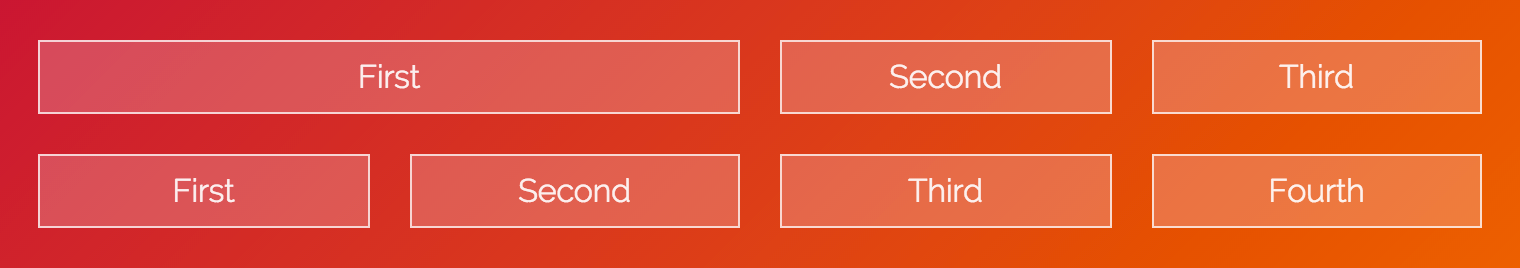
If you add another section below the first, you can see the problem.
<section>
  <div class="column">First</div>
  <div class="column">Second</div>
  <div class="column">Third</div>
</section>
<section>
  <div class="column">First</div>
  <div class="column">Second</div>
  <div class="column">Third</div>
  <div class="column">Fourth</div>
</section>
.column {
  margin: 10px;
  flex-grow: 1;
  flex-shrink: 1;
  flex-basis: 0;
}

section:first-of-type .column:first-of-type {
  flex-grow: 2;
  flex-shrink: 2;
  flex-basis: 0;
}
Why don't the columns line up? It's because flexbox includes the padding, border and margin in the basis when it calculates how big the item should be.
The first and second columns in the second row have 22 pixels between them (20 pixels for the gutter and 2 pixels for the borders). We can add this missing space to the first column in the first row by setting flex-basis to 22px.
section:first-of-type .column:first-of-type {
  flex-grow: 2;
  flex-shrink: 2;
  flex-basis: 22px;
}
Shorthand
Together, flex-grow, flex-shrink and flex-basis form the cornerstone of what makes flexbox flexible. Since these properties are so closely tied together, there's a handy shorthand property, flex, that lets you set all three. You can use it like this:
flex: <flex-grow> <flex-shrink> <flex-basis>;
We can rewrite our CSS to look like this:
.column {
  flex: 1 1 0px;
}

section:first-of-type .column:first-of-type {
  flex: 2 2 22px;
}
Ahh, that's better. Why the 0px in the first flex declaration? There's a bug in Internet Explorer 10 and 11 that ignores flex if the basis doesn't include a unit.
That's It!
You've covered a ton of great stuff in this article, including flex-grow, flex-shrink and flex-basis. You've also seen how these properties can be used to implement twelve-column layouts.
If you're looking for a challenge, try finishing off the entire grid. When you're ready, check the CodePen below to see how it was done.
See the Pen Flexbox 12-Column Grid Example by Landon Schropp (@LandonSchropp) on CodePen.
If you're still confused about how flex-grow, flex-shrink and flex-basis work, don't worry. These properties are the hardest thing to understand about flexbox. You'll be reviewing them again in later lessons, including the next one, where you'll build an awesome video player layout! To make sure you get it, head over to the Free Flexbox Starter Course and sign up. Also, check out my full book, Unraveling Flexbox, for the complete series.


About Landon Schropp
Landon is a developer, designer and entrepreneur based in Kansas City. He's the author of the Unraveling Flexbox. He's passionate about building simple apps people love to use.


I have been using responsive grid frameworks for the longest time. How have I never heard about this before. Thank you for the heads up! I am now off to check out browser support for these features.
You’re welcome Trevor! Browser support for flexbox is actually pretty good right now at 95%.
very good tutorial. One thing missing here is the offset features of the grid which are available in twitter bootstrap. I hope you will cover that in your next article.
Yep, offsets are a little bit trickier. In order to do them responsively, you have to use percentages, which requires you to know the “total” number of columns. For example, if you’d like for two center columns to be offset by two columns on the side, then you need to add a 25% left margin to the first column and a 25% right margin to the second column.
Very great explanation of how to make simple grid with flexbox. There are maybe some tricks I can take to make more better mine you can find here if you want: http://gridlex.devlint.fr
Take it from someone who wasted time making a flexbox/calc grid framework: wait for the CSS3 Grid spec to land in browsers.
What was the issue with your flexbox/calc system?
This is really cool – thanks Landon!
You’re welcome Francis.
I’m loving all the different viewpoints which flexbox has unraveled. It’s just so flexible – bad pun I know.
Wow, how cool….. thx for sharing this. If we need more complicated solutions may be we can use lost-grid from Cory Simmons where we can include flexbox and calc
https://github.com/corysimmons/lost#global-grid-settings
@lost flexbox flex;
Thanks a lot Landon, learning about Flexbox has been in my long list of to-dos for a while, i now pretty much clear on how it can be used to setup a 12 grid layout. I need to learn more on how the responsiveness is implemented though.
Nice example. However I wonder how you would work with breakpoints as I guess nobody wants 3 columns shrinked on a small device for example.. And having them dropping on the next line using flex-wrap: wrap; is not, in many case, an option.
So how would you rearrange the size of the elements inside that section if, let’s suppose, you have a few breakpoints (ie:
480,600,840,960,1280,1440,1600; these a google material design breakpoints). How would you do to set your element to be full width below960and to be a third beyond that?It feels like we touch to some flexbox limitations here, which makes me follow the ones that are saying flexbox should never be used for “layouting”. The css grid property, when it will be available seems far better than flexbox in my opinion. For the layout purpose anyway.
Any tips on how you could achieve this with a pure flexbox solution?Because this is where it really starts to be a bit confusing..
Anyway, thanks for the tutorial, which is very interesting indeed!
You could manipulate flex-basis with media queries.
flex-basis to 100% on an item, even in with unwrap (defaut) property on the parent, will take the full width, pushing other elements below.
Personally, I use JS to re-arrange blocks visually, not necessary in the same order, as I found the defaut “responsive” behavior not always suited for my content, I’m not fond of one serialized big column for mobile.
In order to achieve that, I duplicate blocks of content (CMS-generated) and Hide/Show then depending on the viewport size. So no need to achieve complicated CSS tricks or JS DOM manipulation. Only downside : more byte to load on the page (but that’s mostly text or cached content anyway).
Dirty, but most efficient wait to re-arrange completely the layout.
Hello there,
I bought the book and reading chapter 5
and I’m wondering
Where is the golden ratio of 1.61803 come from ?
Thanks in advance
It comes from math or from nature. If you read about ‘the fibonacci sequence’ on Wikipedia or find a documentary you will understand and be amazed ☺️.
Thanks so much and sorry for the silly question I realized it just a few seconds after I send the email :)
That’s a good article on Flexbox itself, but Flexbox should not be used for page layouts, it’s not what it was designed for and the W3c itself says it shouldn’t be used in this way. It’s table layouts for pages all over again (without the solid browser support).
Its far simpler easier to use %. There are loads of resources out there to find the maths/figures for good percentage grids.
In about 9 years time we’ll all be able to use CSS grid across the board thankfully, which is amazing.
Also, the 95% support for browser usage is very misleading. That’s no-doubt based on figures supplied by organisations like W3 schools and Can I Use. They get their browser usage figures from people who are web-designers/ devs visiting site their sites. The total support amongst the public usage of browsers for Flexbox would be around 75-80%ish.
Don’t forget 6% of computers used in the Western World still actively use IE8.
One thing I just discovered is the
orderproperty. it is amazing. Giving each section of my page an order number I can change the order of content so easy via a media query.I’ve read several flexbox tutorials and been using flexbox for longer time, but I finally fully understand those 3 flex values. Thanks!