Creating an Animated Product Slider with Sequence.js
In this tutorial, we're going to create a simple animated content slider with Sequence.js.
We'll base our demo on the Sequence.js Theme, Mono. For the sake of brevity, our demo won't include everything that Mono does but you'll learn all of the Sequence.js key concepts, as well as having a good base to work from and start creating your own unique animated applications.
Take a look at the demo here, as well as some of the applications we've built in the Sequence.js Theme Store.
See the Pen Sequence.js - Mono by Ian Lunn (@IanLunn) on CodePen.
What is Sequence.js
Sequence.js provides all of the functionality needed for animated step-based applications such as sliders and presentations. Its built-in CSS framework allows you to animate content as steps become active and inactive using simple in and out class names.
By describing content transitions in CSS, you can rely on hardware acceleration for smooth animation and media queries to make a responsive application using a workflow you are already familiar with.
Sequence.js is supported in modern browsers with a traditional side-to-side fallback theme for Internet Explorer 8 and 9.
Sequence.js can be used free for personal use or with the purchase of a license when used commercially.
Project Setup
To start, download the demo files here and unzip into your preferred location. These are the starters files that we'll add this tutorial's code to.
The zip contains the following folders and files:
css/demo.css- A stylesheet for our demoimages- Contains the images we'll add shortlyscripts- Contains the scripts required for Sequence.jsindex.html- The HTML pageCREDITS.md- Credits for some of the third-party assets we'll use
If you'd rather download the very latest version of Sequence.js, head to the download page where you can download a zip or find instructions for installing via NPM or Bower.
Open index.html and you'll find the following basic HTML template:
<!DOCTYPE html>
<html lang="en">
<head>
  <meta charset="utf-8">
  <meta name="viewport" content="width=device-width, initial-scale=1.0">
  <title>Sequence.js - Getting Started</title>
  <link href="css/demo.css" rel="stylesheet" media="all">
</head>
<body>

</body>
</html>
Here I've added a page title and referenced the style sheet css/demo.css. I've also added a <meta name="viewport"> tag that tells the browser to make the viewport the same width as the device, with a scale of 100%; this sets up the page ready to be responsive across a wide range of devices.
Adding Content and Structure
Let's begin adding the basic Sequence.js structure and some content to our page.
In index.html find the <body> element and inside it add the following:
<div id="sequence" class="seq">
<ul class="seq-canvas">
<li class="step1">
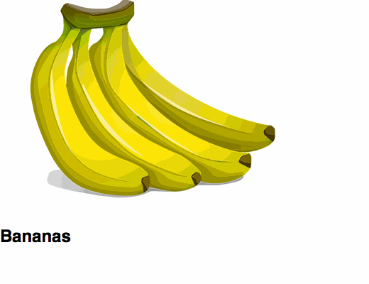
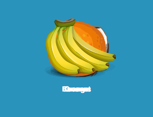
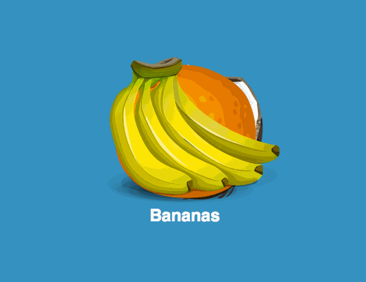
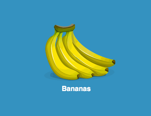
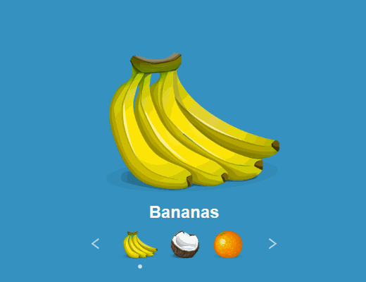
<img class="feature" src="images/bananas.png" alt="A cartoon illustration of a bunch of bananas" width="389" height="300" />
<h2 class="title">Bananas</h2>
</li>
<li class="step2">
<img class="feature" src="images/coconut.png" alt="A cartoon illustration of half a coconut" width="325" height="300" />
<h2 class="title">Coconut</h2>
</li>
<li class="step3">
<img class="feature" src="images/orange.png" alt="A cartoon illustration of a round orange" width="350" height="300" />
<h2 class="title">Orange</h2>
</li>
</ul>
</div>
In the above code, we've added the Sequence.js basic structure and some content; an image and a title. Let's ignore the content and look at the Sequence.js structure.
<div id="sequence" class="seq">
  <ul class="seq-canvas">
    <li class="step1">
      ...
    </li>
    <li class="step2">
      ...
    </li>
    <li class="step3">
      ...
    </li>
  </ul>
</div>
When adding Sequence.js to a page, it must be made up of a container, canvas, and steps.
The <div id="sequence" class="seq"> element acts as the container. We've given it an ID which we'll use to attach the Sequence.js script to shortly. The seq class will be used to apply styles. Inside the container is the canvas element and steps. Any other elements such as navigation can also be placed inside the container.
The canvas <ul class="seq-canvas"> holds the steps. This can be any element providing it has the class seq-canvas. The canvas can be automatically animated by Sequence.js so that the active step is always in view. We'll experiment with this shortly.
Finally, the <li> elements break up our content into steps. You might like to think of steps as slides in a presentation for example -- we call them steps in Sequence.js because they do a whole lot more than just slide!
As with the canvas, the steps can be any element you wish, providing they are the immediate descendants of the canvas. So you could use a canvas/steps structure such as:
<section class="seq-canvas">
  <article>
    ...Step 1...
  </article>
  <article>
    ...Step 2...
  </article>
  <article>
    ...Step 3...
  </article>
</section>
The choice is yours.
Note: I've given the steps class names step1, step2, and so on. This isn't required but we will use it in our demo to make the steps a different color.
Inside a step is where content is placed. You're not limited to the content or HTML elements you can use.
Adding Sequence.js
Now the content and structure is in place, we need to add the Sequence.js scripts.
Before the closing </body> in the HTML, add the following scripts:
<script src="scripts/imagesloaded.pkgd.min.js"></script>
<script src="scripts/hammer.min.js"></script>
<script src="scripts/sequence.min.js"></script>
<script src="scripts/demo.js"></script>
The scripts are as follows:
- imagesLoaded - Third-party providing preloader functionality for Sequence.js
- Hammer.js - Third-party providing touch functionality for Sequence.js
- sequence.min.js - The main Sequence.js script that provides the animation framework and other functionality
- demo.js - A Sequence.js options file for our demo
The third-party scripts are optional and only need be added if you want to use preloader and touch support. The options file is where we'll attach Sequence.js to our HTML, change options, and if you wish, add custom functionality.
Open scripts/demo.js and add the following:
var sequenceElement = document.getElementById("sequence");

var options = {

}

var mySequence = sequence(sequenceElement, options);
This is the basic code required to initiate Sequence.js on a webpage. The first line gets the element we want to have Sequence.js applied to (the container element with ID of sequence), the second changes Sequence.js options, and the third initiates Sequence.js on our chosen element.
It is a good idea to enable the keyNavigation option when developing with Sequence.js so you can navigate between slides via your keyboards left/right arrows. To do this, add the following to the options object:
var options = {
  keyNavigation: true
}
Save the file.
Container Layout
Now our structure and content are in place, let's add some basic styles.
In css/demo.css, add the following:
body,
html,
.seq {

  /* #1 */
  width: 100%;
  height: 100%;

  /* #2 */
  margin: 0;
  padding: 0;
}

.seq {

  /* #1 */
  position: relative;

  /* #2 */
  overflow: hidden;

  /* #3 */
  font-family: sans-serif;
}

.seq-canvas,
.seq-canvas > * {

  /* #1 */
  height: 100%;
  width: 100%;

  /* #2 */
  margin: 0;
  padding: 0;
  list-style: none;
}
The body, html, .seq elements:
- Are made fullscreen via
widthandheight - Have their
marginandpaddingreset for better browser consistency
The .seq container element:
- Is positioned so all absolute elements within are relative to it
- Prevents any elements inside of it from showing outside should they overflow
- Is given a basic font
The canvas .seq.canvas and steps .seq-canvas > *:
- Are made fullscreen via
widthandheight - Have some styles reset including removing the disc applied to
<li>elements by default
These are the basic styles we'll use for our demo and we'll make it look nice later. For the most part, they're the styles you can use for starting out with any Sequence.js application. Our demo is going to take up the full browser window so if you plan on adding a Sequence.js application to a content webpage, you probably don't want to do this. Instead you could remove the .body, .html, .seq ruleset entirely and apply width/height properties to the .seq ruleset instead. For example, the following would make the container full width but with a defined height:
.seq {
  position: relative;
  overflow: hidden;
  width: 100%;
  height: 600px;
  font-family: sans-serif;
}
You could use height: 90vh to make the container 90% of the viewport height, use a CSS technique to maintain aspect ratio (we use this for our official Sequence.js themes), and so on. There are few restrictions when it comes to using CSS with Sequence.js. The choice is yours.
Canvas Layout and Animation
We're not going to use canvas animation for this tutorial but the following is included to demonstrate how easy it is to automatically animate the canvas in Sequence.js. If you want to skip ahead, continue reading and following instructions from No Canvas Animation.
Let's preview what we have so far in a browser. If everything is set up correctly, you can press your keyboard's left/right arrow keys and Sequence.js will automatically animate the canvas so the active step always appears in the container.
By default, the canvasAnimation option in Sequence.js is true. With this option enabled, Sequence.js will automatically animate the canvas by getting a step's offset position and moving the canvas so that the active step's top left corner meets the container's top left corner. This means you can position your steps top-to-bottom, side-by-side, or in a custom layout and the canvas will automatically move to show the active step in the container.
Note: CSS transforms do not effect an element's offset position so it is best to layout steps via position and top, bottom, left, right properties. Sequence.js is smart enough to be able to take these property values and animate the canvas using a CSS transform which has better performance when animated.
Note 2: The speed at which the canvas animates can be changed by specifying a millisecond value for the animateCanvasDuration option.
Let's experiment with the layout to see automatic canvas animation in progress.
Side-by-Side Layout
We made each step take up the full width and height of a container. Because of this, the browser by default wraps them so they appear below each other and the canvas animates up and down to show each active step.
To make the steps sit side-by-side instead, you could use the following:
.seq-canvas {
  /* #1 */
  white-space: nowrap;
}

.seq-canvas > * {
  /* #1 */
  display: inline-block;
  vertical-align: top;

  /* #2 */
  white-space: normal;
}
In the .seq-canvas ruleset the canvas is prevented from wrapping elements (pushing them onto a new line).
The .seq-canvas > * ruleset:
- Makes the steps sit side-by-side now the canvas will let them do it
- Resets the white-space back to normal so the steps don't inherit
nowrapfrom the canvas

Custom Layout
How about a custom layout? Try the following:
.seq-canvas > * {
  position: absolute;
}

.step2 {
  top: 2000px;
  left: 2000px;
}

.step3 {
  top: 4000px;
  left: 4000px;
}
Here the steps are positioned absolute and then given top and left properties to position them wherever we please.

No Canvas Animation (Steps in the Same Place)
For this tutorial we won't actually use canvas animation, instead we'll just animate content (which we'll look at shortly). To disable canvas animation, place all of the steps in the same place by adding the following to css/demo.css:
.seq-canvas > * {
  /* #1 */
  position: absolute;
}
Because Sequence.js knows the steps are all in the same place now, it won't animate the canvas. As good practice though, it's worth turning off canvas animation in the options too. Update the options object in scripts/demo.js like so:
options = {
  keyNavigation: true,
  animateCanvas: false
}
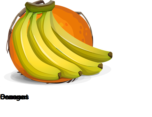
The application will look pretty bad at this point. As we've now positioned all of the steps in the same place, the content from each step is overlapping. In Animating Content, we'll fix this by hiding content in inactive steps and only showing content when its step is active.
Adding Content Styles
Now we've looked at what's possible with canvas animation, let's improve the look of our demo before moving onto Animating Content.
When a step becomes active, the container element <div id="sequence" class="seq"> is given a class name "seq-stepX", the X being replaced by the step number, for example .seq-step1.
To change the background color each time the step changes, add at the bottom of css/demo.css:
.seq-step1 {
  background-color: #2A93BC;
}

.seq-step2 {
  background-color: #6BC85E;
}

.seq-step3 {
  background-color: #45367E;
}
How about we animate that too? Update the .seq ruleset to the following:
.seq {

  /* #1 */
  position: relative;

  /* #2 */
  overflow: hidden;

  /* #3 */
  font-family: sans-serif;
  color: white;
  text-align: center;

  /* #4 */
  background-color: #2A93BC;

  /* #5 */
  transition-duration: .5s;
  transition-property: background-color;
}
Note: For brevity we won't use browser prefixes in this tutorial for elements such as transition-duration but at the time of writing, you should use the -webkit- prefix to make the demo work in Safari and iOS browsers.
Here we've:
- Set the text color to white and center aligned it
- Made the background color initially the same color as step 1 (because the application starts on step 1)
- Applied a half second transition to the background color
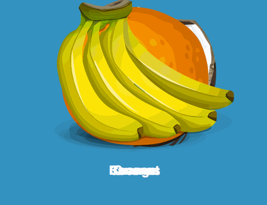
When you navigate through the application now, the background color will transition to a new color with each step.
Our content is still overlapping but this nicely demonstrates another feature of Sequence.js. By default, its moveActiveStepToTop option is enabled, which gives the active step a higher z-index value than the rest so it always appears on top.
We want the application to be responsive so it nicely fits on the page regardless of the browser width. At the bottom of css/demo.css, add the following:
.feature {
  width: 70%;
  max-width: 100%;
  height: auto;
}

@media only screen and (min-width: 460px) and (min-height: 520px) {
  .feature {
    width: 100%;
  }
}
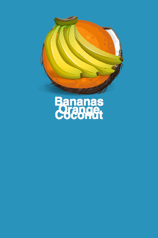
This will make the images responsive; filling their container by 70% on devices less than 460px wide and 520px high, and 100% on bigger devices, but never breaking aspect ratio or exceeding the images original width.
Note: This isn't a perfect solution. In the final demo, the pagination overlaps the image when the browser height is less than 360px for example. In the Mono theme that this demo is based on, I used multiple media queries and based the images height on the viewport via the vh unit where appropriate. To keep this tutorial simple, we won't cover that here.
Let's also add some whitespace around the images by updating the .seq-canvas > * ruleset as follows:
.seq-canvas > * {
  /* #1 */
  position: absolute;

  /* #2 */
  padding: 32px;
  box-sizing: border-box;
}
This adds a 32px space around the edge of each step. However, because in another ruleset we set the steps to have 100% width, the browser sees this as being 100% plus 64px (32px either side), which makes the content overflow the window and no longer centered. The box-sizing property tells the browser to include padding in its calculation of width to work around this.
Now finally, let's vertically align the content. As you may know, vertically centering in CSS is a little painful. You can use whatever method you prefer but as I'd like this demo to support Internet Explorer 8+, I'll use the "Ghost Element" technique as explained in Centering in the Unknown.
This requires wrapping our content in a <div>, so in index.html change each step's HTML so they now appear like this:
<li class="step1 valign">
  <div class="vcenter">
    <img class="feature" src="images/bananas.png" alt="A cartoon illustration of a bunch of bananas" width="389" height="300" />
    <h2 class="title">Bananas</h2>
  </div>
</li>
<li class="step2 valign">
  <div class="vcenter">
    <img class="feature" src="images/coconut.png" alt="A cartoon illustration of half a coconut" width="325" height="300" />
    <h2 class="title">Coconut</h2>
  </div>
</li>
<li class="step3 valign">
  <div class="vcenter">
    <img class="feature" src="images/orange.png" alt="A cartoon illustration of a round orange" width="350" height="300" />
    <h2 class="title">Orange</h2>
  </div>
</li>
Save the file, then to css/demo.css, add the following:
.valign:before {
  content: "";
  height: 100%;
}

.valign:before,
.valign > .vcenter {
  display: inline-block;
  vertical-align: middle;
}

.valign {
  font-size: 0;
}

.valign > .vcenter {
  font-size: 16px;
}
The content at the moment still looks broken but your application should now look like the above.
Animating Content
Sequence.js is most powerful when animating content. Content can be animated using CSS transitions and the classes seq-in and seq-out to describe the in and out positions for content when a step becomes active and inactive.
To demonstrate this, when a step becomes active, let's make the title of each step go from transparent in its start position, opaque in its in position, and then back to transparent in its out position.
At the bottom of css/demo.css add the following:
.title {
  /* #1 */
  margin: 0;

  /* #2 */
  opacity: 0;

  /* #3 */
  transition-duration: .5s;
  transition-property: opacity;
}
This is considered the start position for an element. It has no specific CSS class unlike seq-in and seq-out because it is the default position.
We've specified:
- The title should have no
margin(a cosmetic change) - The title should be transparent and if that changes,
- Transition over a half second period
Now, below this ruleset, add:
.seq-in .title {
  /* #1 */
  opacity: 1;
}
When a step becomes active, Sequence.js will give it the class seq-in and the title element will transition from opacity: 0 to opacity: 1 over a half second period.

Try it in the browser. Each time you hit the right arrow on your keyboard, the next step becomes active and the title fades in.
When the active step is navigated away from and is no longer active, the seq-in class is replaced with seq-out. We could use this to make the content element fade out but actually that is already occurring. As the seq-in class is removed when the step becomes inactive, the default styles from the start position are applied again.
Use the seq-out class when you'd like to apply a different animation for the transition to the out position or maintain the same style as applied via the seq-in class.
Let's get a little more advanced. Update the .title ruleset with the following:
.title {
  /* #1 */
  margin: 0;

  /* #2 */
  opacity: 0;
  transform: translateX(50px) translateZ(0);

  /* #3 */
  transition-duration: .5s;
  transition-property: opacity, transform;
}
We've updated the transition so now the title starts 50px to the right of its original position and when this changes, will also cause a transition along with the opacity.
Note: We're making use of the translateZ(0) trick to cause the browser to use hardware acceleration for the transition. This makes animations smoother, especially on mobile devices.
Now update the in position:
.seq-in .title {
  opacity: 1;
  transform: translateX(0) translateZ(0);
}
Take a look in the browser again...

When a step becomes active the title now fades and floats into position from the side. When a step becomes inactive, the title returns to its start position but that kinda looks weird right? Here's where we can use the seq-out class to make the title move to the left so navigating through our application seems more like a natural progression.
Add the following:
.seq-out .title {
  opacity: 0;
  transform: translateX(-50px) translateZ(0);
}
Now when a step becomes inactive the title animates to the left instead.
Let's apply the same technique to the images. Add the following to css/demo.css:
.feature {
  transform: translateZ(0) scale(0);
  transition-duration: .5s;
  transition-property: transform, opacity;
}

.seq-in .feature {
  transform: translateZ(0) scale(1);
}

.seq-out .feature {
  transform: translateZ(0) scale(1);
  opacity: 0;
}
Save the file.
With these rules we achieve the following:
- Scale the image down to nothing (so it can't be seen) in the start position and make transitions occur over half a second
- Scale the image to full size in the in position
- Maintain the full size scale but fade-out in the out position
Now the images will have a zoom-in effect when their step becomes active and fade out when they become inactive.
Although what I've shown here is very basic, this simple animation framework provided by Sequence.js is incredibly powerful. Animate multiple properties and elements in 2D and 3D space, make them move, fade, scale, rotate, and more. What you can achieve is only limited by your imagination.
Take a look at some of the examples we've created in the Sequence.js Theme Store.
Hopefully you're excited to try out some of your own ideas at this point. Feel free to experiment but continue reading to learn more about Sequence.js, and in particular, the most important concept to make sure your application works fully, Watching Animated Elements.
Watching Animated Elements
An important concept to learn when using Sequence.js is watching animated content.
As transitions are specified via CSS, Sequence.js can't be sure which elements will be animating and when they'll end. We need to let it know which elements it should watch.
Watching elements is required for many Sequence.js features to work such as autoPlay, phaseThreshold (a customizable delay between the in and out transitions), reverseWhenNavigatingBackwards, and more. For example, when autoPlay is enabled Sequence.js will automatically navigate to the next step once the current step has finished animating after a period of X milliseconds (by default 5000ms/5 seconds as defined by the autoPlayInterval option). Without watching elements, Sequence.js will navigate to the next slide every 5 seconds regardless of the length of animations. So, if your animations last for longer than 5 seconds, the next step will be navigated to before the current one has even finished.
Watching elements is as simple as adding the attribute data-seq to the element(s) we want to watch.
Tip: It isn't always necessary to watch elements. For example, you might want content to transition in and out over 1 second, but have a background image slowly transition for much longer and not prevent Sequence.js from automatically navigating to the next step via autoPlay. The general rule of thumb is that if the transition is applied to content you should watch it. If it's just a decorative transition, you don't need to.
Now we have our content transitions in place, let's watch the elements they're applied to.
In index.html, find each instance of the <img class="feature" /> and <h2 class="title"> elements, and add the data-seq attribute to them like so:
<img data-seq src="images/bananas.png" alt="A cartoon illustration of a bunch of bananas" width="389" height="300" />
and:
<h2 data-seq class="title">
With these elements now watched (6 in total; 2 for each step), when we navigate to a step, Sequence.js will be able to determine how long they transition for. If autoPlay is enabled in this scenario for example, when the step becomes active, Sequence.js will wait half a second for the longest transition to finish before starting its 5 second countdown for autoPlay to automatically navigate to the next step.

Save what you have so far and preview in the browser again. Notice that the next step now takes longer to animate in. We've told Sequence.js it should watch the image and title elements so it is waiting for the current step's transitions to end before starting the next. This threshold between the in and out phases is known as the Phase Threshold and can be changed via the phaseThreshold option.
Handling Phase Threshold
The phase threshold is the duration between the current step animating out and the next step animating in. By default, the phaseThreshold option is set to true, meaning the next step will animate in only once the current one has animated out (providing watched elements are correctly set up). Instead, let's make both phases (the in and out transitions) occur at the same time.
In scripts/demo.js, in the options object, add phaseThreshold: false, like so:
var options = {
  keyNavigation: true,
  animateCanvas: false,
  phaseThreshold: false
}
The current step will now animate out at the same time the next step will animate in. This achieves the same as what we had prior to watching elements because Sequence.js couldn't determine how long the transitions would last and just started both the in and out phases at the same time.
The phaseThreshold option can also be given a custom time in milliseconds, for example phaseThreshold: 250 will delay the next step from animating in for 250 milliseconds.
Animating in Reverse
When navigating in reverse (hitting your keyboard's left arrow and going from step 3, to step 2, and so on), the current experience doesn't quite feel natural because our transitions are still playing forwards. Sequence.js can automatically reverse transitions via the reverseWhenNavigatingBackwards option.
In the options file scripts/demo.js, enable reverseWhenNavigatingBackwards like so:
var options = {
  keyNavigation: true,
  animateCanvas: false,
  phaseThreshold: false,
  reverseWhenNavigatingBackwards: true
}

With this option enabled, you can see our transitions now work in reverse automatically. The titles slide in from left-to-right and the images fade in, then zoom out.
Adding Next/Previous and Pagination Buttons
During development, we've been using the keyboard's left/right arrow keys to navigate between steps. The user might not know to do this though so instead, let's add some user interface buttons. This is super easy with Sequence.js.
In index.html, after the <ul class="seq-canvas"></ul> element but still inside the container, add the following:
<fieldset class="nav" aria-label="Slider buttons" aria-controls="sequence">

  <button type="button" class="seq-prev" aria-label="Previous"><img src="images/prev.svg" alt="Previous" /></button>

  <!-- Pagination goes here -->

  <button type="button" class="seq-next" aria-label="Next"><img src="images/next.svg" alt="Next" /></button>
</fieldset>
Now add the following to css/demo.css to style the buttons:
.nav {
  /* #1 */
  position: absolute;
  z-index: 100;
  left: 0;
  right: 0;
  bottom: 2.5em;
  max-width: 640px;
  width: 100%;

  /* #2 */
  border: none;
  margin: 0 auto;
  padding: 0;
}

.seq-next,
.seq-prev {
  /* #1 */
  padding: 0;
  background: transparent;
  border: none;

  /* #2 */
  padding: .75em;
  cursor: pointer;
  color: white;
  font-size: .75em;
  text-transform: uppercase;

  /* #3 */
  opacity: .7;
  transition-duration: .25s;
  transition-property: opacity;
}

.seq-next:hover,
.seq-prev:hover {
  opacity: 1;
}
The .nav ruleset:
- Positions the element holding the buttons 40px from the bottom
- Resets styles on the
<fieldset>element
The .seq-next, .seq-prev ruleset:
- Resets the styles
- Adds some general styles such as font-size and color
- Sets up the
opacityso that it will transition from 70% transparency to opaque when hovered over
Save your HTML and preview in the browser. The buttons now allow you to navigate to the next/previous step. By giving an element inside a Sequence.js container the class seq-prev or seq-next, you're letting Sequence.js know they should act as previous and/or next buttons. The functionality required for them to work is taken care of, so you needn't worry about the JavaScript.
Using the class seq-pagination, you can also add pagination links to an application.
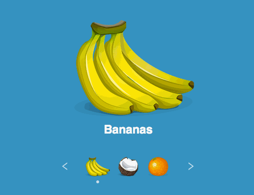
Back in index.html, find the line <!-- Pagination goes here --> and replace it with the following example HTML for pagination:
<ul role="navigation" aria-label="Pagination" class="seq-pagination">
  <li class="seq-current">
    <a href="#step1" rel="step1" title="Go to bananas">
      <img src="images/tn-bananas@2x.png" alt="Bananas" width="50" height="40" />
    </a>
  </li>
  <li>
    <a href="#step2" rel="step2" title="Go to coconut">
      <img src="images/tn-coconut@2x.png" alt="Coconut" width="50" height="40" />
    </a>
  </li>
  <li>
    <a href="#step3" rel="step3" title="Go to orange">
      <img src="images/tn-orange@2x.png" alt="Orange" width="50" height="40" />
    </a>
  </li>
</ul>
The pagination must consist of a container and links; links being the immediate descendant of the container. The first immediate descendant will link to the first step, and so on. As with the Sequence.js container, canvas, and steps, the markup you use here is entirely up to you. Providing you add the class of seq-pagination to an element that has immediate descendants, you've got pagination!
Save index.html then to css/demo.css add the following:
.seq-next,
.seq-prev,
.seq-pagination {
  position: relative;
  display: inline-block;
  vertical-align: middle;
  margin-top: 0;
}

.seq-pagination {
  margin: 0 1em;
  padding: 0;
}

.seq-pagination li {
  /* #1 */
  position: relative;

  /* #2 */
  list-style: none;

  /* #3 */
  display: inline-block;
  vertical-align: middle;

  /* #4 */
  width: 50px;
  height: 40px;
  margin: 0 .25em;
}

.seq-pagination li:before {
  /* #1 */
  content: "";
  display: block;
  position: absolute;
  top: 100%;
  left: 50%;
  width: 6px;
  height: 6px;
  margin-left: -3px;
  margin-top: .5em;
  border-radius: 50%;
  background: white;

  /* #2 */
  opacity: 0;
  transition-duration: .25s;
  transition-property: opacity;
}

.seq-pagination .seq-current:before {
  opacity: .7;
}

.seq-pagination img,
.seq-pagination a {
  display: block;
  border: none;
}
The .seq-next, .seq-prev, .seq-pagination ruleset makes the next/previous buttons and pagination sit side-by-side.
The pagination is given a little space either side in the .seq-pagination ruleset.
The .seq-pagination li ruleset achieves the following:
- Position the links so a dot that indicates the active step can be positioned relative to it
- Removes the disc from the
<li>element - Makes each link sit side-by-side
- Gives the links dimensions and space
We then add the current link indicator via a pseudo-element in the .seq-pagination li:before ruleset, which does the following:
- Positions the dot underneath the image acting as a pagination link
- Makes the dot transparent but sets up a transition so that when a link becomes active, the dot fades in
After that we use the .seq-current class. This is added by Sequence.js to any pagination link that is associated with the current step so it can be styled. In our case, we used the ruleset .seq-pagination .seq-current:before to make our dot appear 70% opaque.
In the ruleset .seq-pagination img,
.seq-pagination a, we reset styles on the pagination image and link.
Now finally, because our content is currently vertically aligned to the canvas, in relation to the new pagination it seems a little off. Let's instead vertically center the content in the space between the top of the page and the top of the pagination, by updating .seq-canvas > *:
.seq-canvas > * {
  /* #1 */
  position: absolute;

  /* #2 */
  padding: 32px;
  box-sizing: border-box;

  /* #3 */
  height: auto;
  top: 0;
  bottom: 80px;

}
The final block of code (3) removes the height of 100% that we previously set on the steps, and replaces it with top: 0 and bottom: 80px. Now each step's height will be from the very top of the canvas but 80px from the bottom, leaving enough space for the pagination. We get the value of 80px because the pagination is positioned 40px from the bottom and is also 40px tall.
Pretty easy to add these important user interface elements right? Now a user can easily navigate and skip between steps, knows at all times which slide they're on, and how many make up the application.
Browser Support
We're almost done with our application but as is always important, we need to make sure it works cross-browser.
Firstly, you may notice that the pagination wraps onto a new line if you reduce the browser width below 300px or the pagination overlaps the title when the browser height is less than 350px. We won't do it in this tutorial for the sake of brevity but as you'll see in the official Mono theme, I used media queries to solve these issues.
I will however show you how to make the application usable when JavaScript is disabled, as well as in browsers that don't support CSS transitions, such as Internet Explorer 8 and 9.
Internet Explorer 8 & 9
Internet Explorer 8 and 9, being older browsers, don't support CSS transitions. To work around this, Sequence.js goes into Fallback Mode.
In Fallback Mode, all steps are given the class seq-in to force the content into its active position. Then, rather than the content animating, the canvas is animated side-to-side much like a traditional slider.
When it is necessary to give these older browsers specific styles, aside from using conditional comments, you can also use the Sequence.js class seq-fallback which is applied to the container element when in Fallback Mode.
No JavaScript Fallback
When JavaScript is disabled the slide content doesn't appear, only the pagination. This is because Sequence.js can't add the seq-in class to any of the steps.
A part-solution is to manually add seq-in class onto the step you'd like to appear when JavaScript is disabled, like so:
<li class="step1 valign seq-in">
The first step's content now appears but the pagination is still visible yet not working.
To work around this, we can make use of the seq-active class. This is progressively applied to the container element when JavaScript is enabled so when it's not, we can write non-JavaScript styles.
For example, the next/previous buttons are useless without the JavaScript functionality to make them work. We could use the following to differentiate between states where JavaScript is disabled and enabled; hiding/showing those buttons accordingly:
.seq-next,
.seq-prev {
  /* Hide buttons when JavaScript is disabled */
  display: none;
}

.seq-active .seq-next,
.seq-active .seq-prev {
  /* Show buttons when JavaScript is enabled */
  display: inline-block;
}
We won't go any further than that in this tutorial but for the application we're creating, when JavaScript is disabled we could make the steps and content relative so they wrap one below the other and the user can navigate between each step like they would a traditional web page.
Conclusion
This tutorial aims to give you a basic understanding of the main features and concepts in Sequence.js. With help of the official documentation, you should now be able to start making your very own unique animated applications.
As you've seen, Sequence.js is a progressive solution. It only aims to simplify the design of animated applications by providing all the functionality you may need in a workflow you're already familiar with. How you tackle the issues of meaningful animation, responsive design, accessibility, and user experience is left yo you -- which is a good thing!
I'd love to see what you create with Sequence.js so please feel free to share in the comments, via Twitter, CodePen, and so on.
The complete version of the Mono Sequence.js theme can be downloaded here.
Credits
Fruit Illustrations made available under a Public Domain license by OpenClipartVectors.
Arrow icon by Yordi Uytersprot from the Noun Project.


About Ian Lunn
A graduate of Internet Technology, Ian combines his education with 7 years commercial experience in responsive web design and front-end development to produce quality user experiences for happy clients over the world.


Thanks but this is extremely complicated — all we want is a slider after all.
A note on presentation — some of the demos look broken (elements piling on top of each other) even though I think you are using them to show intermediate progress. But this should be make *very clear* in the demonstration.
Many folks will just glance at the beginning demos, and conclude “another crappy js library that doesn’t quite work”. And you can’t really blame them :-)
thanks for your article.
Hi lurker above. Thanks for the feedback.
Certainly, Sequence.js has a learning curve but that comes with a hugely powerful library in which you have complete control over transitions and responsive layout. This article aims to get you up to speed as quickly as possible by producing a simple slider so you can then go onto create more advanced applications (not just sliders) that other slider libraries aren’t capable of.
Yes, the images with elements piled on top of each other show intermediate progress but point taken.
The resulting animation looks awesome, I really like it. The only thing that is missing to me is to have the main interaction with the user to be that on a mobile, with swipes from left to right. I think that the aim for interactive developers should be to have that mobile/tablet interaction as much of a flow as possible, and your animation is definitely “flowy”.
Great work!
Good post, always good to learn new things.
Personally I really like velocity.js and gsap.js for animations.
I have great control over the animations, especially with Greensock.
Just my 2 cents.
Thanks again for the post, I enjoyed it.
Nice tut, but what’s going on at paging fieldset?
…
Great post, and great js library. Can’t wait to apply this to my next project and take my old boring sliders to the next level!
I am having a huge problem trying to make the text/buttons within the canvas selectable. I also want to add hover states and buttons within each slide, how do I get that to work? Please help!