Same Site, New Theme
Hello faithful subscribers,
I've posted a new davidwalsh.name theme. Let me know your thoughts. I'm not a designer but I think this is a bit better than the last "design." I still have some tweaks to make but I think it's set enough now to post.
David
![How to Create a RetroPie on Raspberry Pi – Graphical Guide]()
Today we get to play amazing games on our super powered game consoles, PCs, VR headsets, and even mobile devices. While I enjoy playing new games these days, I do long for the retro gaming systems I had when I was a kid: the original Nintendo...
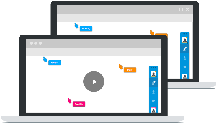
![5 Awesome New Mozilla Technologies You’ve Never Heard Of]()
My trip to Mozilla Summit 2013 was incredible. I've spent so much time focusing on my project that I had lost sight of all of the great work Mozillians were putting out. MozSummit provided the perfect reminder of how brilliant my colleagues are and how much...
![MooTools Zebra Table Plugin]()
I released my first MooTools class over a year ago. It was a really minimalistic approach to zebra tables and a great first class to write. I took some time to update and improve the class.
The XHTML
You may have as many tables as...
![Form Element AJAX Spinner Attachment Using jQuery]()


There seems to be a little redundancy between the ‘gratuitous accordion’ and the bottom panel, no?
Looks good overall.
I like it overall… nice and clean. However, I do feel like I’d prefer more than 55(ish)% of the page width to be given to the actual article content.
Looking good David, though I would choose to nofollow all those sponsor links…
@Will: Yes and no. I’m not sure people would find everything in the footer if it wasn’t above somewhere too.
@Evil: Agreed, I’m going to try to squeeze as much space out as possible. If worse comes to worse, I dwarf the right side a tad.
@Joost: Good call.
Im sure it will grow on me but I prefer the older design. I found it a lot easier to find stuff on the old site and the content seemed to be more prominant. The adds and bookmarking links are the overall eye tracking and what pulls me into looking at the site, previously it was the content.
This type of design seems to be getting quite popular but im not sure its a useability improvement, although it is clean I just prefer the older design :) Like evil said above, maybe try to squeeze more of that side column.
Paul
I feel it’s verry clean again! good job. I really like the comments formatting.
I really like the 50% but is could be tough for code view. For code view, you may want to have a link to convert the div to absolute so it can be full width (overlay the accordian). I hate horizontal scroll on those.
I also didnt know the accordian was an accordian. You may want to point out / highlight that you can click to see more. I also would rather see all of the items expanded at once when entering the site.
One last thing, I wish there were more articles per page- say 5 or ten so I could scan the categories easier.
I like it very much, it’s very clean and simplistic. Gray is the new colorful!
I would also nofollow the sponsors, I think TLA has that option. It is rumored that Google has their own “spy” accounts over there and do some manual research in terms of paid Pagerank passing, so better put them to nofollow… IMO.
And why nofollow the Related Posts links? I would absolutely put them to do-follow.
The accordion I like also, maybe you could add a simple arrow icon or so to the bar titles to indicate that they are expandable.
All in all, I really like it a lot. Keep it up!
Regular text links with out the nofollow attribute is the reason advertise use TLA. That is one of the only advantages of using them. It gives the advertiser pagerank. Their USP (Unique Selling Proposition) is, “Improve your traffic and search engine rankings. Only TLA can deliver an ad that does both.” Obivously Nofollow takes this away from advertisers.
I was under the impression that it was against the terms to add nofollow to TLA links. With that in mind Google has been known to punish websites that use TLA. You can read more about that on Matt Cutts website, (google employee).
I would either get rid of them completely, or understand the risk and leave the nofollow.
I like it, although I liked more the blue color in header. I would agree that sidebar is too wide. I like the accordion and the footer, very nice!
I preferred the old design. This is not a bad design at all, but the previous design was much easier for my eyes to follow. I’d prefer a smaller right-side column to allow a wider content area. Also, I’d recommend moving the site search out of the accordion. Makes it a lot easier to use the search feature when doing multiple searches or trying to narrow down a search.
A very clean site. A grate addition to the great information you present. Good Job, Mate!
Great work, as usually. Clear, simple and intuitive.
Really nice innovation. Things are in the right spot, simple and straight to the point.
Personally i did liked the footer information. Today is very common to see bloggers inserting blog information in a big footer area.
Also liked the twitter dialog box in the footer. really nice.
good job.
Thanks David!!!!!
Good script.
There is a error generate when i run the script with database with contain large data
this error is shown
Fatal error: Allowed memory size of 134217728 bytes exhausted (tried to allocate 133693567 bytes) in C:\wamp\www\backup\index.php on line 62.
What can i do..???