Setup to Build Responsive Websites
Eric Wendelin is one versatile dude. When I met him he was writing Java at a small startup called Sun / Oracle, and now he's writing front-end code for a startup -- that's a big leap. With this responsive design post, Eric flexes a little muscle and shares his process for putting together a responsive website.
Not long ago, the biggest challenge for a web engineer was making sites that worked well in several different browsers. While that is still the case, our challenge is shifting to supporting the growing number of devices. I have come across a few tools and paradigms that helped me make this shift. Some ideas cannot be easily expressed in words; truly the best teacher is experience. Make a committment to yourself to grind your mental axe on this skill.
The first thing I want to say is in regards to design. You cannot have a responsive site without a responsive design. I recommend taking a "mobile first" approach because it forces you to focus on the most critical elements in your app. Once the most important elements are established, the rest can be deemphasized or taken away on smaller screens. This isn't really a dev tip — for the rest of the article I'll assume you have a polished design that must adapt to various screens.
Chrome Developer Tools Setup
Chrome has an awesome feature that helps emulate other devices. Open the Developer Tools and find the gear in the lower-right for the settings. Go to the Overrides tab and check the User Agent box, then select a device from the dropdown list. Chrome will automatically populate the device metrics and scale the viewport accordingly. The arrow button on the right changes the orientation of the "device". You can also emulate touch events.
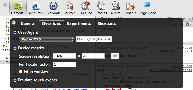
I use this to really dig into the layout for a specific device. Theoretically, you could open multiple Chrome tabs and set them to different devices, but that's cumbersome. I have a tool I use for that.
Responsive Design Bookmarklet
Lennart Schoors and Benjamin Keen developed a really neat bookmarklet that creates a series of <iframe>s containing various resolutions of the current page. I use it to test a bunch of resolutions at the same time to make sure the layout responds correctly on a wide range of devices.
Here are the resolutions I usually use (based on my Google Analytics data + speculation):
- 480x800 — Generalized Smartphone/Nexus S Portrait
- 800x480 — Generalized Smartphone/Nexus S Landscape
- 640x960 — iPhone 4S Portrait
- 960x640 — iPhone 4S Landscape
- 640x1136 — iPhone 5 Portrait
- 1136x640 — iPhone 5 Landscape
- 768x1024 — iPad Portrait
- 1024x768 — iPad Landscape
- 720x1280 — Samsung Galaxy Nexus Portrait
- 1280x720 — Samsung Galaxy Nexus Landscape
- 1440x900 — Generalized Laptop
- 1920x1080 — Generalized Monitor
You can use your favorite dev tools to inspect any given viewport, but you can't change all of them at the same time. If you need to click around and check out multiple different devices simultaneously, use Adobe Shadow Edge Inspect.
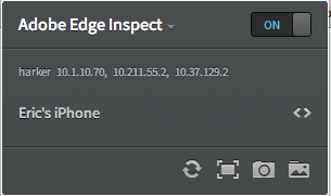
Adobe Edge Inspect
The previous setups have some major gaps (such as pixel density and font scaling) that are tough or impossible to emulate without using a real device. You can use various emulators or Apple's shiny new Remote Debugger in Safari 6 but that is (currently) only for iOS devices and only if you're non-mobile computer is a Mac. Weak.
The free version of Adobe Edge Inspect allows you to preview and inspect your web pages in real-time on one mobile device. The paid version will allow you to work on multiple devices at the same time.
For this setup, you need to install the Edge Inspect native app on all of your mobile and non-mobile devices and install the Edge Inspect Chrome extension. Connect all devices, start Edge Inspect on them, and choose the computer you want to connect to. Now all of the mobile devices will one-way mirror your computer. Interactions on one mobile device is not mirrored on any other screen. You can also view and change HTML/CSS/JS/Storage with the inspector. Turn on the Chrome extension and click the <> symbol next to a device to inspect the page on it. Awesome!
Edge Inspect + LiveReload FTW
Using your favorite editor and seeing changes in real-time is the new hotness, and we can do just that using LiveReload. I recommend buying the Mac app because setting up Edge Inspect sync without it is tedious. You also need to install the Latest LiveReload extension for your browser. If you don't have a Mac, you'll need to use guard-livereload and livereload.js. For more help, see Adobe's guide to using LiveReload with Edge Inspect.
The only drawback to the Edge Inspect and LiveReload system right now is that WebSockets are not supported by Android browsers (as of v4.1), so LiveReload doesn't work on Android.
Phew! Now we have a system that allows us to develop in our favorite editor and see changes on multiple screens at once! The setup is tedious, but well worth it. Nothing beats seeing and using the design on a real device.
Other Resources
- BrowserStack has a bunch of mobile emulators for iOS, Android and Opera Mobile that you can run remotely, and their service is cheap and awesome. Recommend.
- I'm intrigued by Adobe Edge Reflow for layout development (not yet released).
- Lastly, I love Majd Taby's article on setting up WebKit Inspector for development. All web developers should read it.
Thank you to David Walsh, Divya Manian and Chris Coyier for their reviews and feedback on this article.


About Eric Wendelin
Eric Wendelin is Principal Engineer at MapVine, a startup aiming to turn sales meetings into sales. He is an open-source software fanatic, blogger and conference speaker.


How would you deal with wordpress setup on a localhost? Would I have to change wp-config.php to accomodate for different host/IP address?
Thanks,
Yulia.
“The only drawback to the Edge Inspect and LiveReload system right now is that WebSockets are not supported by Android browsers (as of v4.1), so LiveReload doesn’t work on Android.”
I use a combination of Edge Inspect and Sublime Text 2 with Windows 7, OS X and the LiveReload plugin for ST2 available here* and it works and refreshes the page with Android 4.x on my Nexus 7 and my Galaxy Nexus GSM on my local network. It even detects when a new client is connected in Sublime Text 2, but you have to load the JS file in the head of your document that you are editing though. It also works server-side (with the ST2 SFTP plugin by Will Bond**.)
*https://github.com/dz0ny/LiveReload-sublimetext2
**http://wbond.net/sublime_packages/sftp
@Yulia: I think that depends on whether WordPress generates links that are relative or absolute. I don’t recall the default behavior of WordPress and whether that would mean changing wp-config.php, but I get the sense it would not be painful to accomodate for. HTH
Thanks for the response, Eric, I got it working with the help of this article:
http://davemcmillan.net/382/snippets/how-to-test-a-wordpress-site-on-a-mobile-or-virtual-machine/
Basically all you have to do is set
WP_HOMEandWP_SITEURLto your IP address and use this for changing the links for images:$('img[src*=localhost]').each(function() { var newImgSrc = $(this).attr('src').replace(/\localhost/,'65.217.150.180'); $(this).attr('src', newImgSrc ); });*might be helpful for anyone else that could encounter the same issue*
@Brandon: That is excellent to hear, thank you. I took Adobe at their word regarding support because I only have older Android devices that don’t seem to be supported.
Firefox developer tools also have responsive design view
https://hacks.mozilla.org/2012/07/debugger-responsive-design-view-and-more-in-firefox-aurora-15/
Responsive Design View is neat, but doesn’t have a couple features that Chrome does like font scale factor or the ability to emulate touch events AFAIK. I left it out for brevity and to encourage to progression to Edge Inspect as a better solution.
The iPhone does not operate as 960×640.. it is 480×320 with a pixel density of 2x. I don’t know why Chrome treated it as they did in the developer tools since it looks nothing like how my phone renders a site.
You make a good point. 480×320 should be added to the list of resolutions. Unfortunately, the only rather weird way of emulating pixel density is scaling the page with ⌘+ (real devices better, obviously)
This is great stuff btw!
Super Helpful. The only thing missing for me was a better viewer for the device snapshots. I was able to track down this Adobe Edge Inspect Snapshot Viewer Github project that makes it easier to view the snapshots generated from the Google Chrome Extension ( helpful for people like me managing dozens of devices ):
https://github.com/manifestinteractive/edge-inspect-viewer
Shameless self promotion? ;) Neat tool, though. Will definitely give it a try.
Hi guys,
i stumbled across a pretty nifty app to check out what a site would look like with responsive features, used it for my site http://www.rocketmill.co.uk/responsive-web-design – have a look for your self – http://mattkersley.com/responsive/
Hi guys! I have created a framework that allows you to create a responsive site quickly and easily just by clicking buttons or if you want adding your html.. My framework is based on Foundation ( another framework ) but if you want you can select Bootstrap ( is converted from Foundation, so not all can be converted ).. This is the site: http://www.responsivetemplater.altervista.org/
Tell me what you think about that :) .. Sorry if I was wrong to write in english :)